


It is said that a picture is worth a thousand words. Through various pictures and graphical presentations, we can express many abstract concepts, theories, data patterns, or certain ideas much clearer.
Data can be messy at times, and simply showing the data points would confuse audiences further. If we could have a simple graph to show its main characteristics, properties, or patterns, it would help greatly. In this tutorial, we explain why we should care about data visualization and then we will discuss techniques used for data visualization in R and Python.
This article is an excerpt from a book ‘Hands-On Data Science with Anaconda’ written by Dr. Yuxing Yan, James Yan.
Data visualization in R
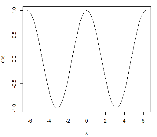
Firstly, let’s see the simplest graph for R. With the following one-line R code, we draw a cosine function from -2π to 2π:
> plot(cos,-2*pi,2*pi)
The related graph is shown here:
Histograms could also help us understand the distribution of data points. The previous graph is a simple example of this. First, we generate a set of random numbers drawn from a standard normal distribution. For the purposes of illustration, the first line of set.seed() is actually redundant. Its existence would guarantee that all users would get the same set of random numbers if the same seed was used ( 333 in this case).
In other words, with the same set of input values, our histogram would look the same. In the next line, the rnorm(n) function draws n random numbers from a standard normal distribution. The last line then has the hist() function to generate a histogram:
> set.seed(333)
> data<-rnorm(5000)
> hist(data)
The associated histogram is shown here:
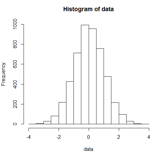
Note that the code of rnorm(5000) is the same as rnorm(5000,mean=0,sd=1), which implies that the default value of the mean is 0 and the default value for sd is 1. The next R program would shade the left-tail for a standard normal distribution:
x<-seq(-3,3,length=100)
y<-dnorm(x,mean=0,sd=1)
title<-"Area under standard normal dist & x less than -2.33"
yLabel<-"standard normal distribution"
xLabel<-"x value"
plot(x,y,type="l",lwd=3,col="black",main=title,xlab=xLabel,ylab=yLabel)
x<-seq(-3,-2.33,length=100)
y<-dnorm(x,mean=0,sd=1)
polygon(c(-4,x,-2.33),c(0,y,0),col="red")
The related graph is shown here:
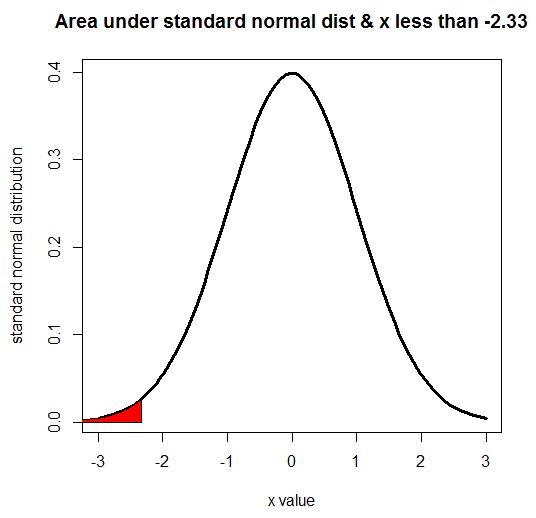
Note that according to the last line in the preceding graph, the shaded area is red.
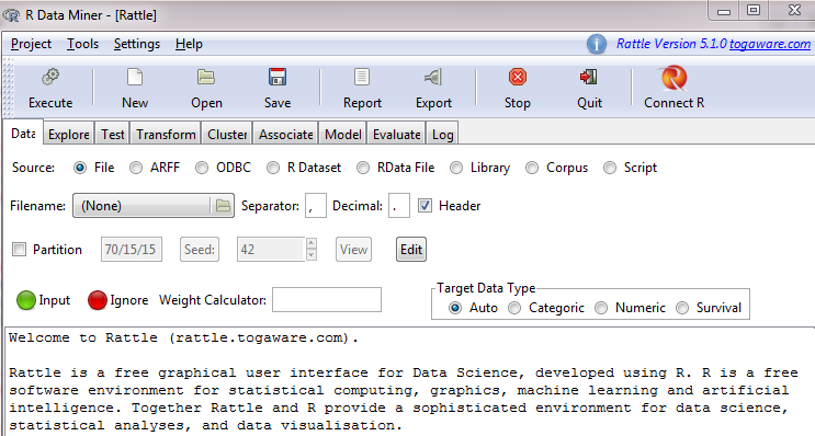
In terms of exploring the properties of various datasets, the R package called rattle is quite useful. If the rattle package is not preinstalled, we could run the following code to install it:
> install.packages("rattle")
Then, we run the following code to launch it;
> library(rattle)
> rattle()
After hitting the Enter key, we can see the following:
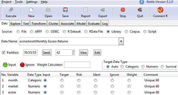
As our first step, we need to import certain datasets. For the sources of data, we choose from seven potential formats, such as File, ARFF, ODBC, R Dataset, and RData File, and we can load our data from there.
The simplest way is using the Library option, which would list all the embedded datasets in the rattle package. After clicking Library, we can see a list of embedded datasets. Assume that we choose acme:boot:Monthly Excess Returns after clicking Execute in the top left. We would then see the following:
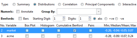
Now, we can study the properties of the dataset. After clicking Explore, we can use various graphs to view our dataset. Assume that we choose Distribution and select the Benford check box. We can then refer to the following screenshot for more details:
After clicking Execute, the following would pop up. The top red line shows the frequencies for the Benford Law for each digits of 1 to 9, while the blue line at the bottom shows the properties of our data set. Note that if you don’t have the reshape package already installed in your system, then this either won’t run or will ask for permission to install the package to your computer:
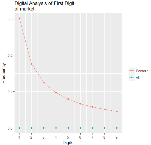
The dramatic difference between those two lines indicates that our data does not follow a distribution suggested by the Benford Law. In our real world, we know that many people, events, and economic activities are interconnected, and it would be a great idea to use various graphs to show such a multi-node, interconnected picture. If the qgraph package is not preinstalled, users have to run the following to install it:
> install.packages("qgraph")
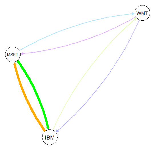
The next program shows the connection from a to b, a to c, and the like:
library(qgraph)
stocks<-c("IBM","MSFT","WMT")
x<-rep(stocks, each = 3)
y<-rep(stocks, 3)
correlation<-c(0,10,3,10,0,3,3,3,0)
data <- as.matrix(data.frame(from =x, to =y, width =correlation))
qgraph(data, mode = "direct", edge.color = rainbow(9))
If the data is shown, the meaning of the program will be much clearer. The correlation shows how strongly those stocks are connected. Note that all those values are randomly chosen with no real-world meanings:
> data
      from   to     width
 [1,] "IBM"  "IBM"  " 0"
 [2,] "IBM"  "MSFT" "10"
 [3,] "IBM"  "WMT"  " 3"
 [4,] "MSFT" "IBM"  "10"
 [5,] "MSFT" "MSFT" " 0"
 [6,] "MSFT" "WMT"  " 3"
 [7,] "WMT"  "IBM"  " 3"
 [8,] "WMT"  "MSFT" " 3"
 [9,] "WMT"  "WMT"  " 0"
A high value for the third variable suggests a stronger correlation. For example, IBM is more strongly correlated with MSFT, with a value of 10, than its correlation with WMT, with a value of 3. The following graph shows how strongly those three stocks are correlated:
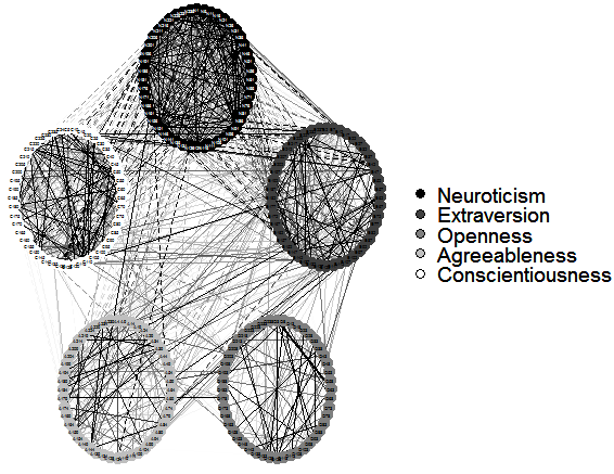
The following program shows the relationship or interconnection between five factors:
library(qgraph)
data(big5)
data(big5groups)
title("Correlations among 5 factors",line = 2.5)
qgraph(cor(big5),minimum = 0.25,cut = 0.4,vsize = 1.5,
    groups = big5groups,legend = TRUE, borders = FALSE,theme = 'gray')
The related graph is shown here:
Data visualization in Python
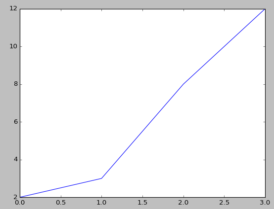
The most widely used Python package for graphs and images is called matplotlib. The following program can be viewed as the simplest Python program to generate a graph since it has just three lines:
import matplotlib.pyplot as plt
plt.plot([2,3,8,12])
plt.show()
The first command line would upload a Python package called matplotlib.pyplot and rename it to plt.
Note that we could even use other short names, but it is conventional to use plt for the matplotlib package. The second line plots four points, while the last one concludes the whole process. The completed graph is shown here:
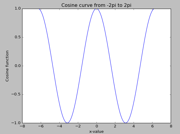
For the next example, we add labels for both x and y, and a title. The function is the cosine function with an input value varying from -2π to 2π:
import scipy as sp
import matplotlib.pyplot as plt
x=sp.linspace(-2*sp.pi,2*sp.pi,200,endpoint=True)
y=sp.cos(x)
plt.plot(x,y)
plt.xlabel("x-value")
plt.ylabel("Cosine function")
plt.title("Cosine curve from -2pi to 2pi")
plt.show()
The nice-looking cosine graph is shown here:
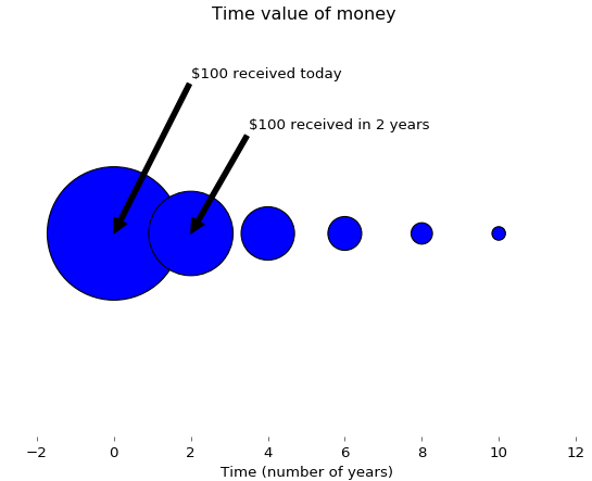
If we received $100 today, it would be more valuable than what would be received in two years. This concept is called the time value of money, since we could deposit $100 today in a bank to earn interest. The following Python program uses size to illustrate this concept:
import matplotlib.pyplot as plt
fig = plt.figure(facecolor='white')
dd = plt.axes(frameon=False)
dd.set_frame_on(False)
dd.get_xaxis().tick_bottom()
dd.axes.get_yaxis().set_visible(False)
x=range(0,11,2)
x1=range(len(x),0,-1)
y = [0]*len(x);
plt.annotate("$100 received today",xy=(0,0),xytext=(2,0.15),arrowprops=dict(facecolor='black',shrink=2))
plt.annotate("$100 received in 2 years",xy=(2,0),xytext=(3.5,0.10),arrowprops=dict(facecolor='black',shrink=2))
s = [50*2.5**n for n in x1];
plt.title("Time value of money ")
plt.xlabel("Time (number of years)")
plt.scatter(x,y,s=s);
plt.show()
The associated graph is shown here. Again, the different sizes show their present values in relative terms:
To summarize, we discussed ways data visualization works in Python and R. Visual presentations can help our audience understand data better.
If you found this post useful, check out the book ‘Hands-On Data Science with Anaconda’ to learn about different types of visual representation written in languages such as R, Python, Julia, etc.
Read Next
A tale of two tools: Tableau and Power BI


