
A Qlik Sense application combines data in the form of a structured data model, visualizations, sheets, and stories. Dimensions, measures, and visualizations can be created as data items that can be reused between several visualizations (charts) and sheets (visualizations).
This article is taken from the book Hands-On Business Intelligence with Qlik Sense by Kaushik Solanki, Pablo Labbe, Clever Anjos, and Jerry DiMaso. By the end of this book, you will be well-equipped to run successful business intelligence applications using Qlik Sense’s functionality, data modeling techniques, and visualization best practices. To follow along with the examples implemented in this article, you can download the code from the book’s GitHub repository.

In this article, we will create a sales analysis application to explore and analyze the data model that you can find on GitHub. While developing the application, we will apply the Dashboard, Analysis, Reporting (DAR) methodology.
Technical requirements
We will use the application we previously created, as a starting point, with a loaded data model to eliminate the process of loading and modeling the data all over again. You can also download the initial and final versions of the application from the book repository on GitHub.
After downloading the initial version of the application, follow these steps:
- If you are using Qlik Sense Desktop, place the QVF application file in the QlikSense\Apps folder, under your document’s personal folder.
- If you are using Qlik Sense Cloud, upload the application to your personal workspace.
The problem statement
Suppose that the company is a worldwide wholesale seller of food and beverages. This means that they need to review information about their sales in several countries. They need to know their performance in each of them, and they require this information to be detailed by the customer name, category name, and product name. They also need to know the average percentage of discounts, how many orders they have issued, and the total sales amount. Each of these key indicators should be dictated by the month and year.
That explains the basis for this case. We need to find the perfect solution by accessing the right dashboard and displaying all of the data in the most consolidated fashion.
Creating the dashboard sheet
We will begin by creating a new sheet with the name Dashboard:
- Open the app and click on Create new sheet:

- Set the Title of the sheet to Dashboard:

- Click on the sheet icon to save the title, and open the sheet to start creating visualizations.
Creating KPI visualizations
A KPI visualization is used to get an overview of the performance values that are important to our company. To add the KPI visualizations to the sheet, follow these steps:
- Click on the Edit button located on the toolbar to enter the edit mode:

- Click on the Master items button on the asset panel and click on the Measures heading:

- Click on Sales $ and drag and drop it into the empty space on the sheet:

- Qlik Sense will create a new visualization of the KPI type because we have selected a measure:

- Resize the visualization toward the top-left of the sheet:

- Repeat steps 1 through 5 to add two visualizations for the Avg Discount % and Orders # measures. Place the objects to the right of the previously added visualization:

- To change the type of visualization from Gauge to KPI, click on the chart type selector:

- Select the KPI chart type:

- Now, all three of the measures are visualized as KPI:

Creating a pie chart with Sales $ by Categories
To add the pie chart with Sales $ by Categories onto the sheet, follow these steps:
- Click on the Charts button on the asset panel, which is on the left-hand side of the screen, to open the chart selector panel.
- Click on Pie chart and drag and drop it into the empty space on the sheet:

- Click on the Add dimension button and select Category in the Dimensions section:

- Click on the Add measure button and select Sales $ in the Measures section:

- The pie chart will look like this:

Now, we will enhance the presentation of the chart by removing the Dimension label and adding a title to the chart:

- To remove the Dimension label, select the Appearance button that lies in the properties panel at the right-hand side of the screen and expand Presentation, under which you will find the Dimension label. Turn it off by simply clicking on the toggle button:

- Click on the title of the object and type Sales $ share by Category:

- Click on Done in the toolbar to enter the visualization mode:

Creating a bar chart with Sales $ by Top 10 Customers
To add the bar chart with the top 10 customers by sales $ to the sheet, carry out these steps:
- Before adding the bar chart, resize the pie chart:

- Click on the Charts button that lies on the asset panel to open the chart selector panel.
- Click on Bar chart and drag and drop it into the empty space in the center of the sheet:

- Click on the Add dimension button and select the Customer option in the Dimensions section.
- Click on the Add measure button and select Sales $ in the Measures section. The bar chart will look like this:

To enhance the presentation of the chart, we will limit the number of customers that are depicted in the chart to 10, and add a title to the chart:
- Select Data in the properties panel on the right-hand side of the screen and expand the Customer dimension.
- Set the Limitation values as Fixed number, Top and type 11 in the limitation box:

- Click on the title of the chart and type Top 10 Customers by Sales $.
- Click on Done to enter the visualization mode. The bar chart will look like this:

Creating the geographical map of sales by country
To add the geographical map of sales by country to the sheet, follow these steps:
- Before adding the map chart, resize the bar chart:

- Click on the Charts button that lies on the asset panel to open the chart selector panel.
- Click on the Map button and drag and drop the chart into the empty space on the right-hand side of the sheet:

- The map visualization will show a default world map with no data, as follows:

Here, we need to add an Area layer to plot the countries, and add a Sales $ measure to fill in the area of each country with a color scale:
- Click on the Add Layer button in the properties panel on the right-hand side of the screen:

- Select the Area layer:

- Add the Country dimension, as it contains the information to plot the area:

- The map will show the country areas filled in with a single color, as follows:

- To add the Sales $ measure to set the color scale for each country, go to the asset panel at the left-hand side of the screen and click on the Master items heading in the Measures section. Drag and drop the Sales $ measure on top of the map:

- In the pop-up menu for the map, select Use in “Country”(Area Layer):

- After that, select Color by: Sales $:

- The map will now show the countries with more Sales $ in a dark color, and those with lower Sales $ in a light color:
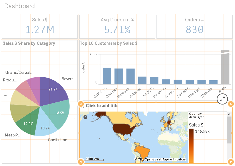
- Now, click on the title of the object and type Sales $ by Country.
- Click on the Done button to enter the visualization mode. The sheet will look like this, but it will vary according to your screen resolution:

Creating the analysis sheet
While the dashboard sheet shows information on several topics for a quick overview, the analysis sheet focuses on a single topic for data exploration. We will create the analysis sheet with the following visualizations:
- A filter panel, with the dimensions: OrderYear, OrderMonth, Country, Customer, Category, and Product
- KPI Sales $
- KPI Avg Discount %
- A combo chart for Pareto (80/20) analysis by customer
- A table with customer data
Let’s start with creating a new sheet with the name Customer Analysis:
- Click on the Sheet selection button at the top-right of the screen to open the sheet overview panel.
- Click on the Create new sheet button and set the title of the sheet to Customer Analysis.
- To finish this example, click on the sheet icon to save the title, and open the sheet to start creating visualizations.
Adding a filter pane with main dimensions
We will now build the customer analysis sheet by adding a filter pane by following these steps:
- Click on the Edit button to enter the edit mode.
- Click on the Charts button on the asset panel and drag and drop Filter pane into the empty space on the sheet:

- Click on the Add dimension button and select Order Year in the Dimensions section:

- Since we need to add more dimensions to our Filter pane, click on the Add dimension button in the properties on the right-hand side of the screen, and select Order Month in the Dimensions section.
- Repeat the previous step to add the Country, Customer, Category, and Product dimensions.
- The Filter pane will look like what’s shown in the following screenshot:

- Now, resize the width of the filter panel to fit three columns of the grid:

We also need to add the Filter pane as a master visualization, which is to be reused across the analysis and reporting sheets that we will create next:
- Right-click on the filter pane and select Add to master items:
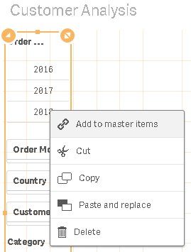
- Set the name of the master item to Default Filter and the description to A filter pane to be reused across sheets:

- Click on the Add button:

Adding KPI visualizations
To add the KPIs of Sales $ and Avg Discount % to the sheet, we have two options. The first option is to add the KPI visualizations to the Master items library, and add them to the new sheet:
- Go to the dashboard sheet.
- Add the KPI visualizations of Sales $ and Avg Discount % to the Master item.
- Name them KPI Sales $ and KPI Avg Discount %, respectively.
- From the visualization section in the Master items library, simply drag and drop each of the KPIs into the top end of the sheet.
The second option is to copy and paste the KPI visualizations between sheets:
- Go to the dashboard sheet.
- Select the KPI visualization for Sales $.
- Press Ctrl + C or right-click on the visualization object and select Copy in the context menu.
- Go back to the Customer Analysis sheet.
- Press Ctrl + V or right-click in the empty area of the sheet and select Paste in the context menu.
- Repeat the same steps for KPI Avg Discount %.
The sheet editor will look like this:

Creating a combo chart for Pareto (80/20) analysis
A Pareto analysis helps us to identify which groups of customers contribute to the first 80% of our sales. To create a Pareto analysis, we will use a combo chart as it allows us to combine metrics with different shapes such as bars, lines, and symbols.
We will represent the data in two axes; the primary axis is found at the left-hand side of the chart, and the secondary axis is found at the right-hand side of the chart. In our example, the chart has a bar for Sales $ in the primary axis, as well as two lines: one for the Cumulative % of sales, and the other as static, with 80% in the secondary axis.
In the following screenshot, you can see the highlighted customers contributing to the first 80% of the sales:

To create the Pareto analysis chart, follow these steps:
- Click on the Charts button on the asset panel and find the Combo chart.
- Drag and drop the Combo chart into the empty space at the right-hand side of the sheet.
- Click on Add Dimension and select Customer in the Dimension section.
- Click on Add Measure and select Sales $ in the Measures section.
- The combo chart will look like this:

- We need to add two other measures, represented by lines. The first is the cumulative percentage of sales, and the second is the reference line at 80%. To add the cumulative sales line, go to the properties panel, expand the Data section, and click on the Add button in Measures:

- Click on the fx button to open the expression editor:

- Type the following expression in the expression editor to calculate a cumulative ratio of the sales for each customer, over the whole amount of the sales of all customers:
RangeSum(Above(Sum(SalesAmount), 0, RowNo())) / Sum(total SalesAmount)
- Click on the Apply button to close the expression editor and save the expression.
- Set the Label of the new measure to Cumulative Sales %.
- Check if the properties Line and Secondary axis are selected for the measure:

- Change the number formatting to Number, set the formatting option to Simple, and select 12.3%.
- Now, find the Add button in the Measure pane to add another measure: the reference line for 80%.
- Open the Expression editor, type 0.8, and click on the Apply button.
- Set the Label to 80%.
- Check if the properties Line is selected and that the Secondary axis is selected for the measure:

We also need to fix the sort order into a descending fashion, by Sales $:
- Go to the properties panel and expand the Sorting section.
- Click on Customer to expand the Sorting configuration for the dimension.
- Switch off the Auto sorting.
- Click on the checkbox for Sort by expression to select the option.
- Open the Expression editor and type sum(SalesAmount).
- Click on Apply to close the expression editor and apply the changes.
- Set the Title of the chart to Pareto Analysis.
- Change the sorting order to Descending.
- Deselect other sorting options if they are selected. The Sorting pane will look like this:

- Finally, the combo chart will look like this:

Creating a reporting sheet
Reporting sheets allow the user to see the data in a more granular form. This type of sheet provides information that allows the user to take action at an operational level.
We will start this example by creating a new sheet with the name Reporting:
- Click on the Sheet selection button at the top-right of the screen to open the sheet overview panel
- Click on the Create new sheet button and set the Title of the sheet to Product Analysis
- Click on the sheet icon to save the title, open the sheet to start creating visualizations, and enter the edit mode
Adding a default filter pane
We will start to build the reporting sheet by adding the default filter pane that has already been added to the Master items library:
- Click on the Edit button to enter the edit mode.
- Click on the Master items button on the asset panel and find Default filter in the Visualization section.
- Click on Default filter pane and drag and drop it into the empty space at the top of the sheet.
- Resize the height of the filter pane to fit one row of the grid. The sheet will then look like this:

Next, we will add the table chart to the sheet, as follows:
- Click on the Charts button on the asset panel and find the Table visualization.
- Click on Table and drag and drop it into the empty space at the center of the sheet.
- Click on the Add dimension button and select OrderID from the Field list.
- Click on Add measure and select Sales $ from the Dimensions list.
- Click on the Master items button on the asset panel, which is on the left-hand side of the screen, and click the Dimensions heading to expand it. We will then add more dimensions.
- Drag and drop the Customer dimension on the table.
- Select Add “Customer” from the floating menu.
- Repeat the process, using the drag and drop feature to add Country, Category, Product, EmployeesFirstName to the table.
- Click on the Measures heading in Master items to expand it.
- Drag and drop the Avg Discount % and Quantity # measures onto the table.
- Select Add in the floating menu for each of the selected measure.
- Click on the Fields button on the asset panel, which is on the left-hand side of the screen.
- Find the OrderID field in the list.
- Drag and drop the OrderID field onto the table.
- Select Add OrderID from the floating menu.
- Repeat the same steps to add the OrderDate field to the table.
The table will look like this:

In this article, we saw how to create a Qlik Sense application using the DAR methodology, which will help you to explore and analyze an application’s information.
If you found this post useful, do check out the book, Hands-On Business Intelligence with Qlik Sense. This book teaches you how to create dynamic dashboards to bring interactive data visualization to your enterprise using Qlik Sense.
Read Next
Best practices for deploying self-service BI with Qlik Sense
Four self-service business intelligence user types in Qlik Sense
How Qlik Sense is driving self-service Business Intelligence