


Autoencoders, which are one of the important generative model types have some interesting properties which can be exploited for applications like detecting credit card fraud. In this article, we will use Autoencoders for detecting credit card fraud.
This is an excerpt from the book Machine Learning for Finance written by Jannes Klaas. This book introduces the study of machine learning and deep learning algorithms for financial practitioners.
We will use a new dataset, which contains records of actual credit card transactions with anonymized features. The dataset does not lend itself to much feature engineering. We will have to rely on end-to-end learning methods to build a good fraud detector.
You can find the dataset here. And the notebook with an implementation of an autoencoder and variational autoencoder here.
Loading data from the dataset
As usual, we first load the data. The time feature shows the absolute time of the transaction which makes it a bit hard to deal with here. So we will just drop it.
df = pd.read_csv('../input/creditcard.csv')

df = df.drop('Time',axis=1)
We separate the X data on the transaction from the classification of the transaction and extract the numpy array that underlies the pandas dataframe.
X = df.drop('Class',axis=1).values

y = df['Class'].values
Feature scaling
Now we need to scale the features. Feature scaling makes it easier for our model to learn a good representation of the data. For feature scaling, we scale all features to be in between zero and one. This ensures that there are no very high or very low values in the dataset. But beware, that this method is susceptible to outliers influencing the result. For each column, we first subtract the minimum value, so that the new minimum value becomes zero. We then divide by the maximum value so that the new maximum value becomes one. By specifying axis=0 we perform the scaling column wise.
X -= X.min(axis=0)

X /= X.max(axis=0)
Finally, we split our data:
from sklearn.model_selection import train_test_split

X_train, X_test, y_train,y_test = train_test_split(X,y,test_size=0.1)
The input for our encoder now has 29 dimensions, which we compress down to 12 dimensions before aiming to restore the original 29-dimensional output.
from keras.models import Model

from keras.layers import Input, Dense
You will notice that we are using the sigmoid activation function in the end. This is only possible because we scaled the data to have values between zero and one. We are also using a tanh activation of the encoded layer. This is just a style choice that worked well in experiments and ensures that encoded values are all between minus one and one. You might use different activations functions depending on your need. If you are working with images or deeper networks, a relu activation is usually a good choice. If you are working with a more shallow network as we are doing here, a tanh activation often works well.
data_in = Input(shape=(29,))

encoded = Dense(12,activation='tanh')(data_in)

decoded = Dense(29,activation='sigmoid')(encoded)

autoencoder = Model(data_in,decoded)
We use a mean squared error loss. This is a bit of an unusual choice at first, using a sigmoid activation with a mean squared error loss, yet it makes sense. Most people think that sigmoid activations have to be used with a cross-entropy loss. But cross-entropy loss encourages values to be either zero or one and works well for classification tasks where this is the case. But in our credit card example, most values will be around 0.5. Mean squared error is better at dealing with values where the target is not binary, but on a spectrum.
autoencoder.compile(optimizer='adam',loss='mean_squared_error')After training, the autoencoder converges to a low loss.
autoencoder.fit(X_train, X_train, epochs = 20, batch_size=128,
validation_data=(X_test,X_test))
The reconstruction loss is low, but how do we know if our autoencoder is doing good? Once again, visual inspection to the rescue. Humans are very good at judging things visually, but not very good at judging abstract numbers.
We will first make some predictions, in which we run a subset of our test set through the autoencoder.
pred = autoencoder.predict(X_test[0:10])We can then plot individual samples. The code below produces an overlaid bar-chart comparing the original transaction data with the reconstructed transaction data.
import matplotlib.pyplot as pltimport numpy as np
width = 0.8
prediction = pred[9]
true_value = X_test[9]
indices = np.arange(len(prediction))
fig = plt.figure(figsize=(10,7))
plt.bar(indices, prediction, width=width,
color='b', label='Predicted Value')
plt.bar([i+0.25*width for i in indices], true_value,
width=0.5*width, color='r', alpha=0.5, label='True Value')
plt.xticks(indices+width/2.,
['V{}'.format(i) for i in range(len(prediction))] )
plt.legend()
plt.show()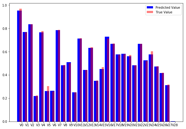
Autoencoder reconstruction vs original data.
As you can see, our model does a fine job at reconstructing the original values. The visual inspection gives more insight than the abstract number.
Visualizing latent spaces with t-SNE
We now have a neural network that takes in a credit card transaction and outputs a credit card transaction that looks more or less the same. But that is of course not why we built the autoencoder. The main advantage of an autoencoder is that we can now encode the transaction into a lower dimensional representation which captures the main elements of the transaction. To create the encoder model, all we have to do is to define a new Keras model, that maps from the input to the encoded state:
encoder = Model(data_in,encoded)Note that you don’t need to train this model again. The layers keep the weights from the autoencoder which we have trained before.
To encode our data, we now use the encoder model:
enc = encoder.predict(X_test)But how would we know if these encodings contain any meaningful information about fraud? Once again, the visual representation is key. While our encodings are lower dimensional than the input data, they still have twelve dimensions. It is impossible for humans to think about 12-dimensional space, so we need to draw our encodings in a lower dimensional space while still preserving the characteristics we care about.
In our case, the characteristic we care about is proximity. We want points that are close to each other in the 12-dimensional space to be close to each other in the two-dimensional plot. More precisely, we care about the neighborhood, we want that the points that are closest to each other in the high dimensional space are also closest to each other in the low dimensional space.
Preserving neighborhood is relevant because we want to find clusters of fraud. If we find that fraudulent transactions form a cluster in our high dimensional encodings, we can use a simple check for if a new transaction falls into the fraud cluster to flag a transaction as fraudulent.
A popular method to project high dimensional data into low dimensional plots while preserving neighborhoods is called t-distributed stochastic neighbor embedding, or t-SNE.
In a nutshell, t-SNE aims to faithfully represent the probability that two points are neighbors in a random sample of all points. That is, it tries to find a low dimensional representation of the data in which points in a random sample have the same probability of being closest neighbors than in the high dimensional data.
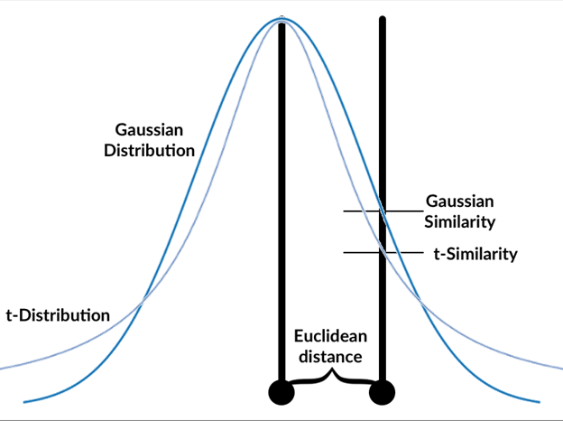
How t-SNE measures similarity
The t-SNE algorithm follows these steps:
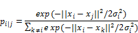
- Calculate the gaussian similarity between all points. This is done by calculating the Euclidean (spatial) distance between points and then calculate the value of a Gaussian curve at that distance, see graphics. The gaussian similarity for all points from the point can be calculated as:
- Where ‘sigma‘ is the variance of the Gaussian distribution? We will look at how to determine this variance later. Note that since the similarity between points i and j is scaled by the sum of distances between and all other points (expressed as k), the similarity between i, j, p i|j, can be different than the similarity between j and i, p j|i . Therefore, we average the two similarities to gain the final similarity which we work with going forward, where n is the number of data points.

- Randomly position the data points in the lower dimensional space.
- Calculate the t-similarity between all points in the lower dimensional space.
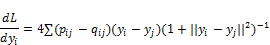
- Just like in training neural networks, we will optimize the positions of the data points in the lower dimensional space by following the gradient of a loss function. The loss function, in this case, is the Kullback–Leibler (KL) divergence between the similarities in the higher and lower dimensional space. We will give the KL divergence a closer look in the section on variational autoencoders. For now, just think of it as a way to measure the difference between two distributions. The derivative of the loss function with respect to the position yi of a data point i in the lower dimensional space is:
- Adjust the data points in the lower dimensional space by using gradient descent. Moving points that were close in the high dimensional data closer together and moving points that were further away further from each other.
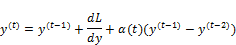
You will recognize this as a form of gradient descent with momentum, as the previous gradient is incorporated into the position update.
The t-distribution used always has one degree of freedom. The choice of one degree of freedom leads to a simpler formula as well as some nice numerical properties that lead to faster computation and more useful charts.
The standard deviation of the Gaussian distribution can be influenced by the user with a perplexity hyperparameter. Perplexity can be interpreted as the number of neighbors we expect a point to have. A low perplexity value emphasizes local proximities while a large perplexity value emphasizes global perplexity values. Mathematically, perplexity can be calculated as:
![]()
Where Pi is a probability distribution over the position of all data points in the dataset and H(Pi) is the Shannon entropy of this distribution calculated as:
![]()
While the details of this formula are not very relevant to using t-SNE, it is important to know that t-SNE performs a search over values of the standard deviation ‘sigma‘ so that it finds a global distribution Pi for which the entropy over our data is our desired perplexity. In other words, you need to specify the perplexity by hand, but what that perplexity means for your dataset also depends on the dataset.
Van Maarten and Hinton, the inventors of t-SNE, report that the algorithm is relatively robust to choices of perplexity between five and 50. The default value in most libraries is 30, which is a fine value for most datasets. If you find that your visualizations are not satisfactory, tuning the perplexity value is probably the first thing you want to do.
For all the math involved, using t-SNE is surprisingly simple. scikit-learn has a handy t-SNE implementation which we can use just like any algorithm in scikit. We first import the TSNE class. Then we create a new TSNE instance. We define that we want to train for 5000 epochs, use the default perplexity of 30 and the default learning rate of 200. We also specify that we would like output during the training process. We then just call fit_transform which transforms our 12-dimensional encodings into two-dimensional projections.
from sklearn.manifold import TSNE

tsne = TSNE(verbose=1,n_iter=5000)

res = tsne.fit_transform(enc)
As a word of warning, t-SNE is quite slow as it needs to compute the distances between all the points. By default, sklearn uses a faster version of t-SNE called Barnes Hut approximation, which is not as precise but significantly faster already.
There is a faster python implementation of t-SNE which can be used as a drop in replacement of sklearn’s implementation. It is not as well documented however and has fewer features. You can find a faster implementation with installation instructions here.
We can plot our t-SNE results as a scatter plot. For illustration, we will distinguish frauds from non-frauds by color, with frauds being plotted in red and non-frauds being plotted in blue. Since the actual values of t-SNE do not matter as much we will hide the axis.
fig = plt.figure(figsize=(10,7))

scatter =plt.scatter(res[:,0],res[:,1],c=y_test, cmap='coolwarm', s=0.6)

scatter.axes.get_xaxis().set_visible(False)

scatter.axes.get_yaxis().set_visible(False)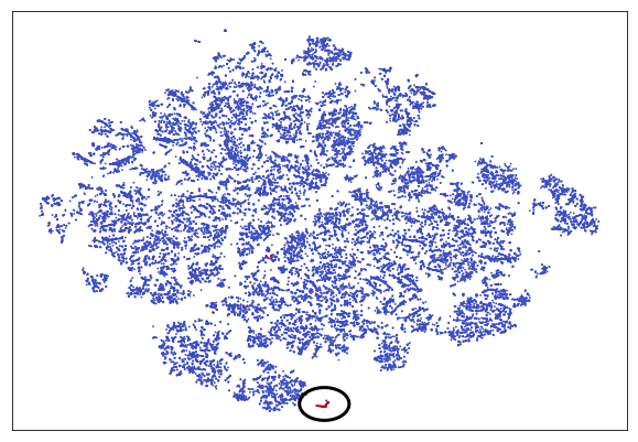
Credit Auto TSNE
For easier spotting, the cluster containing most frauds is marked with a circle. You can see that the frauds nicely separate from the rest of the transactions. Clearly, our autoencoder has found a way to distinguish frauds from the genuine transaction without being given labels. This is a form of unsupervised learning. In fact, plain autoencoders perform an approximation of PCA, which is useful for unsupervised learning. In the chart, you can see a few more clusters which are clearly separate from the other transactions but which are not frauds. Using autoencoders and unsupervised learning it is possible to separate and group our data in ways we did not even think about as much before.
Summary
In this article, we have learned about one of the most important types of generative models: Autoencoders. We used the autoencoders for credit card fraud.
Read Next
Implementing Autoencoders using H2O
What are generative adversarial networks (GANs) and how do they work? [Video]


