


Let’s talk about fonts for a bit. When you’re working on a site, how much time do you actually spend on them? Probably not too long, why bother about something like letters when you’ve got to make sure your work is perfectly responsive after all?
Fonts are actually pretty essential and aren’t really given enough credit in how important they are for people; after all, would you use Comic Sans on a business site? Of course not. The wrong font can reduce readability, put customers off, and generally gives your site an unprofessional look up there with a garish color scheme. You want to avoid it at all costs.
A quick search online shows us there are around 200,000 different fonts available for download. That’s a lot to choose from – way too many when you think about it, can you think of 200,000 different situations where a different font is absolutely needed? Where do you even begin?!
To help you out and give you a bit of a fighting chance in this article I’ll take you through the very basics of typography and hopefully get you thinking about fonts so you can start looking at it in more detail – constantly use Times New Roman? Here’s where to get moving away from that!
Types of Fonts
With 200,000 fonts you’re going to have a hard time collecting them into strict classifications, but it’s generally agreed that there are 4 key groups most can fit into; Serif, Sans-Serif, Script, and Decorative.
There’re a few more groups we could touch upon like Blackletter (Think stereotypical Ye Olde Butcherede Englishe) and Calligraphic (Which are partially connected to, but distinct enough from Script to be classed on its own) but these aren’t used as much anymore and are more of a novelty these days.
Now, let’s look at each of the 4 in turn briefly and see what makes them up, when to use them, and more importantly, when not to.
Serif Fonts
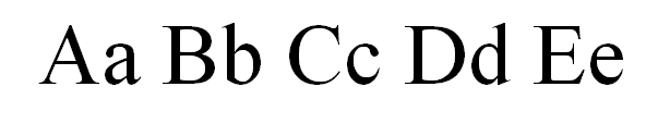
Times New Roman
“Serifs” are the small lines attached to the end of each stroke in letters and symbols; some people refer to them as “feet”. This font family is very much the ur-example, first used in stone inscriptions as far back as Roman times. The style of a Serif font feels incredibly formal with a lot of impact when used correctly; as such they’re better for business projects or for something that will be read in print. Classic examples of a Serif font are Times New Roman, Garamond, and Centaur.
As they were designed to be used in the physical world the transition to computers has created as few problems specific to Serif fonts. Most of these problems stem from the actual serifs themselves – as the amount of pixels per inch on a screen is around 100 Serifs can appear too large, too small, or just disappear which makes reading them a hassle to some people depending on the type of device they use. If you really want to use a Serif font online then try to use some of the more modern variations – Georgia was specifically designed to get around these limitations and look good on low resolution screens for example!
Sans-Serif Fonts
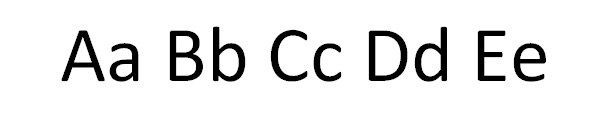
Calibri (Body)
If Serif fonts are known by having feet attached to every stroke then San-Serifs are the opposite; lacking any sort of feet at all, this gives them an informal and clear feel.
Sans-Serif is currently the most popular font choice on the internet, and it’s easy to see why. Sans do not have to worry about the problems Serif fonts face with computers and so can be seen easily on any screen regardless of resolution or type. It’s also really helpful when designing advertisements, as it can easily be read in small sizes from a long distance compared to the rest. This; combined with their informal feel means that they suit many sites without too much effort.
Everyone’s favorite font Comic Sans is an example of Sans-Serif, so now you know why everyone loves to use it so much! For a font that doesn’t evoke pure rage whenever someone sees it though, try the classic Arial, Helvetica, or Verdana for your responsive projects.
The only real problem with Sans-Serif is that, as far as font types go, it’s very much the “Master of None” style. Don’t be afraid to use them all over the place, but when looking to create some impact you might want to try pairing a body of Sans-Serif with a Serif as a header to create a tasteful contrast!
Script Fonts
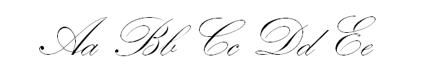
Kunstler Script
Script fonts are designed to look like cursive handwriting. If you picture in your mind a handwritten invitation then you’ve probably got a good idea about what to expect. The golden rule to using Script fonts is usually “don’t” because they’re so incredibly difficult to read; ever struggled to understand someone else’s handwriting? That’s exactly what Script fonts are like most of the time.
There is, however, at least one place you can use them if the planets align right – the title. If the brand’s character calls for it then they can be effective; they add a touch of class when used sparingly… but when used incorrectly they can make a mess of your work. If you really want to give them a try have a look at Blackadder ITC or Lucida Handwriting.
Decorative Fonts
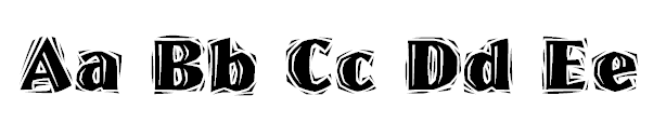
Westwood LET
The most diverse category by far, as there is very little that really interlinks each one together. A lecturer I once knew referred to them as “WordArt for professionals” and that’s a pretty apt way to describe their use – adverts, announcements, posters, and billboards. They can range from cheesy cloud shaped letters to graffiti inspired words.
Never use Decorative fonts for main bodies of texts. The less they’re used the better to ensure they keep the impact they offer on the page. Unless you’re working on something with a theme like a circus, Art Nouveau inspired, or a website aimed at children you’re probably best off avoiding them all together really.
Want to try one? Stencil is available on most word processors and gives a good idea for you to get what this style is all about.
Things to Keep in Mind
So we have our 4 font types, but can we use them all in one project? Of course not! Here are a few tips to keep in mind now you know the difference between each type of font:
- Only use 2-3 types of font per project. Treat your fonts like a hierarchy, with the main choice being complimented by the others.
- Never change font mid-sentence or paragraph. Ever.
- When combining Serif and Sans-Serif use Serif as the heading and Sans for the main text.
- Try to avoid combining fonts that look too similar. If you squint and can’t tell much difference then it’s better to change one to make them stand out more.
- Context is important; a font that doesn’t fit your work is like suddenly TYPING IN ALL CAPS FOR NO REASON.
Another thing to keep in mind is that while fonts can have a huge impact on the feel of your work they’re only one part of a whole. Don’t slack off with the rest of your design too! While you’re here, why not grab the second edition of our fan favourite Responsive Web Design with HTML5 and CSS3? It lives up to the hype and then some! Already got it? Well, there’s a few other titles at the bottom on this page for you to browse too!
Where to Next?
So there we go; an overview of the 4 main font types and their uses. Hopefully you got something out of that and are interested in finding out more. I may come back to this topic one day, but for now I’d recommend moving out of your comfort zone and start testing out different fonts with your own eyes. If you’re looking for something specific to look into, then why not looking into what certain fonts can do to drawn readers to certain sections, or even how they can be used to subliminally influence emotions? A strategic font choice is just as effective as any design decision in that regard!
Or you can do what I do, and just start using Helvetica. Helvetica’s great.