


In this article by Pablo Perea and Pau Giner, authors of the book UX Design for Mobile, we will cover how to use different techniques that can be applied according to the needs of the project and the how to obtain the information that we want.
(For more resources related to this topic, see here.)
Tree Test
This is also called reverse card sorting. This is a method where the participants try to find elements in a given structure. The objective of this method is to discover findability problems and improve the organization and labeling system.
The organization structure used should represent a realistic navigation for the application or web page you are evaluating. If you don’t have one by the time the experiment is taking place, try to create a real scenario, as using a fake organization will not lead to really valuable results.
There are some platforms available to perform this type of experiment with a computer. One example is https://www.optimalworkshop.com.
This can have several advantages: the experiment can be carried out without requiring a physical displacement by the participant, and you can also study the participant steps and not just analyze whether the participant succeeded or not. It can be that the participants found the objectives but had to make many attempts to achieve them.
The method steps
- Create the structure: Type or create the navigation structure with all the different levels you want to evaluate.
- Create a set of findability tasks: Think about different items that the participant should find or give a location in the given structure.
- Test with participants: The participant will receive a set of tasks to do. The following are some examples of possible tasks:
- Find some different products to buy
- Contact the customer support
- Get the shipping rates
- The results: At the end, we should have a success rate for each of the tasks. Tasks such as finding products in a store must be done several times with products located in different sections. This will help us classify our assortment and show us how to organize the first levels of the structure better.
How to improve the organization
Once we find the main weak points and workarounds we have in our structure, we can create alternative structures to retest and try to find better results. We can repeat this process several times until we get the desired results.
The Information Architecture is the science field of organizing and labeling content in a web page to support usability and findability. There’s a growing community of Information architecture specialists that supports the Information architecture Institute–https://en.wikipedia.org/wiki/Information_architecture.
There are some general lines of work in which we have to invest time in order to improve our Information architecture.
Content organization
The content can be ordered by following different schemes, in the same way that a supermarket orders products according to different criteria. We should try to find the one that better fits our user needs. We can order the content, dividing it into groups according to nature, goals, audience, chronological entry, and so on. Each of these approaches will lead to different results and each will work better with different kinds of users.
In the case of mobile applications, it is common to have certain sections where they mix contents of a different nature, for instance, integrating messages for the user in the contents of the activity view. However, an abuse of these types of techniques can lead to turning the section into a confusing area for the user.
Areas naming
There are words that have a completely different meaning for one person to another, especially if those people are thinking in different fields when they use our solution. Understanding our user needs, and how the think and speak, will help us provide clear names for sections and subsections. For example, the word pool will represent a different set of products for a person looking for summer products than for a person looking for games.
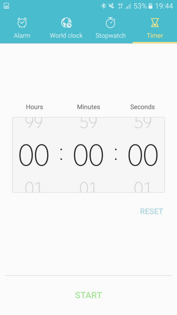
In the case of applications, we will have to find a balance between simplicity and clarity. If space permits, adding a label along with the icon will clarify and reduce the possible ambiguities that may be encountered in recognizing the meaning of these graphic representations. In the case of mobiles, where space is really small, we can find some universal icons, but we must test with users to ensure that they interpret them properly.
In the following examples, you can find two different approaches. In the Gmail app, attachment and send are known icons and can work without a label. We find a very different scenario in the Samsung Clock app, where it would be really difficult to differentiate between the Alarm, the Stopwatch, and the Timer without labels:
The working memory limit
The way the information is displayed to the user can drastically change the ease with which it is understood. When we talk about mobiles, where space is very limited, limiting the number of options and providing a navigation adapted to small spaces can help our user have a more satisfactory experience.
As you probably know, the human working memory is not limitless, and it is commonly supposed to be limited to remembering a maximum of seven elements (https://en.wikipedia.org/wiki/The_Magical_Number_Seven,_Plus_or_Minus_Two). Some authors such as Nelson Cowan suggested that the number of elements an adult can remember while performing a task is even lower, and gives the number of reference as four (https://en.wikipedia.org/wiki/Working_memory). This means that your users will understand the information you give them better if you block it into groups according to their limitations.
Once we create a new structure, we can evaluate the efficiency of this new structure versus the last version. With small improvements, we will be able to increase the user engagement. Another way to learn about how the user understands the organization of our app or web is by testing a competitor product. This is one of the cheapest ways to have a quick prototype. Evaluate as many versions as you can; in each review, you will find new ideas to organize and show the content of your application or web app better.
Surveys
Surveys allow us to gather information from lots of participants without too much effort. Sometimes, we need information from a big group of people, and interviewing them one by one will not be affordable. Instead of that, surveys can quickly provide answers from lots of participants and analyze the results with bulk methods.
It is not the purpose of this book to deal in depth with the field of questionnaires since there are books devoted entirely to this subject. Nevertheless, we will give some brushstrokes on the subject since they are commonly used to gather information in both web pages and mobile applications.
Creating proper questions is a key part of the process that will reduce the noise and help the participants provide useful answers. Some questions will require more effort to analyze, but they will give us answers with deeper level of detail. Questions with pre-established answers are usually easier to automatize, and we can get results in less time.
What we want to discover?
The first thing to do is to define the objective for which we are making a survey. Working with a clear objective will help the process be focused and will get better results. Plan carefully and determine the information that you really need at that moment.
We should avoid surveys with lots of questions that do not have a clear purpose.
They will produce poor outcome and result in meaningless exercises for the participants. On the contrary, if we have a general leitmotiv for the questionnaire, it will also help the participants understand how the effort of completing the survey will help the company, and therefore it will give clear value to the time expended.
You can plan your survey according to different planning approaches, your questions can be focussed on short and long term goals:
- Long-term planning: Understanding your users expectations and their view about your product in the long term will help plan the evolution of your application and help create new features that match their needs. For example, imagine that you are designing a music application, and you are unsure about focusing on mass majority music or maybe giving more visibility to amateur groups. Creating a long-term survey can help you understand what your users want to find in your platform and plan changes that match the conclusions extracted from the survey analysis.
- Short-term planning: This is usually related to operational actions. The objective with these kind of surveys is to gather information for taking actions later with a defined mission. These kind of surveys are useful when we need to choose between two options, that is, whether we are deciding to make a change in our platform or not. For example, it can help to decide what type of information is most important for the user when choosing between one group and another, so we can make that information more visible. We will take better decisions by understanding the main aspects our users will expect to find in our platform.
Find the participants
Depending on the goal of the survey, we can use a wider range of participants or reduce their number, filtering by their demographics, experience, or the relationship with our brand or products.
If the goal is to expand our number of users, it may be interesting to expand the search range to participants outside our current set of users. Looking for new niches and interesting features for our potential users can make new users try out our application. If, on the contrary, our objective is to keep our current users loyal, it can be a great source of improvement to consult them about their preferences and their opinions about the things that work properly in our application. This data, along with the data of use and navigation, will let us see areas for improvement, and we will be able to solve problems of navigation and usability.
Determining the questions
We can ask different types of questions; depending on the type, we will get more or less detailed answers. If we choose the right type, we can save analysis effort, or we can reduce the number of participants when we require a deep analysis of each response.
It is common to include questions at the beginning of the questionnaires in order to classify the results. They are usually called filtering or screening questions, and they will allow us to analyze the answers based on data such as age, gender, or technical skills. These questions have the objective of knowing the person answering the survey.
If we know the person solving the questionnaire, we will be able to determine whether the answers given by this user are useful for our goals or not. We can add questions about the experience the participant has with general technology, or with our app, and about the relation with the brand.
We can create two kinds of questions based on the type of answers the participant can provide; each of them, therefore, will lead to different results.
Open-answer questions
The objective of this type of questions is to know more about the participant without guiding the answers. We will try to ask objectively for a subject without providing possible answers. The participant will answer these type of questions with open-ended answers, so it will be easier to know more about how that participant thinks and which aspects are proving more or less satisfactory.
While the advantage of this kind of questions is that you will gain a lot of insights and new ideas, the con is the cost of managing big amounts of data. So, these type of questions will be more useful when the number of participants is reduced.
Here are some examples of open-answer questions:
- How often have you been using our customer service?
- How was your last purchase experience on our platform?
Questions with pre-established answers
These type of questions facilitate the analysis when the number of participants is high. We will create questions with a clear objective and give different options to respond. Participants will be able to choose one of the options in response. The analysis of these types of questions can be automated and therefore is faster, but it will not give us as detailed information as an open question, in which the participant can expose all his ideas about the matter in the question.
The following is an example of a question with pre-established answers:
- Questions: How many times have you used our application in the last week?
Answers:
1) More than five times
2) Two to Five
3) Once
4) None
Another great advantage is the facility to answer these types of questions when the participant does not have much time or interest to respond. In environments such as mobile phones, typing long answers can be costly and frustrating. With these types of questions, we can offer answers that the user can select with a single click. This can help increase the number of participants completing the form.
It is common to mix both the types of questions. Open-answer questions where the user can respond in more detail can be included as optional questions. The participants willing to share more information can use these fields to introduce more detailed answers. This way, we can make a quicker analysis on the questions with pre-established answers and analyze the questions that require more precise revision later.
Humanize the forms
When we create a form, we must think about the person who will answer it. Almost no one likes to fill in questionnaires, especially if they are long and complex.
To make our participants feel comfortable filling out all the answers on our form, we have to try to treat the process as a human relationship:
- The first thing we should do is to explain the reason of our form. If our participants understand how their answers will be used in the project, and how they can help us achieve the goal, they will feel more encouraged to answer the questions and take their role seriously.
- Ask only what is strictly necessary for the purpose you have set for it. We must prevent different departments from introducing questions without a common goal. If the form will answer concerns of different departments, all of them should have the same goal. This way, the form will have more cohesion.
- The tone used on the form should be friendly and clear. We should not go beyond the limits of indiscretion with our questions, or the participant may feel overwhelmed, especially if the participants of our study are not users of our application or our services, we must treat them as unknown. Being respectful and kind is a key point in getting high participation.
Summary
In the article we saw how to apply Tree Test and how to conduct surveys to gain information that you want.
Resources for Article:
Further resources on this subject:
- Trends UX Design [article]
- Building Mobile Apps [article]
- Auditing Mobile Applications [article]


