(For more resources related to this topic, see here.)
Data visualization is a field that is constantly evolving. However, some concepts have proven their value time and again through the years and have become what we call best practices. These notions should not be seen as strict rules that must be applied without any further consideration but as a series of tips that will help you create better applications.
If you are a beginner, try to stick to them as much as you can. These best practices will save you a lot of trouble and will greatly enhance your first endeavors. On the other hand, if you are an advanced developer, combine them with your personal experiences in order to build the ultimate dashboard.
Some guidelines in this article come from the widely known characters in the field of data visualization, such as Stephen Few, Edward Tufte, John Tukey, Alberto Cairo, and Nathan Yau. So, if a concept strikes your attention, I strongly recommend you to read more about it in their books.
Throughout this article, we will review some useful recommendations that will help you create not only engaging, but also effective and user-friendly dashboards. Remember that they may apply differently depending on the information displayed and the audience you are working with. Nevertheless, they are great guidelines to the field of data visualization, so do not hesitate to consider them in all of your developments.
Gestalt principles
In the early 1900s, the Gestalt school of psychology conducted a series of studies on human perception in order to understand how our brain interprets forms and recognizes patterns. Understanding these principles may help you create a better structure for your dashboard and make your charts easier to interpret:
Proximity: When we see multiple elements located near one another, we tend to see them as groups. For example, we can visually distinguish clusters in a scatter plot by grouping the dots according to their position.
Similarity: Our brain associates the elements that are similar to each other (in terms of shape, size, color, or orientation). For example, in color-coded bar charts, we can associate the bars that share the same color even if they are not grouped.
Enclosure: If a border surrounds a series of objects, we perceive them as part of a group. For example, if a scatter plot has reference lines that wrap the elements between 20 and 30 percent, we will automatically see them as a cluster.
Closure: When we detect a figure that looks incomplete, we tend to perceive it as a closed structure. For example, even if we discard the borders of a bar chart, the axes will form a region that our brain will isolate without needing the extra lines.
Continuity: If a number of objects are aligned, we will perceive them as a continuous body. For example, the different blocks of code when you indent QlikView script are percieved as one continuous code.
Connection: If objects are connected by a line, we will see them as a group. For example, we tend to associate the dots connected by lines on a scatter plot with lines and symbols.
Giving context to the data
When it comes to analyzing data, context is everything. If you present isolated figures, the users will have a hard time trying to find the story hidden behind them. For example, if I told you that the gross margin of our company was 16.5 percent during the first quarter of 2015, would you evaluate it as a positive or negative sign? This is pretty difficult, right?
However, what if we added some extra information to complement this KPI? Then, the following image would make a lot more sense:
As you can see, adding context to the data can make the landscape look quite different. Now, it is easy to see that even though the gross margin has substantially improved during the last year, our company has some work to do in order to be competitive and surpass the industry standard.
The appropriate references may change depending on the KPI you are dealing with and the goals of the organization, but some common examples are as follows:
Last year's performance
The quota, budget, or objective
Comparison with the closest competitor, product, or employee
The market share
The industry standards
Another good tip in this regard is to anticipate the comparisons. If you display figures regarding the monthly quota and the actual sales, you can save the users the mental calculations by including complementary indicators, such as the gap between them and the percentage of completion.
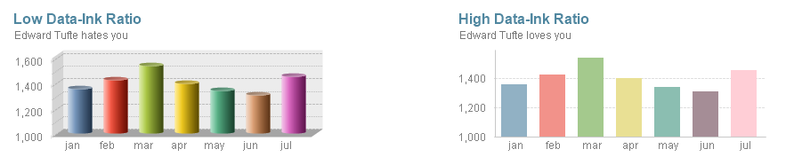
Data-Ink Ratio
One of the most interesting principles in the field of data visualization is Data-Ink Ratio, introduced by Edward R. Tufte in his book, The Visual Display of Quantitative Information, which must be read by every designer. In this publication, he states that there are two different types of ink (or in our case, pixels) in any chart, as follows:
Data-ink: This includes all the nonerasable portions of graphic that are used to represent the actual data. These pixels are at the core of the visualization and cannot be removed without losing some of its content.
Non-data-ink: This includes any element that is not directly related to the data or doesn't convey anything meaningful to the reader.
Based on these concepts, he defined the Data Ink Ratio as the proportion of the graphic's ink that is devoted to the nonredundant display of data information:
Data Ink Ratio = Data Ink / Total Ink
As you can imagine, our goal is to maximize this number by decreasing the non-data-ink used in our dashboards. For example, the chart to the left has a low data-ink ratio due to the usage of 3D effects, shadows, backgrounds, and multiple grid lines. On the contrary, the chart to the right presents a higher ratio as most of the pixels are data-related.
Avoiding chart junk
Chart junk is another term coined by Tufte that refers to all the elements that distract the viewer from the actual information in a graphic. Evidently, chart junk is considered as non-data-ink and comprises of features such as heavy gridlines, frames, redundant labels, ornamental axes, backgrounds, overly complex fonts, shadows, images, or other effects included only as decoration. Take for instance the following charts:
Unlock access to the largest independent learning library in Tech for FREE!
Get unlimited access to 7500+ expert-authored eBooks and video courses covering every tech area you can think of.
Renews at $19.99/month. Cancel anytime
As you can see, by removing all the unnecessary elements in a chart, it becomes easier to interpret and looks much more elegant.
Balance
Colors, icons, reference lines, and other visual cues can be very useful to help the users focus on the most important elements in a dashboard. However, misusing or overusing these features can be a real hazard, so try to find the adequate balance for each of them.
Excessive precision
QlikView applications should use the appropriate language for each audience. When designing, think about whether precise figures will be useful or if they are going to become a distraction. Most of the time, dashboards show high-level KPIs, so it may be more comfortable for certain users to see rounded numbers, as in the following image:
3D charts
One of Microsoft Excel's greatest wrongdoings is making everyone believe that 3D charts are good for data analysis. For some reason, people seem to love them; but, believe me, they are a real threat to business analysts. Despite their visual charm, these representations can easily hide some parts of the information and convey wrong perceptions depending on their usage of colors, shadows, and axis inclination. I strongly recommend you to avoid them in any context.
Sorting
Whether you are working with a list box, a bar chart, or a straight table, sorting an object is always advisable, as it adds context to the data. It can help you find the most commonly selected items in a list box, distinguish which slice is bigger on a pie chart when the sizes are similar, or easily spot the outliners in other graphic representations.
Alignment and distribution
Most of my colleagues argue that I am on the verge of an obsessive-compulsive disorder, but I cannot stand an application with unaligned objects. (Actually, I am still struggling with the fact that the paragraphs in this book are not justified, but anyway...).
The design toolbar offers useful options in this regard, so there is no excuse for not having a tidy dashboard. If you take care of the quadrature of all the charts and filters, your interface will display a clean and professional look that every user will appreciate:
Animations
I have a rule of thumb regarding chart animation in QlikView—If you are Hans Rosling, go ahead. If not, better think it over twice. Even though they can be very illustrative, chart animations end up being a distraction rather than a tool to help us visualize data most of the time, so be conservative about their use.
For those of you who do not know him, Hans Rosling is a Swedish professor of international health who works in Stockholm. However, he is best known for his amazing way of presenting data with GapMinder, a simple piece of software that allows him to animate a scatter plot. If you are a data enthusiast, you ought to watch his appearances in TED Talks.
Avoiding scroll bars
Throughout his work, Stephen Few emphasizes that all the information in a dashboard must fit on a single screen. Whilst I believe that there is no harm in splitting the data in multiple sheets, it is undeniable that scroll bars reduce the overall usability of an application. If the user has to continuously scroll right and left to read all the figures in a table, or if she must go up and down to see the filter panel, she will end up getting tired and eventually discard your dashboard.
Consistency
If you want to create an easy way to navigate your dashboard, you cannot forget about consistency. Locating standard objects (such as Current Selections Box, Search Object, and Filter Panels) in the same area in every tab will help the users easily find all the items they need. In addition, applying the same style, fonts, and color palettes in all your charts will make your dashboard look more elegant and professional.
White space
The space between charts, tables, and filters is often referred to as white space, and even though you may not notice it, it is a vital part of any dashboard. Displaying dozens of objects without letting them breathe makes your interface look cluttered and, therefore, harder to understand. Some of the benefits of using white space adequately are:
The improvement in readability
It focuses and emphasizes the important objects
It guides the users' eyes, creating a sense of hierarchy in the dashboard
It fosters a balanced layout, making your interface look clear and sophisticated
Applying makeup
Every now and then, you stumble upon delicate situations where some business users try their best to hide certain parts of the data. Whether it is about low sales or the insane amount of defective products, they often ask you to remove a few charts or avoid visual cues so that those numbers go unnoticed. Needless to say, dashboards are tools intended to inform and guide the decisions of the viewers, so avoid presenting misleading visualizations.
Meaningless variety
As a designer, you will often hesitate to use the same chart type multiple times in your application fearing that the users will get bored of it. Though this may be a haunting perception, if you present valuable data in an adequate format, there is no need to add new types of charts just for variety's sake. We want to keep the users engaged with great analyses, not just with pretty graphics.
Summary
In this article, you learned all about the best practices to be followed in Qlikview.

 United States
 Great Britain
 India
India
 Germany
 France
 Canada
 Russia
 Spain
Spain
 Brazil
 Australia
 Singapore
 Canary Islands
 Hungary
 Ukraine
 Luxembourg
 Estonia
 Lithuania
 South Korea
 Turkey
 Switzerland
 Colombia
 Taiwan
 Chile
Chile
 Norway
 Ecuador
 Indonesia
 New Zealand
 Cyprus
 Denmark
 Finland
 Poland
 Malta
Malta
 Czechia
 Austria
 Sweden
 Italy
Italy
 Egypt
Egypt
 Belgium
 Portugal
 Slovenia
 Ireland
 Romania
 Greece
 Argentina
 Netherlands
 Bulgaria
 Latvia
 South Africa
 Malaysia
 Japan
Japan
 Slovakia
 Philippines
 Mexico
 Thailand