(For more resources on WordPress, see here.)
Blog design principles
Blogs tend to have a fairly simple, minimalist layout and design. This has always been one of their key characteristics. Blogs are all about frequently updated content, so the main purpose of their design is to present that content as efficiently and conveniently as possible. The vast majority of blogs present their most recent content on the page that visitors arrive at; hence, the front page contains the latest posts. There's no home page with a verbose welcome message and a long navigation menu to click through to the important stuff. The visitor gets straight into the meat of the blog. By default, this is the structure that WordPress provides. It is possible to set a static page as your blog's front page, but, in the vast majority of cases, I wouldn't recommend it.
So when considering the architecture of a blog, unlike other types of website, we don't have to worry too much about a complex navigation structure. There is a convention that we can follow. Yes, we may want to add some extra static pages, but probably only a few of these. What we are most concerned with in blog design is not a complicated navigation structure and how all the pages link together, but how the actual blog page should look and feel. This can be broken down into four key components, which we will examine, one by one:
- Layout
- Color
- Typography
- Usability and accessibility
Layout
Good design is all about making something easy for people to use. Designers achieve this by employing standards and conventions. For example, cars have a standard design: four wheels, a chassis, a steering wheel, gas pedal, brake, gear shift, and so on. Car designers have stuck to this convention for many years. First, because it works well and second, because it enables us to drive any car we choose. When you sit down in any standard road car, you know how it works. You turn the key in the ignition, select a gear, hit the gas, and off you go. It's certainly not beyond the ken of car designers to come up with new ways for getting a car in motion (a joystick maybe, or a hand-operated brake) but this would make it more difficult for people to drive. Cars work reasonably safely and efficiently because we are all familiar with these conventions.
The layout of blog pages also tends to follow certain conventions. As with cars, this helps people to use blogs efficiently. They know how they work, because they're familiar with the conventions. Most blogs have a header and a footer with the main content arranged into columns. This columnar layout works very well for the type of chronological content presented in blogs.
Because of these conventions, the decisions about our blog layout are fairly simple. It's basically a case of deciding where we want to place all our page elements and content within this standard columnar layout. The set of page elements we have to choose from is also based on fairly well entrenched blogging conventions. The list of things we may want on our page includes:
- Header
- Posts
- Comments
- Static content (for example, the About page)
- Links to static pages (simple navigation)
- RSS feeds
- Search
- Categories
- Archives
- Blogroll
- Widgets and plugins
- Footer
If we look at this list in more detail, we can see that these page elements can be grouped in a sensible way. For example:
- Group 1
- Header
- Links to static pages
- Group 2
- Posts
- Comments
- Static content
- Group 3
- RSS Feeds
- Search
- Categories
- Group 4
- Archives
- Blogroll
- Widgets and plugins
- Group 5
This isn't the only possible grouping scheme we might come up with. For example, we may place the items in Groups 3 and 4 into a single larger group, or we may have widgets and plugins in a group on their own. From this grouping, we can see that the type of items in Group 2 are likely to be the main content on our page, with Groups 3 and 4 being placed in sidebars .
Sidebars are areas on the page where we place ancillary content.
Having considered the elements we want on the page and how they might be grouped, we can think about possible layouts. Within the conventional columnar structure of blogs there are quite a few possible layout variations. We'll look at four of the most common. The first is a three-column layout.
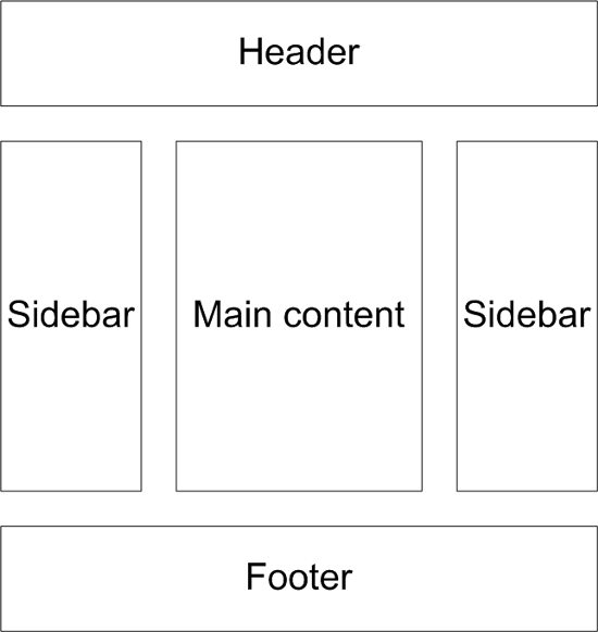
Here, we have two sidebars, one on either side of the main content. Using this type of layout, we would probably place the items in Groups 3 and 4 in the sidebars and Group 2 in the main content area.
A variation on the three-column layout is to have the two sidebars next to each other on one side of the page (usually the right), as shown in the following diagram. This is a popular layout for blogs, not just for aesthetics, but because the search engine spiders encounter the post column first as that content is at the top of the template.
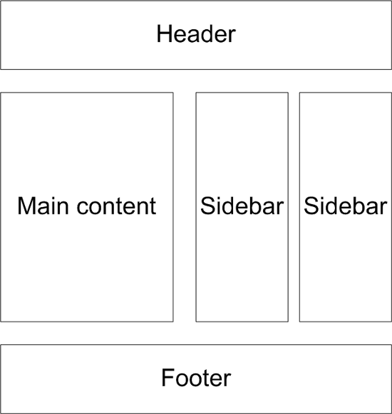
Using two sidebars is useful if you anticipate having a lot of ancillary content on your blog. The list of page elements given earlier is really the bare minimum you would want on your page. However, if you decide to use lots of widgets or have a long blogroll, it's a good idea to spread them across two sidebars. This means that more of your content can be placed above the fold.
The concept of above the fold in web design applies to content in a web page which is visible without having to scroll down, that is, the stuff in the top part of the page. It's a good idea to place the most important content above the fold so that readers can see it immediately. This is particularly true if you plan to monetize your blog by displaying adverts. Adverts that appear above the fold get the most exposure, and therefore, generate the most revenue
Another popular layout amongst bloggers has just two columns. In this layout, we would place the items in Groups 3 and 4 together in the one sidebar. It doesn't really matter which side of the page the sidebar is placed, but it seems more common to have it on the right. Studies have shown that a web user's eyes are most often focused on the top-left region of a web page, when they first open any page. So it makes sense to place your main content there, with your sidebar on the right.
Also, remember that the search engine spiders will find the leftmost content first. You want them to find your main content quickly, which is a good reason for placing your sidebar on the right, out of their way.
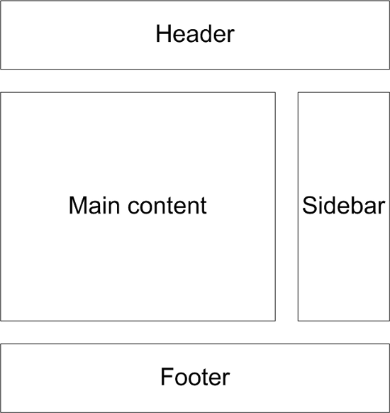
An important benefit of a two-column layout is that it allows more room for your main content area. This may be important, if you intend to use a lot of video or images within your blog posts. The extra room allows you to display this visual content bigger.
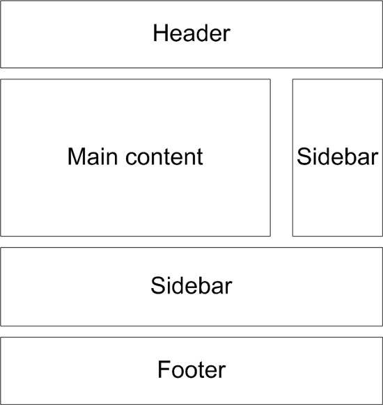
Many blogs place some of their ancillary content just above the footer, below the main content. This also has the advantage of leaving more space for the main content, as with the two-column layout. The following diagram shows this type of layout. Here, the content just above the footer isn't strictly speaking a sidebar, but I've labeled it this way because it's the terminology most often applied to this type of ancillary content.
Wireframing
The layout diagrams we've just seen are referred to as wireframes by web designers. They give a simple overview of where the elements of a page should be placed. It would be a good idea for you to create your own wireframe for your blog design. This can be done using most graphic software packages or something like Microsoft Visio , or a simple pen and paper does the job equally well!
Color
This is the next design principle we need to consider. It may be that you already have a corporate color scheme based on your company logo, stationery, or existing website. In this case, you'll probably want to continue that theme through your blog design. Even if you already have your corporate color scheme, this section may still be useful in case you decide to change your blog colors in the future.
The subject of color in design is a large one. Design students spend a great deal of time learning about the psychology and science of colors and techniques for achieving the best color schemes. Obviously, we don't have enough space to go into that kind of detail, but I will try to give you a few pointers.
The first thing to think about is the psychology of color, in particular, color associations. This is the idea that different colors evoke different feelings and emotions in the eye of the beholder. To a certain extent this can be rather subjective and it can also depend on cultural influences, but there are some generalities that can be applied. For example, red is often perceived as being exciting, passionate, or dramatic. Yellow is an active and highly visible color, which is why it is used in warning signs. It is also associated with energy and happiness. Blue is sometimes thought of as being cold. It can also be a calming color and may sometimes be seen as corporate or conservative. White, for many people, gives the idea of cleanliness, purity, and perfection. Black can be seen as strong, elegant, and chic. Obviously, these color associations can vary from person to person, so designers don't rely on them solely in their color decisions, but they are certainly worth bearing in mind.
There are more practical considerations regarding color that are probably more relevant than color psychology. For example, we all know that some color combinations don't work well together. There is a great deal of design theory aimed at devising good color combinations, but unless you're a professional designer, it's not really worth going into. Probably the best method for working out good color combinations is trial and error. If you're trying to figure out a background color and text color for your blog, simply test a few out. You could use a graphics package such as Photoshop or Microsoft Paint , or one of the many online color tools such as, http://colorschemedesigner.com/ or Adobe's Kuler at http://kuler.adobe.com.
When choosing background and text colors you need to think about contrast. For example, yellow text on a white background can be very difficult to read. Some people also find light text on a black background a strain on their eyes.
Unlock access to the largest independent learning library in Tech for FREE!
Get unlimited access to 7500+ expert-authored eBooks and video courses covering every tech area you can think of.
Renews at $19.99/month. Cancel anytime
It's also important not to use too many colors in your design. Try to limit your palette to a maximum of three or four. Sometimes you may only need two colors to make an attractive design.
One method for devising color combinations is to look for examples all around you, particularly in nature. Maybe look at a photograph of a landscape and pick out color combinations you like. Also consider the work of professional designers. Think about websites and blogs you like, and examine the color schemes they have used. You will also find good examples in offline design—pick up a book and see how colors have been used in the cover design.
If you would like to base your blog's color scheme on your company logo, you could use lighter and darker versions of one color from the logo. Use the most vivid color in the logo for emphasis or headings.
Web color theory
At this point, it's worth looking at the technical theory behind colors on the Web. Web browsers use the Hexadecimal RGB color system to render colors in web pages. This is because computer monitors use an RGB color model, which means every pixel is colored using a combination of red, green, and blue light (hence RGB). There are 256 different levels of red light, 256 different levels of green light, and 256 different levels of blue light. These can be combined to create 16,277,216 different colors, which are all available for your web browser.
The hexadecimal system gives us a way of counting from 0 to 255 using numbers and letters, which covers all 256 levels of RGB light. In the hexadecimal scale, 0 is 00 and 255 is FF. A six-character hexadecimal color code specifies the levels of red, green and blue, which form a particular color. For example, the color white combines red, green, and blue at their highest possible levels, that is 255. Remember that in hexadecimal 255 is FF, so the color code for white is FFFFFF (Red: FF, Green: FF, and Blue: FF). The color code for black is 000000 as the levels of red, green, and blue are set to their lowest, or 00 (in hexadecimal). The code for red is FF0000, blue is 0000FF, and yellow is FFFF00, and so on.
We can use six-character Hexadecimal RGB codes to define all of the 16,277,216 web colors.
So how do we know the hexadecimal code for a particular color? Well, there are many tools available that define the Hexadecimal RGB codes for the colors you choose. Some are standalone applications for PC or Mac, and others are online. Take a look at https://www.webpagefx.com/web-design/color-picker/ or do a quick search in Google on color picker . For more information on web colors , read the article at http://en.wikipedia.org/wiki/Web_colors.
Typography
Another important consideration for your blog design is the fonts you use. Your choice of font will have a big impact on the readability of your blog. It's important to bear in mind that although there are literally thousands of fonts to choose from, only a small number of them are practical for web design. This is because a web browser can only display fonts that are already installed on the user's computer. If you choose an obscure font for your blog, the chances are that most users won't have it installed on their computer. If this is the case the web browser will automatically select a substitute font. This may be smaller or far less readable than the font you had in mind. It's always safest to stick to the fonts that are commonly used in web design, which are known as web safe fonts. These include the following:
- Arial
- Verdana
- Times New Roman
- Georgia
There are two types of font, serif and sans-serif. Serif fonts have little flourishes at the end of the strokes whereas sans-serif fonts don't have this extra decoration. Arial and Verdana are sans-serif fonts, whereas Times New Roman and Georgia are serif fonts.
As you'll see later in the article, when we look at CSS, fonts are usually specified in groups or families. They are listed in the order of the designer's preference. For example, a designer may specify font-family:"Georgia, Times New Roman, serif". This means when the browser renders the page it will first look for the Georgia font; if it isn't installed, it will look for the Times New Roman font and if that isn't installed, it will look for the computer's default serif font. This method gives the designer more control over the font choices the browser will make.
The size of your font is also an important factor. Generally speaking, the bigger it is, the easier it is to read. Computer displays are getting bigger and bigger but the default screen resolutions are tending to get smaller. In other words, the individual pixels on users' screens are getting smaller. This is a good reason for web designers to choose larger font sizes. This trend can be seen on many Web 2.0 sites, which tend to use large and clear fonts as part of their design, for example http://www.37signals.com. But be careful not to go too big as this can make your design look messy and a little childish.
Remember that you're not limited to using just one font in your blog design. For example, you may decide to use a different font for your headings. This can be an effective design feature but don't go crazy by using too many fonts, as this will make your design look messy. Probably two, or at most three, fonts on a page are plenty.
Font replacement
Font replacement refers to a relatively new group of technologies that are pushing the envelope of web typography. In theory, they allow designers to use any font in their web page designs. In practice, things are a little more complicated. Issues around browser compatibility and font licensing make font replacement technologies a bit of a minefield for anyone who is new to web design. It's true that, thanks to font replacement technologies, professional designers are no longer constrained by the notion of web safe fonts. But, if you are a web design novice, I recommend you stick to web safe fonts until your skills improve and you are ready to learn a whole new technology.
A full discussion on font replacement is way beyond the scope of this article; I mention it only to give you a better overview of the current state of web typography. But if you are interested in knowing more, three popular font replacement technologies are Cufón (http://cufon.shoqolate.com), Font Squirrel (http://www.fontsquirrel.com), and Google Fonts API (http://code.google.com/apis/webfonts/).
There is also something known as @font-face, which is part of CSS3, the latest specification of CSS. Again, it offers the tantalizing possibility of giving designers free rein in their choice of fonts. Sadly, @font-face is also hindered by browser compatibility and font licensing issues. The Font Squirrel technology, mentioned previously, resolves these issues to a certain extent, so this is something to be aware of as your web design skills develop. But for the time being, I recommend you concentrate on the basics of web typography and don't worry about @font-face until you feel ready.
Usability and accessibility
This is another very important area to consider when designing your blog. Many people, who live with various disabilities, use a range of 'assistive' software to access the Web. For example, people with visual impairments use screen readers, which translate the text in a web browser into audible speech. There are also people who are unable to use a mouse, and instead rely on their keyboard to access web pages. It's the responsibility of web designers to ensure that their websites are accessible for these different methods of browsing. There's no sense in alienating this group of web surfers just because your blog is inaccessible to them.
There are also many other circumstances when your blog might be accessed by means other than a standard web browser, for example, via mobile phones, PDAs, or tablets. Again, a good designer will ensure that these modes of browsing are catered for. The web design industry has been well aware of these accessibility issues for many years and has come up with guidelines and technologies to help conscientious designers build websites that are standards compliant . These web standards help ensure best practice and maximize accessibility and usability.
Luckily, WordPress takes care of a lot of the accessibility issues simply by the way it's been developed and built. The code behind WordPress is valid XHTML and CSS, which means that it complies with web standards and is easily accessible. It's important, then, that you don't break the system by allowing bad practice to creep in.
Some of the things to bear in mind relate to a couple of design principles we've already discussed, for example, using a color scheme and font size that makes your text easy to read. Other issues include keeping the number of navigation links on your page to a minimum—a whole load of useless links can be annoying for people who have to tab through them to get to your main content.
You should also ensure that any third-party plugins you install are standards-compliant and don't throw up any accessibility problems. The same is true if you decide to use a ready-made theme for your blog design. Just make sure it's accessible and satisfies web standards. For more background reading on web standards, you could take a look at http://www.alistapart.com or the World Wide Web Consortium (W3C) website at http://www.w3.org.
Implementing your blog design
We've now considered the principles involved in designing our blog. The next thing to decide is how we actually carry out the design work. There are three main options available, each of which involves varying degrees of work. However, they all require knowledge of the design principles we just covered.
The first approach is probably the easiest; it simply involves finding a readymade theme and installing it in WordPress. By working through the earlier design principles, you should have an idea of what you want your blog to look like and then you simply need to find a theme that matches your vision as closely as possible. A good place to start looking is the official WordPress Free Themes Directory at http://wordpress.org/extend/themes/. You'll also find many more theme resources by running a search through Google.
There are hundreds of very attractive WordPress themes available for free and many others which you can pay for. However, if you adopt this approach to your blog design, you won't have a unique or original blog. The chances are the theme you choose will also be seen on many other blogs.
At the other end of the scale, in terms of workload, is designing your own theme from scratch. This is a fairly complicated and technical process, and is well beyond the scope of this article. In fact, it's a subject that requires its own book. If you intend to build your own theme, I recommend WordPress 2.8 Theme Design by Tessa Blakeley Silver ISBN 978-1-849510-08-0 published by Packt Publishing.
The third approach is to modify a readymade theme. You could do this with any theme you choose, even the default Twenty Ten theme that ships with WordPress. However, if you edit a fully developed theme, you spend a lot of time unpicking someone else's design work and you may still be left with elements that are not completely your own. A better method is to start with a theme framework, which has been specially designed to be a blank canvas for your own design.
Over the last few years many WordPress theme frameworks have appeared, some free, some paid-for. Two of the most popular paid-for theme frameworks are Thesis (http://diythemes.com/) and Genesis (http://www.studiopress.com/themes/genesis), while popular free frameworks include Hybrid (http://themehybrid.com/), Carrington (http://carringtontheme.com/), and Thematic (see below).

 United States
 Great Britain
 India
India
 Germany
 France
 Canada
 Russia
 Spain
Spain
 Brazil
 Australia
 Singapore
 Canary Islands
 Hungary
 Ukraine
 Luxembourg
 Estonia
 Lithuania
 South Korea
 Turkey
 Switzerland
 Colombia
 Taiwan
 Chile
Chile
 Norway
 Ecuador
 Indonesia
 New Zealand
 Cyprus
 Denmark
 Finland
 Poland
 Malta
Malta
 Czechia
 Austria
 Sweden
 Italy
Italy
 Egypt
Egypt
 Belgium
 Portugal
 Slovenia
 Ireland
 Romania
 Greece
 Argentina
 Netherlands
 Bulgaria
 Latvia
 South Africa
 Malaysia
 Japan
Japan
 Slovakia
 Philippines
 Mexico
 Thailand


