In this article by James Church, author of the book Learning Haskell Data Analysis, we will see the different methods of data analysis by plotting data using Haskell. The other topics that this article covers is using GHCi, scaling data, and comparing stock prices.
(For more resources related to this topic, see here.)
Can you perform data analysis in Haskell? Yes, and you might even find that you enjoy it. We are going to take a few snippets of Haskell and put some plots of the stock market data together. To get started with, the following software needs to be installed:
The cabal command-line tool is the tool used to install packages in Haskell. There are three packages that we may need in order to analyze the stock market data. To use cabal, you will use the cabal install [package names] command.
Run the following command to install the CSV parsing package, the EasyPlot package, and the Either package:
$ cabal install csv easyplot either
Once you have the necessary software and packages installed, we are all set for some introductory analysis in Haskell.
We need data
It is difficult to perform an analysis of data without data. The Internet is rich with sources of data. Since this tutorial looks at the stock market data, we need a source. Visit the Yahoo! Finance website to find the history of every publicly traded stock on the New York Stock Exchange that has been adjusted to reflect splits over time. The good folks at Yahoo! provide this resource in the csv file format.
We begin with downloading the entire history of the Apple company from Yahoo! Finance (http://finance.yahoo.com). You can find the content for Apple by performing a quote look up from the Yahoo! Finance home page for the AAPL symbol (that is, 2 As, not 2 Ps). On this page, you can find the link for Historical Prices. On the Historical Prices page, identify the link that says Download to Spreadsheet. The complete link to Apple's historical prices can be found at the following link:
We should take a moment to explore our dataset. Here are the column headers in the csv file:
Date: This is a string that represents the date of a particular date in Apple's history
Open: This is the opening value of one share
High: This is the high trade value over the course of this day
Low: This is the low trade value of the course of this day
Close: This is the final price of the share at the end of this trading day
Volume: This is the total number of shares traded on this day
Adj Close: This is a variation on the closing price that adjusts the dividend payouts and company splits
Another feature of this dataset is that each of the rows are written in a table in a chronological reverse order. The most recent date in the table is the first. The oldest is the last.
Yahoo! Finance provides this table (Apple's historical prices) under the unhelpful name table.csv. I renamed my csv file aapl.csv, which is provided by Yahoo! Finance.
Start GHCi
The interactive prompt for Haskell is GHCi. On the command line, type GHCi. We begin with importing our newly installed libraries from the prompt:
Parse the csv file that you just downloaded using the parseCSVFromFile command. This command will return an Either type, which represents one of the two things that happened: your file was parsed (Right) or something went wrong (Left). We can inspect the type of our result with the :t command:
Did we get an error for our result? For this, we are going to use the fromRight and fromLeft commands. Remember, Right is right and Left is wrong. When we run the fromLeft command, we should see this message saying that our content is in the Right:
Pull the cells of our csv file into cells. We can see the first four rows of our content using take 5 (which will pull our header line and the first four cells):
> let cells = fromRight' eitherErrorOrCells<
> take 5 cells<
[["Date","Open","High","Low","Close","Volume","Adj Close"], ["2014-11-10","552.40","560.63","551.62","558.23","1298900","558.23"], ["2014-11-07","555.60","555.60","549.35","551.82","1589100","551.82"], ["2014-11-06","555.50","556.80","550.58","551.69","1649900","551.69"], ["2014-11-05","566.79","566.90","554.15","555.95","1645200","555.95"]]
The last column in our csv file is the Adj Close, which is the column we would like to plot. Count the columns (starting with 0), and you will find that Adj Close is number 6. Everything else can be dropped. (Here, we are also using the init function to drop the last row of the data, which is an empty list. Grabbing the 6th element of an empty list will not work in Haskell.):
We know that this column represents the adjusted close prices. We should drop our header row. Since we use tail to drop the header row, take 5 returns the first five adjusted close prices:
We should store all of our adjusted close prices in a value called adjCloseOriginal:
> let adjCloseAAPLOriginal = map (x -> x !! 6) (tail (init cells))
These are still raw strings. We need to convert these to a Double type with the read function:
> let adjCloseAAPL = map read adjCloseAaplOriginal :: [Double]
We are almost done messaging our data. We need to make sure that every value in adjClose is paired with an index position for the purpose of plotting. Remember that our adjusted closes are in a chronological reverse order. This will create a tuple, which can be passed to the plot function:
Unlock access to the largest independent learning library in Tech for FREE!
Get unlimited access to 7500+ expert-authored eBooks and video courses covering every tech area you can think of.
Renews at $19.99/month. Cancel anytime
> let aapl = zip (reverse [1.0..length adjCloseAAPL]) adjCloseAAPL<
> take 5 aapl <
[(2577,558.23),(2576,551.82),(2575,551.69),(2574,555.95),(2573,564.19)]
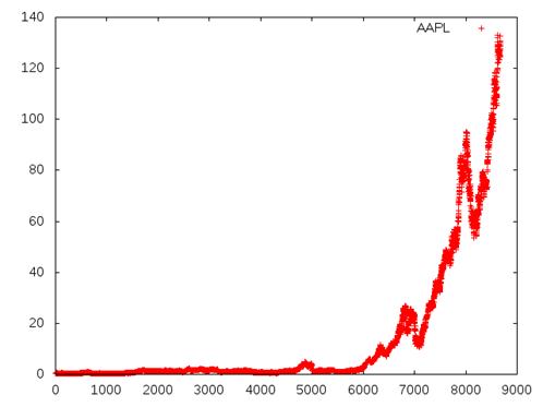
The following chart is the result of the preceding command:
Open aapl.png, which should be newly created in your current working directory. This is a typical default chart created by EasyPlot. We can see the entire history of the Apple stock price. For most of this history, the adjusted share price was less than $10 per share. At about the 6,000 trading day, we see the quick ascension of the share price to over $100 per share.
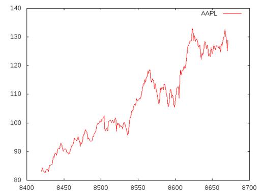
Most of the time, when we take a look at a share price, we are only interested in the tail portion (say, the last year of changes). Our data is already reversed, so the newest close prices are at the front. There are 252 trading days in a year, so we can take the first 252 elements in our value and plot them. While we are at it, we are going to change the style of the plot to a line plot:
> let aapl252 = take 252 aapl<
> plot (PNG "aapl_oneyear.png") $ Data2D [Title "AAPL", Style Lines] [] aapl252<
True
The following chart is the result of the preceding command:
Scaling data
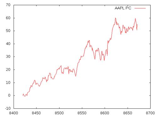
Looking at the share price of a single company over the course of a year will tell you whether the price is trending upward or downward. While this is good, we can get better information about the growth by scaling the data. To scale a dataset to reflect the percent change, we subtract each value by the first element in the list, divide that by the first element, and then multiply by 100. Here, we create a simple function called percentChange. We then scale the values 100 to 105, using this new function. (Using the :t command is not necessary, but I like to use it to make sure that I have at least the desired type signature correct.):
> let percentChange first value = 100.0 * (value - first) / first<
> :t percentChange<
percentChange :: Fractional a => a -> a -> a<
> map (percentChange 100) [100..105]<
[0.0,1.0,2.0,3.0,4.0,5.0]
We will use this new function to scale our Apple dataset. Our tuple of values can be split using the fst (for the first value containing the index) and snd (for the second value containing the adjusted close) functions:
The following chart is the result of the preceding command:
Let's take a look at the preceding chart. Notice that it looks identical to the one we just made, except that the y axis is now changed. The values on the left-hand side of the chart are now the fluctuating percent changes of the stock from a year ago. To the investor, this information is more meaningful.
Comparing stock prices
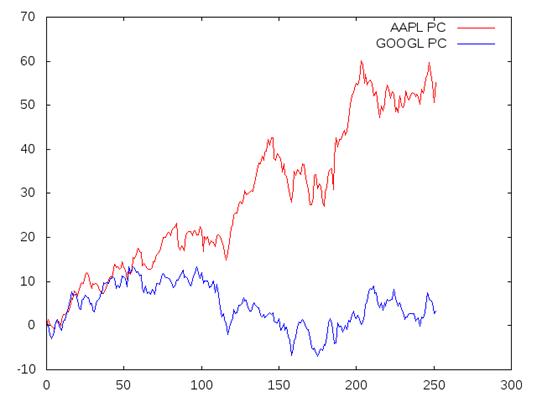
Every publicly traded company has a different stock price. When you hear that Company A has a share price of $10 and Company B has a price of $100, there is almost no meaningful content to this statement. We can arrive at a meaningful analysis by plotting the scaled history of the two companies on the same plot. Our Apple dataset uses an index position of the trading day for the x axis. This is fine for a single plot, but in order to combine plots, we need to make sure that all plots start at the same index. In order to prepare our existing data of Apple stock prices, we will adjust our index variable to begin at 0:
We will compare Apple to Google. Google uses the symbol GOOGL (spelled Google without the e). I downloaded the history of Google from Yahoo! Finance and performed the same steps that I previously wrote with our Apple dataset:
> -- Prep Google for analysis<
> eitherErrorOrCells <- parseCSVFromFile "googl.csv"<
> let cells = fromRight' eitherErrorOrCells<
> let adjCloseGOOGLOriginal = map (x -> x !! 6) (tail (init cells))<
> let adjCloseGOOGL = map read adjCloseGOOGLOriginal :: [Double]<
> let googl = zip (reverse [1.0..genericLength adjCloseGOOGL]) adjCloseGOOGL<
> let googl252 = take 252 googl<
> let firstValue = snd (last googl252)<
> let firstIndex = fst (last googl252)<
> let googl252scaled = map (pair -> (fst pair - firstIndex, percentChange firstValue (snd pair))) googl252
Now, we can plot the share prices of Apple and Google on the same chart, Apple plotted in red and Google plotted in blue:
The following chart is the result of the preceding command:
You can compare for yourself the growth rate of the stock price for these two competing companies because I believe that the contrast is enough to let the image speak for itself. This type of analysis is useful in the investment strategy known as growth investing. I am not recommending this as a strategy, nor am I recommending either of these two companies for the purpose of an investment. I am recommending Haskell as your language of choice for performing data analysis.
Summary
In this article, we used data from a csv file and plotted data. The other topics covered in this article were using GHCi and EasyPlot for plotting, scaling data, and comparing stock prices.

 United States
 Great Britain
 India
India
 Germany
 France
 Canada
 Russia
 Spain
Spain
 Brazil
 Australia
 Singapore
 Canary Islands
 Hungary
 Ukraine
 Luxembourg
 Estonia
 Lithuania
 South Korea
 Turkey
 Switzerland
 Colombia
 Taiwan
 Chile
Chile
 Norway
 Ecuador
 Indonesia
 New Zealand
 Cyprus
 Denmark
 Finland
 Poland
 Malta
Malta
 Czechia
 Austria
 Sweden
 Italy
Italy
 Egypt
Egypt
 Belgium
 Portugal
 Slovenia
 Ireland
 Romania
 Greece
 Argentina
 Netherlands
 Bulgaria
 Latvia
 South Africa
 Malaysia
 Japan
Japan
 Slovakia
 Philippines
 Mexico
 Thailand