


The 32nd annual NeurIPS (Neural Information Processing Systems) Conference 2018 (formerly known as NIPS), is currently being hosted in Montreal, Canada this week. The Conference is the biggest machine learning conference of the year that started on 2nd December and will be ending on 8th December. It will feature a series of tutorials, invited talks, product releases, demonstrations, presentations, and announcements related to machine learning research.
One such tutorial was presented at NeurIPS, earlier this week, called “Visualization for machine learning” by Fernanda Viegas and Martin Wattenberg. Viegas and Wattenberg are co-leads at Google’s PAIR (People in AI research ) initiative, which is a part of Google Brain. Their work in machine learning focuses on transparency and interpretability to improve human AI interaction and to democratize AI technology.
Here are some key highlights from the tutorial.
The tutorial talks about how visualization works, and explores common visualization techniques, and uses of visualization in Machine learning.
Viegas opened the talk with first explaining the data visualization concept. Data visualization refers to a process of representing and transforming data into visual encodings and context. It is used for data exploration, for gaining scientific insight, and for better communication of data results.
How does data visualization work?
Data visualization works by “finding visual encodings”. In other words, you take data and then transform it into visual encodings. These encodings then further perform a bunch of different functions.
Firstly, they help guide viewers attention through data. Viegas explains how if our brains are given “the right kind of visual stimuli”, our visual system works dramatically faster.
There are certain things that human visual systems are acutely aware of such as differences in shapes, alignments, colors, sizes, etc.
Secondly, they communicate the data effectively to the viewer, and thirdly, it allows the viewer to calculate data. Once these functions are complete, you can then interactively explore the data on the computer.
Wattenberg explains how different encodings have different properties. For instance, “position” and “length” properties are as good as a text for communicating exact values within data. “Area” and “colors” are good for drawing the attention of the viewer.
He further gives an example of Colorbrewer, a color advice tool by Cynthia Brewer, a cartographer, that lets you try out different color palettes and scales. It’s a handy tool when playing with colors for data visualization. Apart from that, a trick to keep in mind when choosing colors for data visualization is to go for a color palette or scale where one color doesn’t look more prominent than the others since it can be perceived as one category that is more important than the other, says Viegas.
Common visualization Techniques
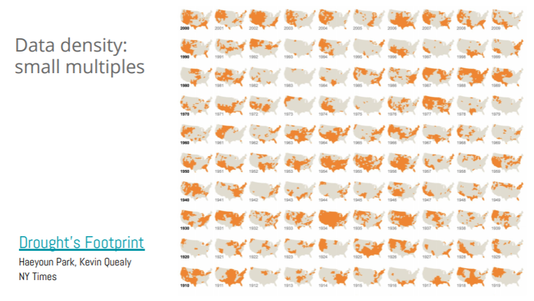
Data Density
Viegas explains how when you have a lot of data, there is something called small multiples, meaning that you “use your chart over and over again for each moment that is important”. A visualization example presented by Viegas is that of a New York Times infographic for Drought, in the US over the decades.
Visualization for machine learning
She explains how in the above visualization, each one of the rows is a decade worth of drought in the US. Another thing to notice is that the background color in the visualization is very faint so that the map of the US recedes in the background, points out Viegas. This is because the map is not the most important thing. The drought information is what needs to majorly pop out. Hence, a sharp highlighting and saturating color are used for the drought.
Data Faceting
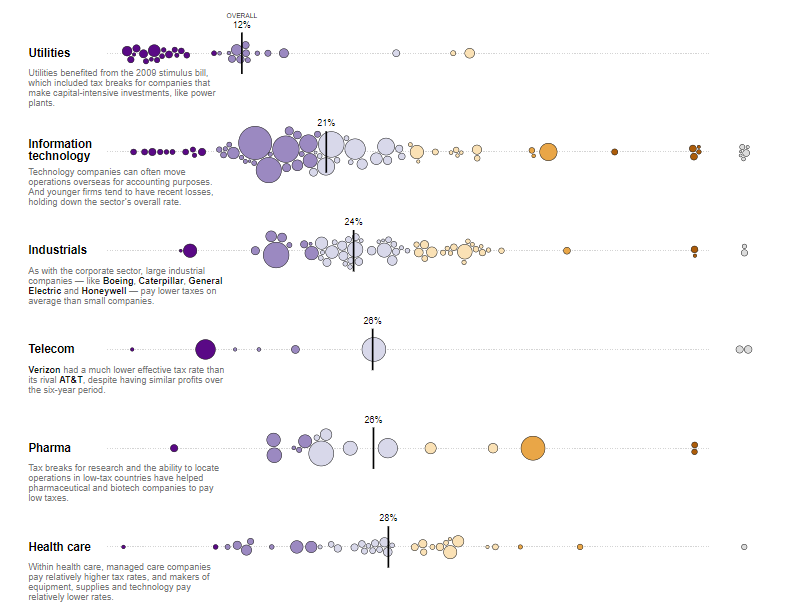
Another visualization technique discussed by Viegas is that of data faceting, which is basically adding two different visualizations together to understand and analyze the data better. A visualization example below shows what are the tax rates for different companies around the US, and how much does the tax amount vary among these companies. Each one of these circles is a company that is sized differently. The color here shows a distribution that goes from the lowest tax rate on the left to the highest on the right.
“Just by looking at the distribution, you can tell that the tax rates are going up the further to the right they are. They have also calculated the tax rate for the entire distribution, so they are packing a ton of info in this graph,” says Viegas.
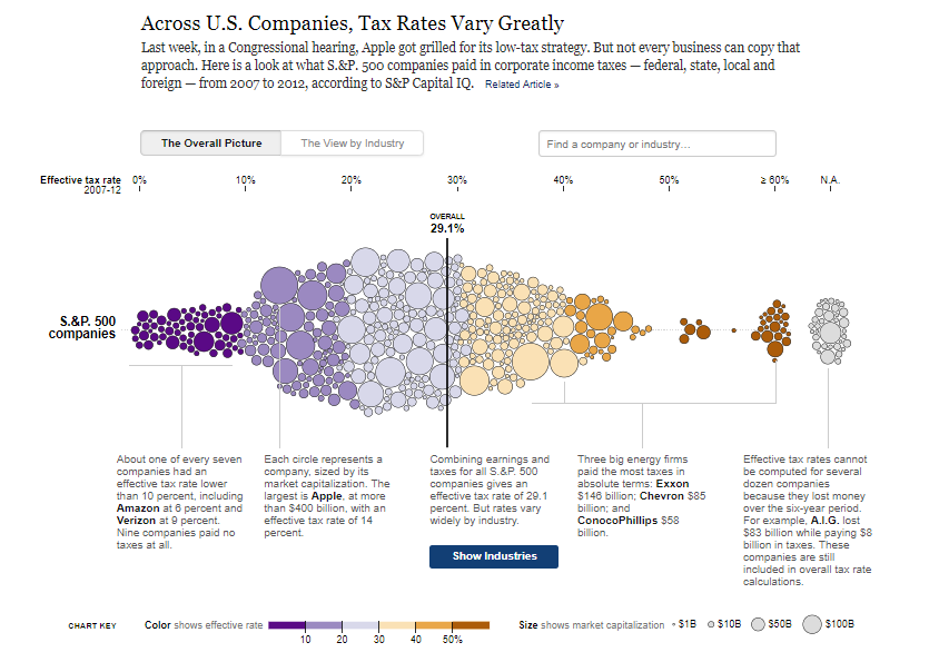
Another tab saying “view by industry”, shows another visualization that presents the distribution of each industry, along with their tax rates and some commentary for each of the industries, starting from utilities to insurance.
Visualization uses in ML
If you look at the visualization pipeline of machine learning, you can identify the areas and stages where visualization is particularly needed and helpful. “It’s thinking about through acquiring data, as you implement a model, training and when you deploy it for monitoring”, says Wattenberg.
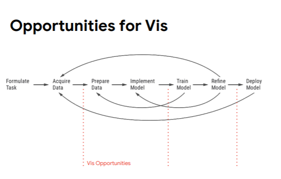
Visualization is mainly used in Machine learning for training data, monitoring performance, improve interpretability, understand high-dimensional data, for education, and communication. Let’s now have a look at some of these.
Visualizing training data
To explain why visualizing training data can be useful, Viegas takes an example of visualizing CIFAR-10 which is a dataset that comprises a collection of images commonly used to train machine learning and computer vision algorithms.
Viegas points out that there are a lot of tools for looking at your data. One such tool is Facets, an Open Source Visualization Tool for Machine Learning Training Data. In the example below, they have used facets where pictures in CIFAR 10 are organized into categories such as an airplane, automobile, bird, etc.
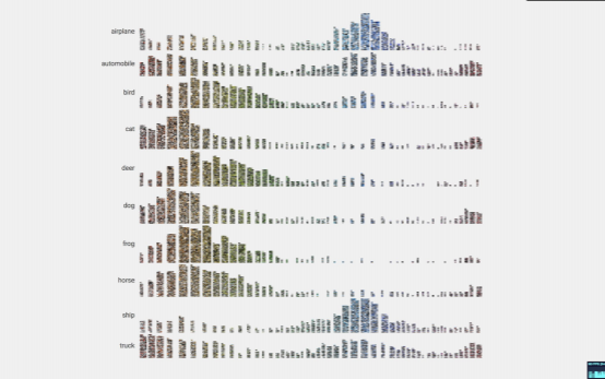
Not only does it provide a clear distinction between different categories, but their Facets can also help with analyzing mistakes in your data. Facets provide a sense of the shape of each feature of the data using Facets Overview. You can also explore a set of individual observations using Facets Dive. These visualizations help with analyzing mistakes in your data and automatically provide an understanding of “distribution of values” across different features of a dataset.
Visualizing Performance monitoring
Viegas quickly went over how visualization is widely seen in performance monitoring in the form of monitor boards, almost on a daily basis, in machine learning. Performance monitoring visualization includes using different graphs and line charts, as while monitoring performance, you are constantly trying to make sure that your system is working right and doing what it’s supposed to do.
Visualizing Interpretability
Interpretability in machine learning means the degree to which a human can consistently predict the model’s result.
Viegas discusses interpretability visualization in machine learning by breaking it further into visualization in CNNs, and RNNs.
CNNs (Convolutional Neural Network)
She compares interpretability of image classification to a petri dish. She explains how image classifiers are effective in practice, however, what they do and how they do it is mysterious, and they also have failures that add to the mystery. Another thing about image classifiers is that since they’re visual, it can be hard to understand what they exactly do such as what features do these networks really use, what roles are played by different layers, etc.
An example presented by Viegas is of saliency maps that show each pixel’s unique quality. Saliency maps simplify and/or change the representation of an image into something that is more meaningful and easier to analyze. “The idea with saliency maps is to consider the sensitivity of class to each pixel. These can be sometimes deceiving, visually noisy,..and ..sometimes easy to project on them what you’re seeing”, adds Viegas.
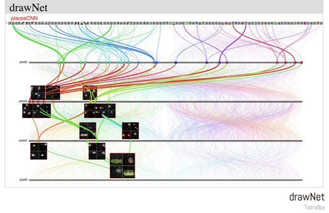
Another example presented by Viegas that’s been very helpful in case of visualization of CNNs is that of drawNet by Antonio Torralba. The reason this visualization is particularly great is that it is great at informing people who are not from a machine learning field on how neural networks actually work.
RNNs (Recurrent Neural Network)
Viegas presented another visualization example in case of RNNs. A visualization example presented here is that of Karpathy, that looked at visualizing text sequences, and trying to understand that if you activate different cells, you can maybe interpret them.
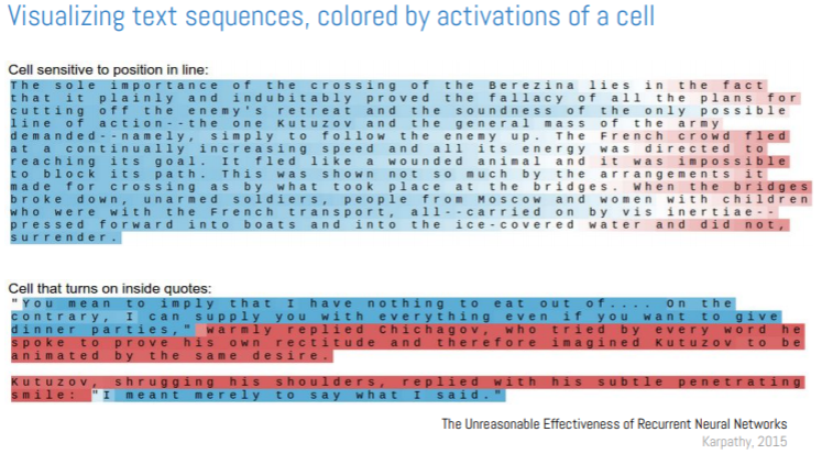
The color scale is very friendly, and the fact that color layers right on top of the data. It is a good example of how to make the right tradeoff when selecting colors to represent quantitative data, explains Wattenberg. Viegas further pointed out how it’s always better to go back to the raw data (in this case, text), and show that to the user since it will make your visualization more effective.
Visualizing High Dimensional Data
Wattenberg explains how visualizing high dimensional data is very tough, and almost “impossible”. However, there are some approaches that help visualize it. These approaches are divided into two: linear and non-linear.
Linear approaches include principal component analysis and visualization of labeled data using linear transformation. Non-linear approaches include multidimensional scaling, sammon mapping, t-SNE, UMAP, etc.
Wattenberg gives an example of PCA on embedding projector that is using MNIST as a dataset. MNIST is a large database of handwritten digits commonly used for training different image processing systems. PCA does a good job at visualizing MNIST. However, using non-linear method is more effective since the clusters of digits get separated quite well.
However, Wattenberg argues that there’s a lot of trickiness that goes around, and to analyze it, t-SNE is used to visualize data. t-SNE is a fairly complex non-linear technique that uses an adaptive sense of distance. It translates well between the geometry of high and low dimensional space. t-SNE is effective in visualizing high-dimensional data but there’s another method, called UMAP ( Uniform Manifold Approximation and Projection for Dimension Reduction), that is faster than t-SNE, and efficiently embed into high dimensions, and captures the global structure better.
After learning how visualization is used in ML, and what different tools and methods work out of visualization in Machine learning, data scientists can now start experimenting and refining the existing visualization methods or they can even start inventing entirely new visual techniques.
Now that you have a head-start, dive right into this fascinatingly informative tutorial on the NeurIPS page!


