


It’s been a few years since Responsive Web first burst onto the scene as a revolution in how we developed and designed websites. Gone are the days of websites that looked the same no matter what device or resolution you were using; replaced by reactive containers, grids, a few images, and white.
Lots and lots of white.
Ever since joining Packt I’ve started to look more and more at how every website I visit looks with a more critical eye, and the biggest common thread I’ve seen is the constant light grey or white that make up many of the biggest websites on the web.
What to Avoid
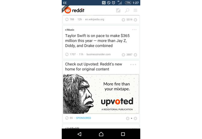
Let’s use Reddit’s new beta mobile design as an example. Reddit has always been pretty minimalist when it comes to design, but the current version shown above can be a nightmare to use at times. Have a go for yourself and check a few of the posts on the front page – buttons are far too small to be of use to most fingers, and I’ve often found myself clicking through to a video when I’ve wanted to read the comments. And look at all that white space! There have been more than a few times where I’ve clicked on something expecting it to take me to the article only to find that, actually, I’m meant to click slightly to the left. This is probably one of the biggest problems with white space, and for a website like Reddit where you can visit several times a day for several different topics can add up to a lot of frustration for customers.
Obviously there are reasons for a white background sometimes – it’s what we’re used to, it’s easy to read large blocks of text with – it works with practically everything, why wouldn’t you use it?! Well, even without going into that some people naturally struggle with reading large chunks of text on a white background, in 2014 mobile officially passed the desktop as the average user’s device of choice; having your website stand out on mobile while also looking good is more important than ever in the world of responsive web. New customers can get put off by the slightest thing, and in today’s web a bland website can be taken as a warning sign. This is a huge shame, because it doesn’t take much to let your site stand out and shine against the rest in the world of mobile.
Good use of space and fits on all devices. This is what you’re aiming for. (Not really)
Luckily I’ve noticed is that a few developers are finally starting to put their own spin on the common responsive design we’ve seen for the last 3 years. In this article I’ll show you a few favorite twists some larger companies have done this year and hopefully inspire you to experiment ways to make your sites stand out so much more with very little effort!
Words Aren’t Enough
Heavy use of images was once frowned upon for mobile sites, but as savvy mobile users start getting bigger data limits we’re seeing an increase in richer mobile sites filled with auto-playing videos, gifs, and more. White space was great for saving data when data limits were a serious concern but with contacts offering high to unlimited data limits we can be a bit more relaxed when it comes to our limits. When used right pictures are far more effective than just reams and reams of words after all.
So, let’s look at 3 examples of websites I’ve used recently that really stood out to me and see how they effectively cut down on white space.
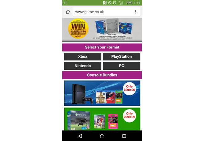
GAME’s website here is filled to the brim with color and carefully chosen ads – in fact, 3/4ths of the front page is just ads with a few other links to back it up. This makes sense from the developers standpoint, as a shopping site needs to do two key things:
- Draw those who do not visit the site regularly to the biggest deals in order to get them to order the big bundles and the newest (And therefore most expensive) products.
- Get the customers exactly where they want to be with as few clicks as possible. The more links a user has to go through to get to what they need the more likely they are to just give up and leave, probably to head to Amazon, which is what you want to avoid.
The simple presentation of this page really works for it. It’s colorful and really helps draw the eye to where the designers want you to go. I really like the lack of words outside of the different categories on this page as well – all this color, all these images are used to create a professional looking site that doesn’t use a lot of mobile data without relying on a heavy amount of white everywhere.
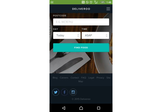
Deliveroo is a food delivery service for restaurants, and that really comes through in its presentation. If you’ve ever used takeout apps before they can come across very differently depending on where you look (As an experiment, check the website designs and copy for Domino, Pizza Hut, and Papa Johns; they’ve all a distinct tone), Deliveroo’s design sidesteps this, and helps all the restaurants featured on the site appear equally professional. This continues through the design scheme as well, subtle blues and a majority of the background being made up of professional looking dishes helps entice the customer while also being simple to set up.
One thing I really like about this site is that the only white space found on the page, the forms, actually helps draw the customer immediately to them so they can get started off straight away. White space is a tool, just like everything else you have in a toolbox, and making the best use of it is important.
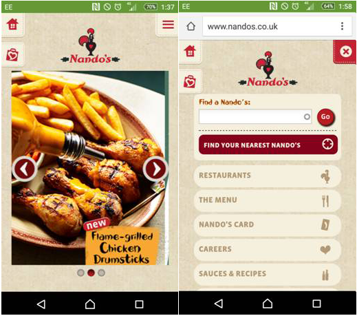
Nandos, everyone’s favorite meme of 2015, has probably one of the best mobile designs I’ve seen for a website a user may visit. Every aspect of the website is aimed to look good and keeps the company aesthetic baked in – material design is in full force too. The initial page still manages to be minimalist, consisting of a swipe ad and a few navigation buttons helpfully fixed to the top of the current screen. The best part is with a simple tap of the menu button everything a hungry soul needs replaces the app without having to load up – it’s quick, painless, and dynamic.
Why is this great? Simply put, it manages to capture the spirit of minimalism without looking bland. The font color naturally meshes well with the background making it easier on the eyes, everything is where it needs to be for easily flicking between, and it’s a real joy to mess around with.
Final Thoughts
I think it’s important to stress again that the typical use of bare containers on a white background isn’t a bad thing by itself, but we’re entering a time where other businesses and developers are now looking to catch the eye of everyone they can and the way to do that these days is through a powerful mobile site. You don’t have to be a designer or spend a lot of money to make a few simple changes that really bring your site to the next level. Give it a shot and see what mixing things up does to your site!