(For more resources on iPhone, see here.)
Starting the application with a proper Default.png
When an application loads for the first time, the user is presented with a variable duration of loading time. This period can change depending on the device processor or RAM, memory requirements of the application, current free memory available on the device, and any number of other variables.
Ideally, the user will only be required to sit through this period for a brief moment. However, this duration can last up to several seconds in length if we're loading an image intensive app on an older device.
Apple has designed a loading screen method that is required by each app, through the inclusion of a PNG file in our app bundle. In this recipe, we'll discuss two interface strategies for this loading period.
Getting ready
For this recipe, we should have a computer with Photoshop or another image creation tool. We should also have knowledge of the devices and orientation types that our application will support.
How to do it...
Loading times are an inherent problem with all types of software, regardless of platform. As hardware has increased in speed, these times have diminished, but they haven't become non-existent.
Apple created a simple design fix for this problem, offering up a quick and easy way to load an image during the loading period. Here are quick, simple steps in order to create an image that will display during the loading period:
- We should start by designing up an art image measuring either 320 x 480 pixels or 320 x 460 pixels (or the equivalent Retina display double resolution size), containing the art piece which we would like the user to see during the loading screen.
- Next, we should then save and name that file Default.png.
- Finally, we should include that image in the resource bundle of our application project in XCode.
- If we're creating a web application, we can also include the image in our HTML code so that the image is displayed when the user launches the web app. To do this, we should name our file startup.png and place the following code in our HTML header:
<link rel="apple-touch-startup-image" href="/startup.png">
iOS is designed to search the bundle for a PNG with this name, and then display it on load if it's available. Once we finish these steps, we have accomplished everything we need to do to have the image load on startup.
When it comes to design styles and technique on what we should include on the image, there are two different strategies that we can take:
The right way
Apple's documentation on the Default.png is fairly clear. According to their design documents, this image should serve as a clean visual of what the application would look like with no pre-populated data.
In essence, this provides the perception that the application has already loaded, but the user is just waiting for the data to populate. It's a subtle way to trick the user into thinking our app loads quicker than it actually does.
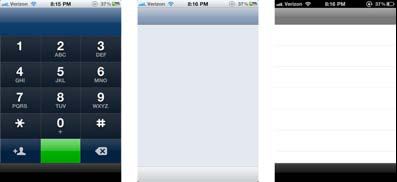
This trick works because it typically takes the brain about 2-4 seconds to see an image on screen, process the layout of what is before them, and then make a decision. Because the loading process for an application is relatively short, typically under three seconds, presenting an overlay of the interface as the Default.png loading image allows the brain to use this time to process what is about to be presented on screen.

Phone - © 2007-2011 Apple Inc.
As shown above, Phone, Messages, and Photos all load preview images with their Default.png displays, which offer the perception that the application loads very quickly. By preparing the user for the app during the Default.png load image period, the user will subconsciously perceive that our application loads faster than it actually does.
The wrong, but possibly preferable way
While we're supposed to use the loading image to prepare the user for our app, we may want this time to serve another purpose, such as a way to advertise our development team or Twitter account. It's an important and powerful moment for application branding, so we should feel free to use this moment as a way to build brand equity through use of a logo and appropriate styling.
There is no set rule that says we can't use the Default.png as an advertisement of sorts, and many applications succeed using this strategy.
We'll need to include a Default.png in the application package, to give our app something to display before loading has concluded. Depending on our application type and loading period, we should be able to include a screen that fits into one of these two methods with ease.
How it works...
Apple has designed iOS so that it is easy to present a loading screen to the user—we only need to create a PNG image, name it Default, and include it inside of our application bundle. The operating system will do the rest for us.
Because this predetermined method works so well, we can instead focus on optimizing the image to best fit into our application. It's important to remember that the Default image is the first thing that the user will ever see in our app, and we should take considerable care in the creation of the art. Attention to detail with such seemingly minute application attributes is what sets outstanding applications apart.
For some situations, creating an image that looks like similar to the first screen after launch will be ideal; as it will offer the perception that our application loads quicker than it actually does. This will increase user appreciation and enjoyment of our app.
In other situations, it may be desirable to go with this splash screen approach instead of the prescribed approach of faking application load. For applications where loading takes a considerable period of time, usually anything over four seconds, it is difficult to use the load to ease users into our app like Apple does with Mail, Messages, or Phone. The pause becomes so long that the user instead believes that the application has broken.
So in such situations, these banner loading Default.png images may provide a better alternative, offering up a way for the user to know that they have indeed loaded the correct application, but that it will still be several seconds before they're able to interact with the initial view.
Regardless of what method we choose, it will be necessary to include a Default.png in with the project. With a bit of work and consideration, we can create something that will win the hearts of our user base.
There's more...
Now that we've learned more about different styles of Default images, we can put a bit of extra effort into going the extra mile with the image as well. Here are a few tips on how to produce a great Default.png.
We can retina optimize our Default.png too
Like any other art piece, we can include a Retina display specific graphic inside our application. By adding the standard @2x modifier to the end of the image, iOS will know to pull this image instead when running a higher resolution device.
As the Default.png is the first image presented to the user, we should take extra effort to show that we're dedicated to a full retina optimized experience.
Prepare for multiple orientations
On the iPhone, we're limited to only one Default.png orientation requirement, as applications tend to be optimized for one orientation and we can create the Default image to account for the prominent orientation.
However, on the iPad, each application should be designed for optimal use in either orientation. This requires us to create two Default images, one for the app launching in portrait and another for if the app launches in landscape.
Apple has created an easy system for the simple creation of such different images. We only need to create the images and add a simple –Portrait or –Landscape modifier (for example, Default-Portrait.png) in order to launch the appropriate view.
Unlock access to the largest independent learning library in Tech for FREE!
Get unlimited access to 7500+ expert-authored eBooks and video courses covering every tech area you can think of.
Renews at $19.99/month. Cancel anytime
Planning our application UI for a first impression
In the real world, we spend a good deal of time preparing for first impressions. We tuck our shirts in, spend time making sure our hair looks perfect, and iron our shirts so that they're wrinkle free. We do this because it's a common understanding that others will greatly have their feelings toward us determined on the basis of how we look or talk during our first meeting. If we don't impress them off the bat, they'll never be willing to warm up to us.
Mobile application development falls under the same sense of unspoken understanding. If our application isn't easy to manage or understand in the first 30 seconds, users will have no qualms over closing our work and deleting it off their device.
Are the colors attractive? Is information easy to access? Do they seem to know what the correct next step is? These are all important questions that the user will subconsciously answer during their first several minutes inside our work.
In this recipe, we'll discuss a couple of design decisions that we can make, in order to impress our users early.
Getting ready
Little is needed for this recipe. Ideally, the implementation of this recipe will take place throughout the course of development, as we fine tune along the way.
How to do it...
The Default.png image is the first visual that every user will see when they check out our app, but it isn't necessarily the first visual that their brain will take a good deal of time processing.
That honor will fall on our actual application, once loaded in full glory for all eyes to behold. It's a somewhat magical moment, as our work is first presented to the audience. Like the opening line of a play, first chapter of a book, the front door to a house, the first few minutes of a game, this is an important moment in the user's determination of what they think about our app.
So how do we present our application with its best foot forward? Here are a couple of simple tips, to help users quickly feel at home inside of our application:
- Use simple, clean In-App icons to help signify key features: When selecting icons to fall inside of Tab Bar cells or Navigation buttons, it's important to ensure that our icon use falls in line with expectations found in other applications. The magnifying glass represents search, a star presumes favorites or top performers, three dots represent that the tab contains multiple options, and a square with a pencil infers that the button composes a new email.
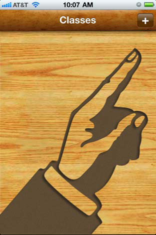
- Start by giving users a push in the right direction: Feel free to offer up a friendly push to the user from the get go. If we make the first step clear, the subsequent steps may become a bit more obvious, as shown in the following screenshot from Grades by Tapity:

Grades - © Tapity
- Hold back sound, flashy animation, or bright colors until the user has had the chance to settle in.
- Offer content early, if only a little taste of what is to come.
How it works...
Creating an intuitive application interface from the first second a user opens our app is an art, which requires that we shape our app carefully overtime. As we add new features, create new art, or conceive new ways to present data on screen, we should always be thinking about what a new user will think upon first presentation of our app.
For Step 1, Apple routinely updates the Mobile Human Interface Guidelines , https://developer.apple.com/library/ios/#documentation/UserExperience/Conceptual/MobileHIG/Introduction/Introduction.html, with suggestions on how to use icons that come built into the iOS SDK .
These guidelines account for a limited quantity of icons and uses, which makes it a bit difficult to gain a good grasp of how we should truly utilize such pieces in our app. While it would be impossible to create an exhaustive list of general shapes and their associated meaning on iOS, the best we can do is make ourselves familiar with as many apps as we possibly can in order to best understand how others have paved the road of user expectations.
In Step 2, we took a look at Grades by Jeremy Olsen. The application allows users to manage test scores and class grades, with an exceptional level of open-ended opportunity. No matter how complex or simple a class's grade scale may be, the application handles the data with ease.
The application makes such scalability easy for the user by using a simple contextual clue on initial launch. By offering direction on how to start tracking information for a class, the user is essentially given a tutorial without even realizing that they're being taught. There is no confusion as to what the first step is, and the user can jump right in and start keeping track of their grades.
For Step three, if we are in the mood, or feel as if it's necessary to make our application stand out through a good deal of noise, eccentric color, or excessive animation, that's perfectly fine. Each application has a different art strategy and depending on our target audience, these elements may very much make sense in our work.
However, we should be hesitant to use such vivid visuals or loud sounds during the user's introduction to our app. While the user may be in our target audience and enjoy our app otherwise, such sudden extreme sense stimulation may be off-putting.
Instead, we should slowly walk our users into the application and give them a chance to prepare for any noise or bright lights that we may throw their way. This way, the user is expecting whatever we decide to present. For example, if we offer loud noises right after the initial launch and our user is sitting in a quiet auditorium, the successive embarrassing situation may turn the user away from our application, just because we presented them with an unexpected bout of displeasure.
By working the user into our loud, colorful, flashy application, we'll be less likely to scare away potential long-term users in the first five minute of using our app.
With regards to Step 3, if our application is a content heavy application, such as a social network or application that features extensive listings of local sport scores, we may be inclined to encourage users to sign up for our service before we offer the meat and potatoes of our app. Most designers are confident that their content is so valuable, users will jump through whatever hoops necessary in order to gain access.
However, the typical user is an impatient soul, unlikely to fill out forms in order to gain access to an app's walled garden. Instead they'll download our app, see the frictional barrier in front of the content, and decide that they're not that interested.
By offering a quick glimpse, we hold some hope in convincing the user that our content is worth going through the sign up process. Service applications such as Instagram and Twitter do a great job at this, offering a handful of images or text entries before asking the user to sign up.
These quick entries give an example of the wealth of content laying behind the apparent barrier of a sign up form. Through these quick previews, the user can gain an idea as to whether they'll enjoy the service or not. By using a preview method such as this, users are able to gauge interest before the sign up, saving everyone's valuable time.
Finally, we know that every iOS device user is familiar with Apple's bundled applications, as they are the only applications that come pre-installed and as such, are the only applications that every user is likely to have used. We should look here for inspiration, as Apple offers a good deal of guidance with their work. When placing an icon on our Tab Bar, ask yourself if every user will instantly know the tabs function based on the imagery. If we have doubts, there is probably a better alternative icon.
In many respects, this recipe isn't so much a one-time action like many others found throughout this book. Instead, it's a design philosophy which we will fine tune as we create more applications for the iPhone or iPad.
There's more...
Tutorials and help menus were a somewhat taboo topic during the early days of the App Store, with Apple holding a hard stance that apps requiring such a menu were too complex for the mobile platform.
Times are changing a bit, with Apple themselves offering help menus in complex apps like Garageband or iMovie. Here's a tip on how to best offer support inside of our app.
Lend a helping hand
While most early apps were capable of success without a help menu, many new apps have become much more complex and require such a way to teach the user about app features.
If we want to provide help for our users, we have two choices. One thing we could do is create a specific help view; we could do something like provide a table of topics that the user can tap upon in order to learn more about. This allows us to dive in-depth into a variety of topics, with as much detail as we feel is required.
We could also provide a tutorial through on screen overlays, where tapping a help button presents short tips on screen with insight into different app features. This method works well because we can directly point at an interface element and tell the user what its purpose is. However, because we're overlaying such information on top of the interface, we must be brief when using this choice.
Our app may be simple and self-explanatory enough, that we won't need one of these two methods in order to provide a help menu. However, if we think that we need to lend a hand, either of these two routes would work well.
 United States
 Great Britain
 India
India
 Germany
 France
 Canada
 Russia
 Spain
Spain
 Brazil
 Australia
 Singapore
 Canary Islands
 Hungary
 Ukraine
 Luxembourg
 Estonia
 Lithuania
 South Korea
 Turkey
 Switzerland
 Colombia
 Taiwan
 Chile
Chile
 Norway
 Ecuador
 Indonesia
 New Zealand
 Cyprus
 Denmark
 Finland
 Poland
 Malta
Malta
 Czechia
 Austria
 Sweden
 Italy
Italy
 Egypt
Egypt
 Belgium
 Portugal
 Slovenia
 Ireland
 Romania
 Greece
 Argentina
 Netherlands
 Bulgaria
 Latvia
 South Africa
 Malaysia
 Japan
Japan
 Slovakia
 Philippines
 Mexico
 Thailand


