(For more resources related to this topic, see here.)
Certainly, whether you are a beginner designer or an expert, creating a responsive website from the ground up can be convoluted. This is probably because of some indispensable technical issues in RWD, such as determining the proper number of columns in the grid and calculating the percentage of the width for each column, determining the correct breakpoint, and other technicalities that usually appear in the development stage.
Many threads regarding the issues of creating responsive websites are open on StackOverflow:
Why use frameworks?
Following are a few reasons why using a framework is considered a good option:
-
Time saver: If done right, using a framework could obviously save a lot of time. A framework generally comes with predefined styles and rules, such as the width of the gird, the button styles, font sizes, form styles, CSS reset, and other aspects to build a website. So, we don't have to repeat the same process from the beginning but simply follow the instructions to apply the styles and structure the markup. Bootstrap, for example, has been equipped with grid styles (http://twitter.github.com/bootstrap/scaffolding.html), basic styles (http://twitter.github.com/bootstrap/base-css.html), and user interface styles (http://twitter.github.com/bootstrap/components.html).
-
Community and extension: A popular framework will most likely have an active community that extends the framework functionality. jQuery UI Bootstrap is perhaps a good example in this case; it is a theme for jQuery UI that matches the look and feel of the Bootstrap original theme. Also, Skeleton, has been extended to the WordPress theme (http://themes.simplethemes.com/skeleton/) and to Drupal (http://demo.drupalizing.com/?theme=skeleton).
-
Cross browser compatibility : This task of assuring how the web page is displayed on different browsers is a really painful one. With a framework, we can minimize this hurdle, since the developers, most likely, have done this job before the framework is released publicly. Foundation is a good example in this case. It has been tested in the iOS, Android, and Windows Phone 7 browsers (http://foundation.zurb.com/docs/support.html).
-
Documentation: A good framework also comes with documentation. The documentation will be very helpful when we are working with a team, to get members on the same page and make them follow the standard code-writing convention. Bootstrap ( http://twitter.github.com/bootstrap/getting-started.html) and Foundation ( http://foundation.zurb.com/docs/index.php), for example, have provided detailed documentation on how to use the framework.
There are actually many responsive frameworks to choose from, such as Skeleton, Bootstrap, and Foundation. Let's take a look.
Skeleton
Skeleton (http://www.getskeleton.com/) is a minimal responsive framework; if you have been working with the 960.gs framework (http://960.gs/), Skeleton should immediately look familiar. Skeleton is 960 pixels wide with 16 columns in its basic grid; the only difference is that the grid is now responsive by integrating the CSS3 media queries.
In case this is the first time you have heard about 960.gs or Grid System, you can follow the screencast tutorial by Jeffrey Way available at http://learncss.tutsplus.com/lesson/css-frameworks/. In this screencast, he shows how Grid System works and also guides you to create a website with 960.gs. It is a good place to start with Grid System.
Bootstrap
Bootstrap (http://twitter.github.com/bootstrap/) was originally built by Mark Otto (http://markdotto.com) and only intended for internal use in Twitter. Short story: Bootstrap was then launched as a free software for public. In it's early development, the responsive feature was not yet included; it was then added in Version 2 in response to the increasing demand for RWD.
Bootstrap has a lot more added features as compared to Skeleton. It is packed with styled user interface components of commonly-used interfaces on a website, such as buttons, navigation, pagination, and forms. Beyond that, Bootstrap is also powered with some custom jQuery plugins, such as a tab, carousel, popover, and modal box.
To get started with Bootstrap, you can follow the tutorial series (http://www.youtube.com/playlist?list=PLA615C8C2E86B555E) by David Cochran (https://twitter.com/davidcochran). He has thoroughly explained from the basics to utilizing the plugins in this series.
Bootstrap has been associated with Twitter so far, but since the author has departed from Twitter and Bootstrap itself has grown beyond expectation, Bootstrap is likely to get separated from the Twitter brand as well (http://blog.getbootstrap.com/2012/09/29/onward/).
Foundation
Foundation (http://foundation.zurb.com) was built by a team at ZURB (http://www.zurb.com/about/), a product design agency based in California. Similar to Bootstrap, Foundation is beyond just a responsive CSS framework; it is equipped with predefined styles for a common web user interface, such as buttons (http://foundation.zurb.com/docs/components/buttons.html), navigation (http://foundation.zurb.com/docs/components/top-bar.html), and forms. In addition to this, it has also been powered up with some jQuery plugins. A few high-profile brands, such as Pixar (http://projection.pixar.com/) and National Geographic Channel (http://globalcloset.education.nationalgeographic.com/), have built their website on top of this framework.
Who is using these frameworks?
Now, apart from the two high-profile names we have mentioned in the preceding section, it will be nice to see what other brands and websites have been doing with these frameworks to get inspired. Let's take a look.
Hivemind
Hivemind is a design firm based in Wisconsin. Their website (www.ourhivemind.com) has been built using Skeleton. As befits the Skeleton framework, their website is very neat, simple, and well structured. The following screenshot shows how it responds in different viewport sizes:
Unlock access to the largest independent learning library in Tech for FREE!
Get unlimited access to 7500+ expert-authored eBooks and video courses covering every tech area you can think of.
Renews at $19.99/month. Cancel anytime

Living.is
Living.is (http://living.is) is a social sharing website for living room stuff, ideas, and inspiration, such as sofas, chairs, and shelves. Their website has been built using Bootstrap. If you have been examining the Bootstrap UI components yourself, you will immediately recognize this from the button styles. The following screenshot shows how the Living.is page is displayed in the large viewport size:

When viewed in a smaller viewport, the menu navigation is concatenated, turning into a navigation button with three stripes, as shown in the following screenshot. This approach now seems to be a popular practice, and this type of button is generally agreed to be a navigation button; the new Google Chrome website has also applied this button approach in their new release.


When we click or tap on this button, it will expand the navigation downward, as shown in the following screenshot:

To get more inspiration from websites that are built with Bootstrap, you can visit http://builtwithbootstrap.com/. However, the websites listed are not all responsive.
Swizzle
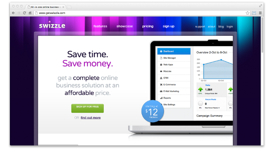
Swizzle (www.getswizzle.com) is an online service and design studio based in Canada. Their website is built on Foundation. The following screenshot shows how it is displayed in the large viewport size:

Swizzle used a different way to deliver their navigation in a smaller viewport. Rather than expanding the menu as Bootstrap does, Swizzle replaces the menu navigation with a MENU link that refers to the navigation at the footer.

The cons
Using a framework also comes with its own problems. The most common problems found when adopting a framework are as follows:
- Excessive codes: Since a framework is likely to be used widely, it needs to cover every design scenario, and so it also comes with extra styles that you might not need for your website. Surely, you can sort out the styles and remove them, but this process, depending on the framework, could take a lot of time and could also be a painful task.
- Learning curve: The first time, it is likely that you will need to spend some time to learn how the framework works, including examining the CSS classes, the ID, and the names, and structuring HTML properly. But, this probably will only happen in your first try and won't be an issue once you are familiar with the framework.
- Less flexibility: A framework comes with almost everything set up, including the grid width, button styles, and border radius, and follows the standard of its developers. If things don't work the way we want them to, changing it could take a lot of time, and if it is not done properly, it could ruin all other code structure.
TOther designers may also have particular issues regarding using a framework; you can further follow the discussion on this matter at http://stackoverflow.com/questions/203069/ what-is-the-best-css-framework-and-are-they-worth-the-effort. The CSS Trick forum has also opened a similar thread on this topic at http://css-tricks.com/forums/discussion/11904/css-frameworks-the-pros-and-cons/p1.
Summary
In this article we discussed some basic things about Responsive Web Design framework.
Resources for Article :
Further resources on this subject:
 United States
 Great Britain
 India
India
 Germany
 France
 Canada
 Russia
 Spain
Spain
 Brazil
 Australia
 Singapore
 Canary Islands
 Hungary
 Ukraine
 Luxembourg
 Estonia
 Lithuania
 South Korea
 Turkey
 Switzerland
 Colombia
 Taiwan
 Chile
Chile
 Norway
 Ecuador
 Indonesia
 New Zealand
 Cyprus
 Denmark
 Finland
 Poland
 Malta
Malta
 Czechia
 Austria
 Sweden
 Italy
Italy
 Egypt
Egypt
 Belgium
 Portugal
 Slovenia
 Ireland
 Romania
 Greece
 Argentina
 Netherlands
 Bulgaria
 Latvia
 South Africa
 Malaysia
 Japan
Japan
 Slovakia
 Philippines
 Mexico
 Thailand


