
Web applications typically provide autocomplete input fields when there are too many choices to select from. Autocomplete fields are like text input fields—as users start typing, they are given a smaller list of choices based on what they’ve typed. Once the user is ready to make a selection, the actual input is filled with components called Chips—especially relevant when the user needs to be able to make multiple selections.
In this article, we will start by building an Autocomplete component. Then we will move on to implementing multi-value selection and see how to better serve the autocomplete data through an API. To help our users better understand the results we will also implement a feature that highlights the matched portion of the string value.
Building an Autocomplete component

Material-UI doesn’t actually come with an Autocomplete component. The reason is that, since there are so many different implementations of autocomplete selection components in the React ecosystem already, it doesn’t make sense to provide another one. Instead, you can pick an existing implementation and augment it with Material-UI components so that it can integrate nicely with your Material-UI application.
How to do it?
You can use the Select component from the react-select package to provide the autocomplete functionality that you need. You can use Select properties to replace key autocomplete components with Material-UI components so that the autocomplete matches the look and feel of the rest of your app.
Let’s make a reusable Autocomplete component. The Select component allows you to replace certain aspects of the autocomplete experience. In particular, the following are the components that you’ll be replacing:
- Control: The text input component to use
- Menu: A menu with suggestions, displayed when the user starts typing
- NoOptionsMessage: The message that’s displayed when there aren’t any suggestions to display
- Option: The component used for each suggestion in Menu
- Placeholder: The placeholder text component for the text input
- SingleValue: The component for showing a value once it’s selected
- ValueContainer: The component that wraps SingleValue
- IndicatorSeparator: Separates buttons on the right side of the autocomplete
- ClearIndicator: The component used for the button that clears the current value
- DropdownIndicator: The component used for the button that shows Menu
Each of these components is replaced with Material-UI components that change the look and feel of the autocomplete. Moreover, you’ll have all of this as new Autocomplete components that you can reuse throughout your app.
Let’s look at the result before diving into the implementation of each replacement component. Following is what you’ll see when the screen first loads:

If you click on the down arrow, you’ll see a menu with all the values, as follows:

Try typing tor into the autocomplete text field, as follows:

If you make a selection, the menu is closed and the text field is populated with the selected value, as follows:

You can change your selection by opening the menu and selecting another value, or you can clear the selection by clicking on the clear button to the right of the text.
How does it work?
Let’s break down the source by looking at the individual components that make up the Autocomplete component and replacing pieces of the Select component. Then, we’ll look at the final Autocomplete component.
Text input control
Here’s the source for the Control component:
const inputComponent = ({ inputRef, ...props }) => (
  <div ref={inputRef} {...props} />
);

const Control = props => (
  <TextField
    fullWidth
    InputProps={{
      inputComponent,
      inputProps: {
        className: props.selectProps.classes.input,
        inputRef: props.innerRef,
        children: props.children,
        ...props.innerProps
      }
    }}
    {...props.selectProps.textFieldProps}
  />
);
The inputComponent() function is a component that passes the inputRef value—a reference to the underlying input element—to the ref prop. Then, inputComponent is passed to InputProps to set the input component used by TextField. This component is a little bit confusing because it’s passing references around and it uses a helper component for this purpose. The important thing to remember is that the job of Control is to set up the Select component to use a Material-UITextField component.
Options menu
Here’s the component that displays the autocomplete options when the user starts typing or clicks on the down arrow:
const Menu = props => (
  <Paper
    square
    className={props.selectProps.classes.paper}
    {...props.innerProps}
  >
    {props.children}
  </Paper>
);
The Menu component renders a Material-UI Paper component so that the element surrounding the options is themed accordingly.
No options available
Here’s the NoOptionsMessage component. It is rendered when there aren’t any autocomplete options to display, as follows:
const NoOptionsMessage = props => (
  <Typography
    color="textSecondary"
    className={props.selectProps.classes.noOptionsMessage}
    {...props.innerProps}
  >
    {props.children}
  </Typography>
);
This renders a Typography component with textSecondary as the color property value.
Individual option
Individual options that are displayed in the autocomplete menu are rendered using the MenuItem component, as follows:
const Option = props => (
  <MenuItem
    buttonRef={props.innerRef}
    selected={props.isFocused}
    component="div"
    style={{
      fontWeight: props.isSelected ? 500 : 400
    }}
    {...props.innerProps}
  >
    {props.children}
  </MenuItem>
);
The selected and style properties alter the way that the item is displayed, based on the isSelected and isFocused properties. The children property sets the value of the item.
Placeholder text
The Placeholder text of the Autocomplete component is shown before the user types anything or makes a selection, as follows:
const Placeholder = props => (
  <Typography
    color="textSecondary"
    className={props.selectProps.classes.placeholder}
    {...props.innerProps}
  >
    {props.children}
  </Typography>
);
The Material-UI Typography component is used to theme the Placeholder text.
SingleValue
Once again, the Material-UI Typography component is used to render the selected value from the menu within the autocomplete input, as follows:
const SingleValue = props => (
  <Typography
    className={props.selectProps.classes.singleValue}
    {...props.innerProps}
  >
    {props.children}
  </Typography>
);
ValueContainer
The ValueContainer component is used to wrap the SingleValue component with a div and the valueContainer CSS class, as follows:
const ValueContainer = props => (
  <div className={props.selectProps.classes.valueContainer}>
    {props.children}
  </div>
);
IndicatorSeparator
By default, the Select component uses a pipe character as a separator between the buttons on the right side of the autocomplete menu. Since they’re going to be replaced by Material-UI button components, this separator is no longer necessary, as follows:
const IndicatorSeparator = () => null;
By having the component return null, nothing is rendered.
Clear option indicator
This button is used to clear any selection made previously by the user, as follows:
const ClearIndicator = props => (
  <IconButton {...props.innerProps}>
    <CancelIcon />
  </IconButton>
);
The purpose of this component is to use the Material-UI IconButton component and to render a Material-UI icon. The click handler is passed in through innerProps.
Show menu indicator
Just like the ClearIndicator component, the DropdownIndicator component replaces the button used to show the autocomplete menu with an icon from Material-UI, as follows:
const DropdownIndicator = props => (
  <IconButton {...props.innerProps}>
    <ArrowDropDownIcon />
  </IconButton>
);
Styles
Here are the styles used by the various sub-components of the autocomplete:
const useStyles = makeStyles(theme => ({
  root: {
    flexGrow: 1,
    height: 250
  },
  input: {
    display: 'flex',
    padding: 0
  },
  valueContainer: {
    display: 'flex',
    flexWrap: 'wrap',
    flex: 1,
    alignItems: 'center',
    overflow: 'hidden'
  },
  noOptionsMessage: {
    padding: `${theme.spacing(1)}px ${theme.spacing(2)}px`
  },
  singleValue: {
    fontSize: 16
  },
  placeholder: {
    position: 'absolute',
    left: 2,
    fontSize: 16
  },
  paper: {
    position: 'absolute',
    zIndex: 1,
    marginTop: theme.spacing(1),
    left: 0,
    right: 0
  }
}));
The Autocomplete
Finally, following is the Autocomplete component that you can reuse throughout your application:
Autocomplete.defaultProps = {
  isClearable: true,
  components: {
    Control,
    Menu,
    NoOptionsMessage,
    Option,
    Placeholder,
    SingleValue,
    ValueContainer,
    IndicatorSeparator,
    ClearIndicator,
    DropdownIndicator
  },
  options: [
    { label: 'Boston Bruins', value: 'BOS' },
    { label: 'Buffalo Sabres', value: 'BUF' },
    { label: 'Detroit Red Wings', value: 'DET' },
    { label: 'Florida Panthers', value: 'FLA' },
    { label: 'Montreal Canadiens', value: 'MTL' },
    { label: 'Ottawa Senators', value: 'OTT' },
    { label: 'Tampa Bay Lightning', value: 'TBL' },
    { label: 'Toronto Maple Leafs', value: 'TOR' },
    { label: 'Carolina Hurricanes', value: 'CAR' },
    { label: 'Columbus Blue Jackets', value: 'CBJ' },
    { label: 'New Jersey Devils', value: 'NJD' },
    { label: 'New York Islanders', value: 'NYI' },
    { label: 'New York Rangers', value: 'NYR' },
    { label: 'Philadelphia Flyers', value: 'PHI' },
    { label: 'Pittsburgh Penguins', value: 'PIT' },
    { label: 'Washington Capitals', value: 'WSH' },
    { label: 'Chicago Blackhawks', value: 'CHI' },
    { label: 'Colorado Avalanche', value: 'COL' },
    { label: 'Dallas Stars', value: 'DAL' },
    { label: 'Minnesota Wild', value: 'MIN' },
    { label: 'Nashville Predators', value: 'NSH' },
    { label: 'St. Louis Blues', value: 'STL' },
    { label: 'Winnipeg Jets', value: 'WPG' },
    { label: 'Anaheim Ducks', value: 'ANA' },
    { label: 'Arizona Coyotes', value: 'ARI' },
    { label: 'Calgary Flames', value: 'CGY' },
    { label: 'Edmonton Oilers', value: 'EDM' },
    { label: 'Los Angeles Kings', value: 'LAK' },
    { label: 'San Jose Sharks', value: 'SJS' },
    { label: 'Vancouver Canucks', value: 'VAN' },
    { label: 'Vegas Golden Knights', value: 'VGK' }
  ]
};
The piece that ties all of the previous components together is the components property that’s passed to Select. This is actually set as a default property in Autocomplete, so it can be further overridden. The value passed to components is a simple object that maps the component name to its implementation.
Selecting autocomplete suggestions
In the previous section, you built an Autocomplete component capable of selecting a single value. Sometimes, you need the ability to select multiple values from an Autocomplete component. The good news is that, with a few small additions, the component that you created in the previous section already does most of the work.
How to do it?
Let’s walk through the additions that need to be made in order to support multi-value selection in the Autocomplete component, starting with the new MultiValue component, as follows:
const MultiValue = props => (
  <Chip
    tabIndex={-1}
    label={props.children}
    className={clsx(props.selectProps.classes.chip, {
      [props.selectProps.classes.chipFocused]: props.isFocused
    })}
    onDelete={props.removeProps.onClick}
    deleteIcon={<CancelIcon {...props.removeProps} />}
  />
);
The MultiValue component uses the Material-UI Chip component to render a selected value. In order to pass MultiValue to Select, add it to the components object that’s passed to Select:
components: {
  Control,
  Menu,
  NoOptionsMessage,
  Option,
  Placeholder,
  SingleValue,
  MultiValue,
  ValueContainer,
  IndicatorSeparator,
  ClearIndicator,
  DropdownIndicator
},
Now you can use your Autocomplete component for single value selection, or for multi-value selection. You can add the isMulti property with a default value of true to defaultProps, as follows:
isMulti: true,
Now, you should be able to select multiple values from the autocomplete.
How does it work?
Nothing looks different about the autocomplete when it’s first rendered, or when you show the menu. When you make a selection, the Chip component is used to display the value. Chips are ideal for displaying small pieces of information like this. Furthermore, the close button integrates nicely with it, making it easy for the user to remove individual selections after they’ve been made.
Here’s what the autocomplete looks like after multiple selections have been made:

API-driven Autocomplete
You can’t always have your autocomplete data ready to render on the initial page load. Imagine trying to load hundreds or thousands of items before the user can interact with anything. The better approach is to keep the data on the server and supply an API endpoint with the autocomplete text as the user types. Then you only need to load a smaller set of data returned by the API.
How to do it?
Let’s rework the example from the previous section. We’ll keep all of the same autocomplete functionality, except that, instead of passing an array to the options property, we’ll pass in an API function that returns a Promise. Here’s the API function that mocks an API call that resolves a Promise:
const someAPI = searchText =>
  new Promise(resolve => {
    setTimeout(() => {
      const teams = [
        { label: 'Boston Bruins', value: 'BOS' },
        { label: 'Buffalo Sabres', value: 'BUF' },
        { label: 'Detroit Red Wings', value: 'DET' },
        ...
      ];

      resolve(
        teams.filter(
          team =>
            searchText &&
            team.label
              .toLowerCase()
              .includes(searchText.toLowerCase())
        )
      );
    }, 1000);
  });
This function takes a search string argument and returns a Promise. The same data that would otherwise be passed to the Select component in the options property is filtered here instead. Think of anything that happens in this function as happening behind an API in a real app. The returned Promise is then resolved with an array of matching items following a simulated latency of one second.
You also need to add a couple of components to the composition of the Select component (we’re up to 13 now!), as follows:
const LoadingIndicator = () => <CircularProgress size={20} />;
const LoadingMessage = props => (
  <Typography
    color="textSecondary"
    className={props.selectProps.classes.noOptionsMessage}
    {...props.innerProps}
  >
    {props.children}
  </Typography>
);
The LoadingIndicator component is shown on the right the autocomplete text input. It’s using the CircularProgress component from Material-UI to indicate that the autocomplete is doing something. The LoadingMessage component follows the same pattern as the other text replacement components used with Select in this example. The loading text is displayed when the menu is shown, but the Promise that resolves the options is still pending.
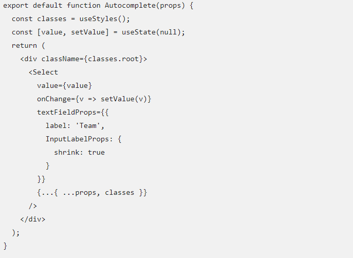
Lastly, there’s the Select component. Instead of using Select, you need to use the AsyncSelect version, as follows:
import AsyncSelect from 'react-select/lib/Async';
Otherwise, AsyncSelect works the same as Select, as follows:
<AsyncSelect
  value={value}
  onChange={value => setValue(value)}
  textFieldProps={{
    label: 'Team',
    InputLabelProps: {
      shrink: true
    }
  }}
  {...{ ...props, classes }}
/>
How does it work?
The only difference between a Select autocomplete and an AsyncSelect autocomplete is what happens while the request to the API is pending. Here is what the autocomplete looks like while this is happening:

As the user types the CircularProgress component is rendered to the right, while the loading message is rendered in the menu using a Typography component.
Highlighting search results
When the user starts typing in an autocomplete and the results are displayed in the dropdown, it isn’t always obvious how a given item matches the search criteria. You can help your users better understand the results by highlighting the matched portion of the string value.
How to do it?
You’ll want to use two functions from the autosuggest-highlight package to help highlight the text presented in the autocomplete dropdown, as follows:
import match from 'autosuggest-highlight/match';
import parse from 'autosuggest-highlight/parse';
Now, you can build a new component that will render the item text, highlighting as and when necessary, as follows:
const ValueLabel = ({ label, search }) => {
  const matches = match(label, search);
  const parts = parse(label, matches);
  return parts.map((part, index) =>
    part.highlight ? (
      <span key={index} style={{ fontWeight: 500 }}>
        {part.text}
      </span>
    ) : (
      <span key={index}>{part.text}</span>
    )
  );
};
The end result is that ValueLabel renders an array of span elements, determined by the parse() and match() functions. One of the spans will be bolded if part.highlight is true. Now, you can use ValueLabel in the Option component, as follows:
const Option = props => (
  <MenuItem
    buttonRef={props.innerRef}
    selected={props.isFocused}
    component="div"
    style={{
      fontWeight: props.isSelected ? 500 : 400
    }}
    {...props.innerProps}
  >
    <ValueLabel
      label={props.children}
      search={props.selectProps.inputValue}
    />
  </MenuItem>
);
How does it work?
Now, when you search for values in the autocomplete text input, the results will highlight the search criteria in each item, as follows:

This article helped you implement autocompletion in your Material UI React application. Then we implemented multi-value selection and saw how to better serve the autocomplete data through an API endpoint.
If you found this post useful, do check out the book, React Material-UI Cookbook by Adam Boduch. This book will help you build modern-day applications by implementing Material Design principles in React applications using Material-UI.
Read Next
How to create a native mobile app with React Native [Tutorial]
Reactive programming in Swift with RxSwift and RxCocoa [Tutorial]