


In this article by Sudheer Jonna and Oleg Varaksin, the author of the book Learning Angular UI Development with PrimeNG, we will see how to work with the chart model and learn about draggable and droppable directives.
(For more resources related to this topic, see here.)
Working with the chart model
The chart component provides a visual representation of data using chart on a web page. PrimeNG chart components are based on charts.js 2.x library (as a dependency), which is a HTML5 open source library. The chart model is based on UIChart class name and it can be represented with element name as p-chart.
The chart components will work efficiently by attaching the chart model file (chart.js) to the project root folder entry point. For example, in this case it would be index.html file. It can be configured as either CDN resource, local resource, or CLI configuration.
- CDN resource configuration:
<script src="https://cdnjs.cloudflare.com/ajax/libs/Chart.js/2.5.0/Chart.bu ndle.min.js"></script> - Angular CLI configuration:
"scripts": [ "../node_modules/chart.js/dist/Chart.js", //..others
]
More about the chart configuration and options will be available in the official documentation of the chartJS library (http://www.chartjs.org/).
Chart types
The chart type is defined through the type property. It supports six types of charts with an options such as pie, bar, line, doughnut, polarArea, and radar. Each type has it’s own format of data and it can be supplied through the data property.
For example, in doughnut chart, the type should refer to doughnut and the data property should bind to the data options as shown here:
<p-chart type="doughnut" [data]="doughnutdata"></p-chart>The component class has to define data the options with labels and datasets as follows:
this.doughnutdata = {
labels: ['PrimeNG', 'PrimeUI', 'PrimeReact'],
datasets: [
{
data: [3000, 1000, 2000],
backgroundColor: [
"#6544a9",
"#51cc00",
"#5d4361"
],
hoverBackgroundColor: [
"#6544a9",
"#51cc00",
"#5d4361"
]
}
]
};
Along with labels and data options, other properties related to skinning can be applied too.
The legends are closable by default (that is, if you want to visualize only particular data variants then it is possible by collapsing legends which are not required). The collapsed legend is represented with a strike line. The respective data component will be disappeared after click operation on legend.
Customization
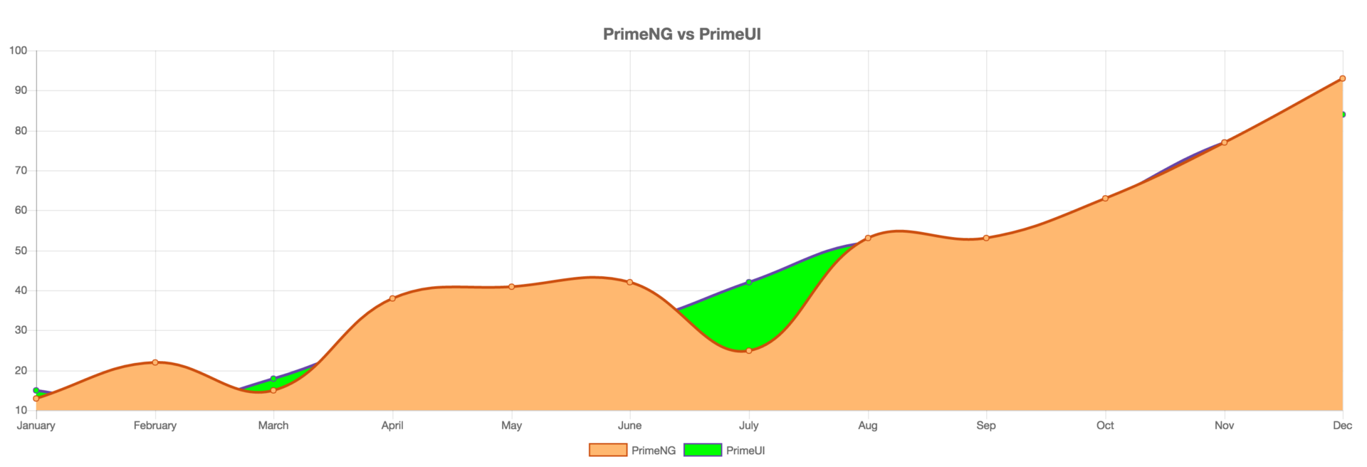
Each series is customized on a dataset basis but you can customize the general or common options via the options attribute. For example, the line chart which customize the default options would be as follows:
<p-chart type="line" [data]="linedata" [options]="options"></p-chart>The component class needs to define chart options with customized title and legend properties as follows:
this.options = {
title: {
display: true,
text: 'PrimeNG vs PrimeUI',
fontSize: 16
},
legend: {
position: 'bottom'
}
};
As per the preceding example, the title option is customized with a dynamic title, font size, and conditional display of the title. Where as legend attribute is used to place the legend in top, left, bottom, and right positions. The default legend position is top. In this example, the legend position is bottom.
The line chart with preceding customized options would results as a snapshot shown here:
The Chart API also supports the couple of utility methods as shown here:
| refresh | Redraws the graph with new data |
| reinit | Destroys the existing graph and then creates it again |
| generateLegend | Returns an HTML string of a legend for that chart |
Events
The chart component provides a click event on data sets to process the select data using onDataSelect event callback.
Let us take a line chart example with onDataSelect event callback by passing an event object as follows:
<p-chart type="line" [data]="linedata"
(onDataSelect)="selectData($event)"></p-chart>
In the component class, an event callback is used to display selected data information in a message format as shown:
selectData(event: any) {
this.msgs = [];
this.msgs.push({
severity: 'info',
summary: 'Data Selected',
'detail':
this.linedata.datasets[event.element._datasetIndex]
.data[event.element._index]
});
}
In the preceding event callback (onDataSelect), we used an index of the dataset to display information. There are also many other options from an event object:
- event.element = Selected element
- event.dataset = Selected dataset
- event.element._datasetIndex = Index of the dataset in data
- event.element._index = Index of the data in dataset
Learning Draggable and Droppable directives
Drag and drop is an action, which means grabbing an object and dragging it to a different location. The components capable of being dragged and dropped enrich the web and make a solid base for modern UI patterns. The drag and drop utilities in PrimeNG allow us to create draggable and droppable user interfaces efficiently. They make it abstract for the developers to deal with the implementation details at the browser level.
In this section, we will learn about pDraggable and pDroppable directives. We will introduce a DataGrid component containing some imaginary documents and make these documents draggable in order to drop them onto a recycle bin. The recycle bin is implemented as DataTable component which shows properties of dropped documents. For the purpose of better understanding the developed code, a picture comes first:
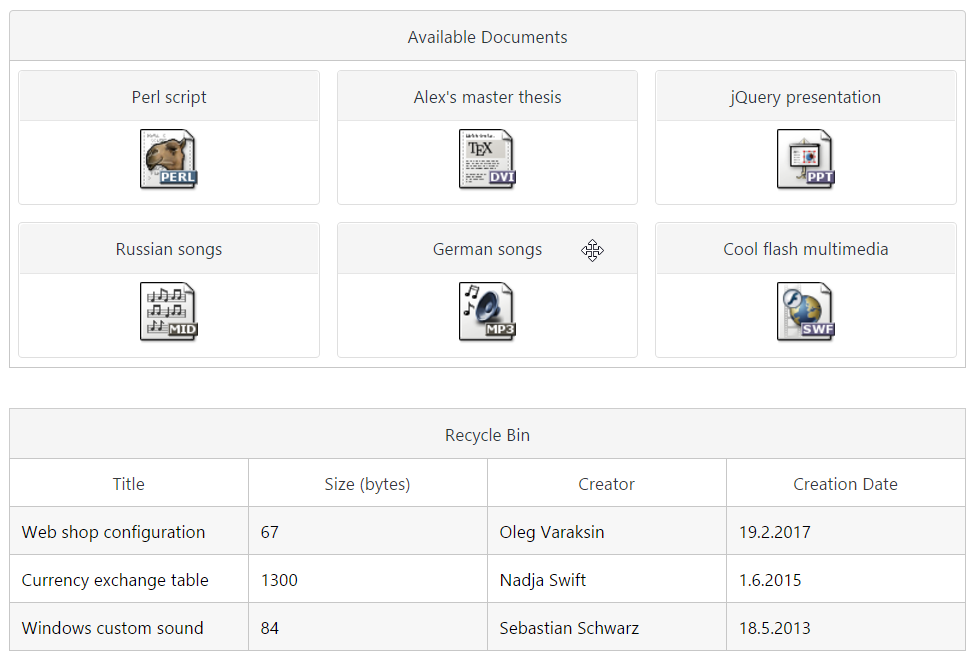
This picture shows what happens after dragging and dropping three documents.
The complete demo application with instructions is available on GitHub at
https://github.com/ova2/angular-development-with-primeng/tree/master/chapter9/dragdrop.
Draggable
pDraggable is attached to an element to add a drag behavior. The value of the pDraggable attribute is required–it defines the scope to match draggables with droppables. By default, the whole element is draggable. We can restrict the draggable area by applying the dragHandle attribute. The value of dragHandle can be any CSS selector. In the DataGrid with available documents, we only made the panel’s header draggable:
<p-dataGrid [value]="availableDocs">
<p-header>
Available Documents
</p-header>
<ng-template let-doc pTemplate="item">
<div class="ui-g-12 ui-md-4" pDraggable="docs" dragHandle=".uipanel-
titlebar"
dragEffect="move" (onDragStart)="dragStart($event, doc)"
(onDragEnd)="dragEnd($event)">
<p-panel [header]="doc.title" [style]="{'text-align':'center'}">
<img src="/assets/data/images/docs/{{doc.extension}}.png">
</p-panel>
</div>
</ng-template>
</p-dataGrid>
The draggable element can fire three events when dragging process begins, proceeds, and ends. These are onDragStart, onDrag, and onDragEnd respectively. In the component class, we buffer the dragged document at the beginning and reset it at the end of the dragging process. This task is done in two callbacks: dragStart and dragEnd.
class DragDropComponent {
availableDocs: Document[];
deletedDocs: Document[];
draggedDoc: Document;
constructor(private docService: DocumentService) { }
ngOnInit() {
this.deletedDocs = [];
this.docService.getDocuments().subscribe((docs: Document[]) =>
this.availableDocs = docs);
}
dragStart(event: any, doc: Document) {
this.draggedDoc = doc;
}
dragEnd(event: any) {
this.draggedDoc = null;
}
...
}
In the shown code, we used the Document interface with the following properties:
interface Document {
id: string;
title: string;
size: number;
creator: string;
creationDate: Date;
extension: string;
}
In the demo application, we set the cursor to move when the mouse is moved over any panel’s header. This trick provides a better visual feedback for draggable area:
body .ui-panel .ui-panel-titlebar {
cursor: move;
}
We can also set the dragEffect attribute to specifies the effect that is allowed for a drag operation. Possible values are none, copy, move, link, copyMove, copyLink, linkMove, and all. Refer the official documentation to read more details at https://developer.mozilla.org/en-US/docs/Web/API/DataTransfer/effectAllowed.
Droppable
pDroppable is attached to an element to add a drop behavior. The value of the pDroppable attribute should have the same scope as pDraggable.
Droppable scope can also be an array to accept multiple droppables.
The droppable element can fire four events.
| Event name | Description |
| onDragEnter | Invoked when a draggable element enters the drop area |
| onDragOver | Invoked when a draggable element is being dragged over the drop area |
| onDrop | Invoked when a draggable is dropped onto the drop area |
| onDragLeave | Invoked when a draggable element leaves the drop area |
In the demo application, the whole code of the droppable area looks as follows:
<div pDroppable="docs" (onDrop)="drop($event)" [ngClass]="{'dragged-doc':
draggedDoc}">
<p-dataTable [value]="deletedDocs">
<p-header>Recycle Bin</p-header>
<p-column field="title" header="Title"></p-column>
<p-column field="size" header="Size (bytes)"></p-column>
<p-column field="creator" header="Creator"></p-column>
<p-column field="creationDate" header="Creation Date">
<ng-template let-col let-doc="rowData" pTemplate="body">
{{doc[col.field].toLocaleDateString()}}
</ng-template>
</p-column>
</p-dataTable>
</div>
Whenever a document is being dragged and dropped into the recycle bin, the dropped document is removed from the list of all available documents and added to the list of deleted documents. This happens in the onDrop callback:
drop(event: any) {
if (this.draggedDoc) {
// add draggable element to the deleted documents list
this.deletedDocs = [...this.deletedDocs, this.draggedDoc];
// remove draggable element from the available documents list
this.availableDocs = this.availableDocs.filter((e: Document) =>
e.id !== this.draggedDoc.id);
this.draggedDoc = null;
}
}
Both available and deleted documents are updated by creating new arrays instead of manipulating existing arrays. This is necessary in data iteration components to force Angular run change detection. Manipulating existing arrays would not run change detection and the UI would not be updated.
The Recycle Bin area gets a red border while dragging any panel with document. We have achieved this highlighting by setting ngClass as follows: [ngClass]="{'dragged-doc': draggedDoc}". The style class dragged-doc is enabled when the draggedDoc object is set. The style class is defined as follows:
.dragged-doc {
border: solid 2px red;
}
Summary
Initially we started with chart components. At first we started with chart Model API and then will learn how to create charts programmatically using various chart types such as pie, bar, line, doughnut, polar and radar charts.
We also learned features of Draggable and Droppable.
Resources for Article:
Further resources on this subject:
- Building Components Using Angular [article]
- Get Familiar with Angular [article]
- Writing a Blog Application with Node.js and AngularJS [article]


