The Best Way to Create Round Cornered Boxes with CSS
Read more
The Best Way to Create Round Cornered Boxes with CSS
Packt
300 min read
2010-03-19 00:00:00
0 Likes
0 Comments
The best way to create round cornered boxes with CSS.
Boxes with round corners have become synonymous with WEB 2.0 and the future of website design. Forget AJAX, don’t worry about SEO, put content on the back burner, what really excites people is nice rounded boxes. Why is this so? I’ll tell you why…
When website layout was done purely with nested tables, creating a box of content with curved corners was tricky. Not impossible, but perhaps more effort than could be justified (or charged for). Using tables, the curved box would be sliced and diced into many smaller images with a top-left corner image, a top-right corner image and so on until you had a perfectly rectangular space in the middle of the clutter of tiny images where the content would sit. It would be at this point that the client would ask for corners with a larger radius, or in a slightly different shade and the whole image slicing would start again. And don’t even talk about drop shadows.
CSS did bring some relief from the slicing of images. With CSS you can assign a whole image as a background to an area of content, and position the content nicely on top of it. The background image could of course be an image of a box with rounded corners. Perfect? Well not quite. If you had fixed size content then a fixed size background image would be fine, but content never stays the same for long. Words are altered, font sizes are changed and before you know it the content exceeds the length of the beautifully rounded box it is sitting on. Yuck.
There have been some inspired, yet ridiculous methods of overcoming the problems of changing content size within a rounded box, some of which create the corners with client-side code, adding a new DIV to the DOM for every pixel in a mathematically calculated corner. Clever? Yes. Bloated, slow and somewhat ridiculous? Yes to that too.
What is needed is the neatest, fastest, most flexible way of creating rounded boxes that can hold varying amounts of content. And this is where I offer my most elegant of solutions.
To achieve such simplicity and elegance there is one small prerequisite, and that is that our box is of fixed width. This is no great trouble because it is very sensible to allow boxes to grow vertically rather than horizontally. Columns and vertical scrolling are good practice. Rows and horizontal scrolling are a big no no.
And so to the method of creating the easiest and most efficient rounded boxes.
Step 1
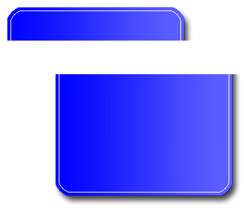
In Photoshop or your favourite graphics editing package, create the round cornered box you need making it the exact required width and any average height. You should now have an image that looks like figure (a). Notice the shading and drop shadow too.
Figure (a)
Step 2
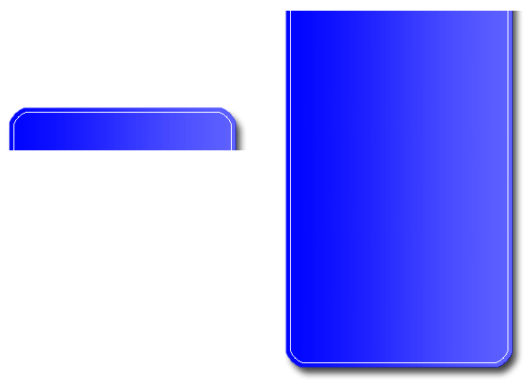
Divide the image into 2 parts, a top and a bottom, making the top part as tall as any title line you way want to add to the box. Your 2 images will look like figure (b).
Figure (b)
Unlock access to the largest independent learning library in Tech for FREE!
Get unlimited access to 7500+ expert-authored eBooks and video courses covering every tech area you can think of.
Renews at $19.99/month. Cancel anytime
Step 3
Increase the canvas size of the bottom portion of the box to a large value making sure it is tall enough to cope with any content it may need to hold. Don’t worry that the bottom image looks far larger than you will need most of the time. Your 2 images will now look like figure (c).
Figure (c)
That’s all there is to do on the graphics side, now on to the CSS.
On your webpage add this HTML:
{literal}
<div id=box1> <div class=boxtop> <div class=topcontent>My First Box</div> </div> <div class=boxbottom> <div class=maincontent>With some content</div> </div> </div>
And to your CSS file add these definitions, obviously changing style parameters to suit your requirements:
.boxtop{ /*make this the same size as the top image*/ display:block; width:267px; height:48px; /*set the image as a background*/ background-position:left top; background-repeat:no-repeat; background-image:url(images/top.gif); } .topcontent{ /*set the font style for the box title*/ font-family:arial; font-size:16pt; color:white; /*shift the title down a bit and center it*/ padding-top:10px; text-align:center; } .boxbottom{ /*make this the same width as the bottom image*/ /*don’t set the height as this needs to be flexible*/ display:block; width:267px; /*set the image as a background*/ background-position:left bottom; background-repeat:no-repeat; background-image:url(images/bottom.gif); } .maincontent{ /*set the font style for the main content*/ color:white; font-family:arial; font-size:12pt; display:block; /*align the main content nicely*/ padding-left:20px; padding-bottom:40px; padding-right:30px; }
{/literal}
Incredibly, that’s all there is to it. You now have a rounded box with shading and a drop shadow that only uses 2 images and a small amount of CSS, and the whole thing is wonderfully cross-browser compatible.
To see the final effect take a look at this page here www.eveshamsolutions.co.uk/cornersdemo.html. Feel free to view the source code and pinch the images to play with. If you use this technique don't forget to mention where you found it, if only in the source code :-)

 United States
 Great Britain
 India
India
 Germany
 France
 Canada
 Russia
 Spain
Spain
 Brazil
 Australia
 Singapore
 Canary Islands
 Hungary
 Ukraine
 Luxembourg
 Estonia
 Lithuania
 South Korea
 Turkey
 Switzerland
 Colombia
 Taiwan
 Chile
Chile
 Norway
 Ecuador
 Indonesia
 New Zealand
 Cyprus
 Denmark
 Finland
 Poland
 Malta
Malta
 Czechia
 Austria
 Sweden
 Italy
Italy
 Egypt
Egypt
 Belgium
 Portugal
 Slovenia
 Ireland
 Romania
 Greece
 Argentina
 Netherlands
 Bulgaria
 Latvia
 South Africa
 Malaysia
 Japan
Japan
 Slovakia
 Philippines
 Mexico
 Thailand


