Bar reports is the most sophisticated built-in data visualization tool in the Zabbix frontend. As such, they are also quite intimidating, thus we will create a couple of reports with all three different bar report types.
Bar reports provide more customization options, but they can also take a lot of time to set up. Let's see what reports are available at Reports | Bar reports—see the Reports dropdown at the upper-right corner.
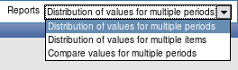
As we can see, three report types are available, but it's not trivial to guess by their names which is useful in which situation, so we'll try to apply each of them.
Distribution of values for multiple periods
This is the first report and there's no need to switch to another, so dismiss the dropdown by clicking in the Title textfield and enter Comparing network traffic there. Let's start by getting some output from the report—click on Add in the Items section. This opens the item configuration dialog, in which you should click the Select button next to the Parameter field. In the upcoming list, find the Incoming traffic on interface eth0 item next to A Test Host and click on it.
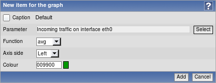
We won't change any other details, so click on Add. Getting a report as soon as possible was our main goal, right? Let's click on Show.
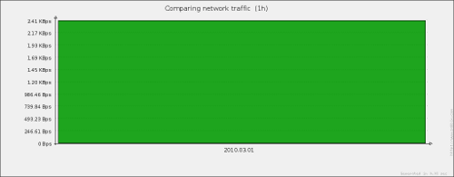
Now that's useless and ugly. There surely must be some way to make this report useful... Take a look at the Scale option—it is currently set to Weekly. If we compare that to the values in the Period section, they are set to one day, thus there's no wonder we got a single huge block. Looking at the Scale dropdown, we can see possible scales of hourly, daily, weekly, monthly, and yearly. Our displayed period is one day, so select Hourly in this dropdown, then click Show to refresh the report.
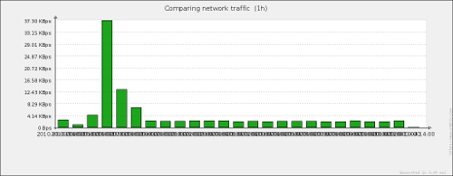
That's way better. Except maybe the x-axis labels... This again is a minor bug in Zabbix version 1.8.1. Now let's add another item—click Add in the Items section and again click on Select next to the Parameter field. Find the item Incoming traffic on interface eth0, but this time for Another Host, and click on it. Change the color for this item by clicking on the colored rectangle and choosing some shade of blue, then click Add. The report is immediately updated and now it looks more useful, we can compare amount of data transmitted for each hour for both hosts. Now, which host had which color? We should enable the legend here, mark the checkbox next to Legend title and click on Show. Let's look at the legend.
That's not helpful. As both items have the same name, they can't be distinguished in the legend—that has to be fixed. In the item list, click on the first item that has the green color chosen. Notice how this dialog looks very similar to the graph item configuration. We also have choice of axis, color, and function. But there's one additional feature, though—look at the first option, Caption. As we saw, the one inserted by default doesn't work that well here, so we will have to change it. Enter in the field A Test Host, then click Save. Now click on the bluish color item, and enter Another Host in that textfield, then click Save. What does the legend look like now?
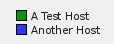
Wonderful, that can finally be used to figure out which entry belongs to which host. We can still improve this report a bit. Enter Hourly distribution in the X Label field and Incoming traffic in the Y Label field. The final result should look like this:
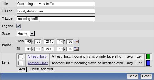
When you are done, click Show. Our report appears below with labels for axis added.
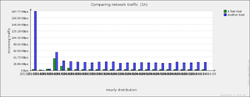
With the help of this report it is quite easy to spot busy hours (or days, or weeks, or months, or years depending on what period and scale you choose) or compare data from several items. This is especially useful with many items, as custom graphs become unreadable with many items. Of course, there are practical limits to how many items can be compared with this bar report, but they are still much easier to read than normal graphs. Ability to choose scale allows for a layout that's better suited to spot important information or make a point. As there are no limits to hosts that items come from, it's possible to create a report that examines several items from a single host or a single item from multiple hosts, or a mix of these in arbitrary combinations.
Distribution of values for multiple items
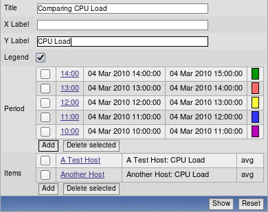
We found out what the first report does, and it's time to move to the second one. In the Reports dropdown select Distribution of values for multiple items. This report has a more simple form, at least it looks like that initially. Let's get to creating a new report—enter Comparing CPU Load in the Title field. Now we have to add periods and items. This will be confusing at first, but you'll get the idea when you see the result.
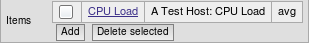
Let's start with adding some item. Click on Add in the Items section, then Select next to the Parameter field in the upcoming pop up. Choose CPU Load for A Test Host, then click Add. We should now have an item added like this:
Now is the time to move to the time periods. Our test installation probably doesn't have huge amounts of data gathered, so we'd be safer choosing smaller time periods like hours. Click on Add in the Period section, which opens period entering form. Now, set your current date in both date fields and set the latest passed full hour in the Till field time selection, and one hour before in the From field. If your current time is 14:50, that would mean you would use 14:00 for the Till field time value and 13:00 for the From field time value. It would look something like this:
Unlock access to the largest independent learning library in Tech for FREE!
Get unlimited access to 7500+ expert-authored eBooks and video courses covering every tech area you can think of.
Renews at $19.99/month. Cancel anytime
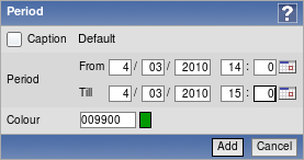
When you are done, click Add. We have to add more periods for this report, so click Add in the Period section again. In the period details form set current date just like before, and this time set one hour period just before the previously added period. If you previously added a period of 13:00-14:00, now add 12:00-13:00. Choose another color and click Add.
Now repeat this process three more times, each time setting the period one hour before and using a different color. Remember to use current date in both fields as well. Don't worry if you make a mistake. You can easily click any of the added periods and fix it. When you are finished, take a rest, then click Show button.
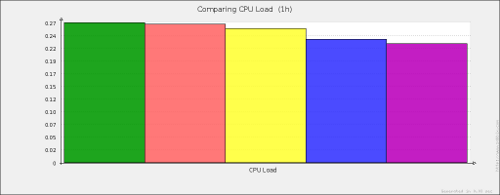
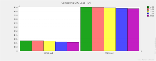
Oh shiny. While your output will look different depending on color choices and actual CPU loads, you'll notice how we can easily compare CPU loads for each defined time period. Sort of. We can observe here the same problem as with the previous report, we can't quite figure out which period is which, so mark checkbox next to the Legend title and click Show. Take a look at the legend.
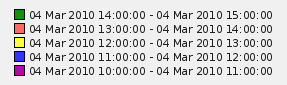
That helped, now we can see which time period each bar represents. The legend is somewhat too verbose though. We know this is a single date and that each period is one hour, so it would be enough if each legend entry would simply list the starting hour. As with the previous report, we can customize captions, so click on the first entry in the Period section. Enter the starting hour in the Caption field (the one in the From field) for this particular period, for example, 13:00, then click Update. Now for some tedious work, do the same with all other periods.

Now our legend is more readable and takes up considerably less space as well.
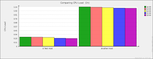
But we have only added a single item so far, let's add some more. Again, click on Add in the Items section and click on Select next to the Parameter field in the upcoming pop up. This time, choose CPU Load for Another Host, then click Add. The report is immediately updated and another block for the newly added item appears.
We can now see how the load compares during each period for each item (in this case, same item for different hosts). Oh, but we have again hit the same problem as before—the block titles are identical, so we don't even know which host is which. Luckily, for this report we can enter custom titles both for periods and for items. Click on the first item and enter A Test Host in the Caption field, then click Save. Click on the second item and enter Another Host in the Caption field, then click Save.
There is one more minor polish we could add; enter CPU Load in the Y Label textfield. The final configuration should look similar to this:
If it does, click Show. Our report appears with all the options set and seems to be quite readable.
While our test installation does not have that much data, this report is useful for large scale comparisons of data—for example, comparing data with periods spanning a year. Smaller periods can be useful to extract seasonal or other periodic patterns. For example, one could create a report with 12 periods, you guessed it,one for each month and observe how seasonal changes impact data. Such a report is much more readable than common graph.
We saw how this report looks like with single item, but would it also be useful with single period? Let's find out. Select all but one checkbox in the Period section and click the Delete selected button just below them.
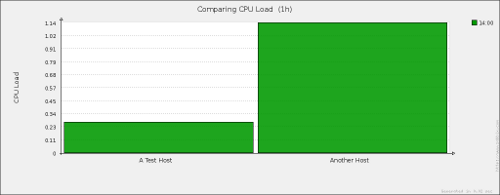
Well, those are huge blocks. But it should be clear now that single period configuration is also very useful. We could create a report on a compile farm, comparing the loads of all involved machines during some specific compilation job or compare the amount of Apache processes started on many web servers. Notice one more option appearing in report configuration, which you might have noticed disappear when we added second period—Sort by. We have a choice to sort either by name or by value. Name, obviously, will sort alphabetically, while value will sort by each item's value in ascending order. You'll be able to easily figure out which systems are overloaded and which are way too idle, for example.

 United States
 Great Britain
 India
India
 Germany
 France
 Canada
 Russia
 Spain
Spain
 Brazil
 Australia
 Singapore
 Canary Islands
 Hungary
 Ukraine
 Luxembourg
 Estonia
 Lithuania
 South Korea
 Turkey
 Switzerland
 Colombia
 Taiwan
 Chile
Chile
 Norway
 Ecuador
 Indonesia
 New Zealand
 Cyprus
 Denmark
 Finland
 Poland
 Malta
Malta
 Czechia
 Austria
 Sweden
 Italy
Italy
 Egypt
Egypt
 Belgium
 Portugal
 Slovenia
 Ireland
 Romania
 Greece
 Argentina
 Netherlands
 Bulgaria
 Latvia
 South Africa
 Malaysia
 Japan
Japan
 Slovakia
 Philippines
 Mexico
 Thailand