Conditions
When you incorporate conditional logic into your prototype, you save yourself from a great deal of overhead work. If you don't use conditional logic, you are limiting your ability to simulate conditional interactions in your prototype. Let's face it, we use logic all the time, even if the results are not always logical. Moreover, in computer science and interaction design, we must use conditional logic in order to accommodate variable situations and exceptions. Yet, there seems to be a general reluctance to deal with direct use of logic when it comes to using software. A good example is the so-called "advanced" search feature that most search engines, including Google, offer, and the reason why Google's concept of a single search field and no operators has become the standard search interface.
If-Then-Else
Programming languages employ a variety of syntaxes for creating and evaluating conditional statements. Axure simplifies things by using the very common syntax of If-Then-Else, which essentially looks like this:
- If A is true, then do X
- Else, if B is true then do Z
This kind of decision-making is very natural to UX designers because we use a similar logical approach to model task and interaction flows. When we create a conditional interaction, we reflect the flow's logic in the prototype. As it is best to learn by doing, let's dive into a quick example:
Sandbox files for learning and experimenting
Sometimes, the most effective way to figure things out is by experimentation. In the course of prototyping, you will find yourself wondering how some Axure feature works, or wanting to explore a new interaction. This is where the sandboxing technique can help: Create a blank new Axure file on your desktop, work through your explorations on this file, and then apply your learning to the project file. In the sandbox file, you don't have to worry about "breaking" any of your previous work and can focus instead just on the mechanics of the feature you are trying to figure out. The technique will also keep your production file clean and free of experimentation wireframes.
Guided example—conditions and dynamic panels
Axure makes it very easy to apply conditional logic to the prototype, as you will see in this example. We will use a "sandbox" file to explore the feature, and later, apply the learning to the Alexandria project file.
Step 1: Defining the interaction
Our goal is to change the state of a dynamic panel based on the user input. This is one of the most commonly used conditional logic interactions in the construction of Axure prototypes, and a great illustration of If-Then-Else.
In this simple example, the user selects a shape from a list of shapes and the appropriate shape appears. The first step is to define the desired interaction. Now that the conditional logic is involved, this is also the opportunity to spell out the logic:
- When: When the user changes the selection
- Where: A droplist widget
- What: Change the state of a dynamic panel to show the corresponding shape
- Conditions: On entry, the droplist should show the option "Select from List", and no shape should be visible
- If the user selects the value "Rectangle" from the droplist, show the rectangle state
- If the user selects the value "Triangle" from the droplist, show the triangle state
- If the user selects the value "Circle" from the droplist, show the circle state
- If the user selects the value "Select from List" from the droplist, hide the shapes
The logic here is simple, because each selection in the droplist has a corresponding dynamic panel state. We instruct Axure to evaluate which option is selected in the droplist, and then change the state of the dynamic panel accordingly.
Notice that the first sentence in the condition section specifies the entry state, in this case, the option "Select from List". This is the default state when the screen loads. When you plan interactions that involve conditions, always make sure you account for a default state of that UI control.
Step 2: Constructing Wireframe
We will start by preparing a sandbox environment. Create a blank directory on your desktop and label it Axure Sandbox. In this directory, create another directory named HTML—this is where we will generate the prototype. Finally, create a new Axure file named Sandbox and save it in the Axure Sandbox directory. The following screenshot illustrates the steps:
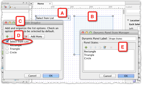
- From the Widgets pane, drag over a Droplist (A) and a Dynamic Panel (B) widget. Label them Droplist and Shape States, for example.
- Double-click on the droplist and in the Edit Droplist dialog (C), add the values specified in Step 1, and check Select from List to make it the default value (D).
- In the dynamic panel, create the states for the three corresponding shapes. This does not need to be an elaborate production. Make sure you label each of the states (E).
- Right-click on the dynamic panel and select Set Hidden from the context menu.
Step 3: Setting the first condition
When you start with interactions, having the flow pre-planned helps in creating the wireframe and in adding the interaction. Now that we covered both in Steps 1 and 2, we will set the conditional logic for the interaction. The following screenshot visualizes the process:
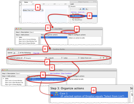
- With the droplist selected in the wireframe (A), switch to the Interactions tab in the Widgets Properties pane, and double-click on the OnChange event (B) to launch Case Editor (C).
- Before clicking on Case 1, we want to create the conditions. Click on the Add Condition link (D) to launch the Condition Builder window (E).
- We will discuss Condition Builder later in this article, but for now, notice that the first condition row already appears in the builder. It is contextual to the selected widget, and is structured like an equation: "The selected option of droplist equals the value Select from List." (F). As this is one of the conditions that needs to be evaluated, each time the user changes a value in the droplist, we can use it as is. Click on OK to close the builder.
- Back in Case Editor (C), notice that the condition has been added to Case 1, and Axure presents it in a human-friendly way: If selected option of Droplist equals "Select from List" (G).
Step 4: Adding the first interaction
Now we need to instruct Axure about the action to apply when the condition we have just set is met. In this case, when the value of the droplist is "Select from List", the shapes should be hidden. As the shapes are in the dynamic panel widget, we want to hide that widget. Now, you might ask yourself, "Why hide the dynamic panel, if it is already hidden?"
When you create conditions, always make sure to account for ALL the possible cases that are applicable to the interaction.
It is true that in the wireframe, the dynamic panel is hidden by default. However, once the user selects a shape from the list, the dynamic panel will become visible, until the user changes the value in the droplist to "Select from List". Moreover, this is where the Set Hidden action will come into play. The following screenshot illustrates the process:
(Move the mouse over the image to enlarge.)
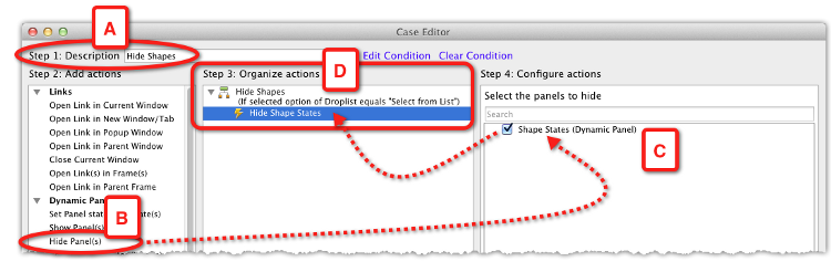
- First, label Case 1 to something meaningful such as Hide Shapes (A).
- Select the Hide Panel(s) action (B), and click to check the dynamic panel widget which is listed in the column Step 4: Configure actions (C).
- The complete interaction is now listed under the column Step 3: Organize actions (D).
Step 5: Completing the interaction
At this point, the interaction includes a single case, which handles a single condition. In order to complete the interaction, we need to capture additional cases when the user picks various shapes from the droplist. The following screenshot illustrates the first half of the process involved in adding the condition and interaction for the first shape:
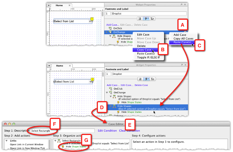
- As we are evaluating the selected option of the same widget, the only variable to check is the value of that option. This means we can use a shortcut: Right-click on the initial case created in Step 4 (A), select Copy Case (B), and then Paste Case(s) (C) from the context menu.
- Double-click on the new case (D) to open Case Editor (E), where the first things to do are to rename the case (F), and delete the Hide action (G).
Using one case as the starting point for another case is common. The following screenshot illustrates the process of tweaking the duplicate case to fit a new condition:
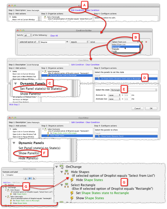
- In Case Editor, click on the Edit Condition link (A). All there is to do next is to change the copied selection from Select from List to Rectangle (B), and close the Condition Builder.
- Back in Case Editor, set the action to Set Panel state(s) to State(s) in the column Step 2: Add actions (C) and in the column Step 4: Configure actions (D), check the dynamic panel widget (D) and select the Rectangle shape (E).
- We need to add a Show Panel(s) action (F), because the dynamic panel widget is hidden by default and it is also hidden when the selected option in the droplist is Select from List. With this action set up, close Case Editor.
- The interaction for OnChange case (G) now covers a couple of the conditions we specified in Step 1 of this example. Add the additional cases using the process outlined in Step 5.
The following screenshot illustrates what the complete conditional interaction should look like:
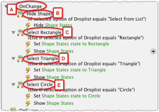
When the user changes an item in the droplist, the OnChange action (A) evaluates the selection and:
- If the user selects the value Rectangle from the droplist, show the rectangle state (C)
- If the user selects the value Triangle from the droplist, show the triangle state (D)
- If the user selects the value Circle from the droplist, show the circle state (E)
- If the user selects the value Select from List from the droplist, hide the shapes (B)
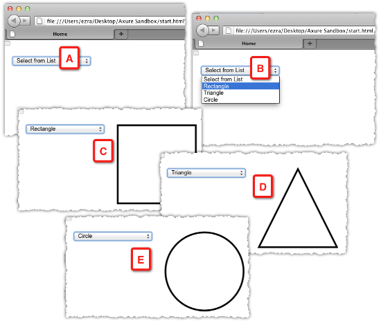
It is time to generate the HTML prototype. Make sure you set the path for the prototype to Axure Sandbox | HTML, as discussed in Step 2 of this example. The following screenshot (A through E) illustrates the generated result:
The Condition Builder
Let's take a closer look at a simple conditional statement from the previous example. The interaction for the Rectangle case is composed of the following two sentences:
- If the selected option in the Droplist equals Rectangle
- Set Shape State state to Rectangle
The first sentence is the condition being evaluated, and the second sentence is the action that takes place if the condition is met. Now let's focus on the condition sentence itself, and the flexibility afforded by the modular nature of Axure's Condition Builder.
Although the condition is composed of five droplists, what we are looking at is an equation in which we compare the first two droplists to the last two droplists. The following screenshot illustrates how the segments are assembled in the builder:
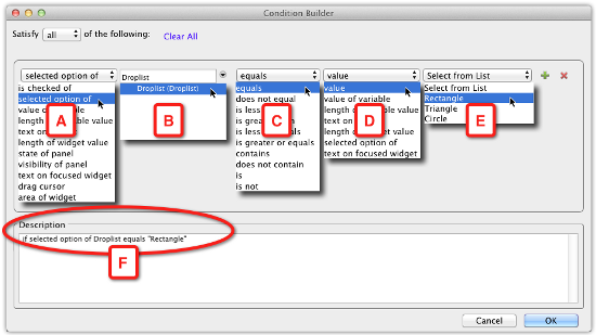
- selected option of is one of eleven choices in the first droplist (A). The selection made here affects the other droplists. Note that, although in our example, we have the interaction tied to the OnChange event of the droplist widget, the condition we add does not have to be limited to evaluating the selected value of the droplist. We could add other conditions to the OnChange event that evaluate any of the other choices in the builder's droplist A.
- Our choice in the first droplist narrows the options in the second droplist (B) to droplists and listbox widgets. Our example wireframe has only a single droplist widget and so Droplist (Droplist) is the only item listed.
- The third droplist (C) is where we set the comparison choices in droplists A and B to the choices in droplist D and E. In addition to the option Equals, there are nine more options to construct the equation.
- In the forth droplist (D), we specify what type of value the comparison will evaluate. In our example, we want to know what is the selected option in the wireframe droplist. However, we could also set a comparison to the selected option of some other droplist and create contextual droplists (example is coming below).
- The last droplist (E) is contextual to the selection we make in D. In our example, as we opted to look at the value of the Droplist widget (B), Axure lists the values we entered for that widget.
- Finally, the Description section (F) is automatically generated by Axure to reiterate the condition in plain English.
Guided example—multiple conditions
We often have to evaluate multiple conditions before we can determine which action to take. For example, simulating validation of the required form or authentication fields, or simulating a contextual rendering of an application screen, based on the user login, status, and other parameters. The Condition Builder is a significant time saver because with relatively few wireframes, mostly variations within dynamic panel states, it is possible to create multiple conditions and simulate sophisticated interactions.
Unlock access to the largest independent learning library in Tech for FREE!
Get unlimited access to 7500+ expert-authored eBooks and video courses covering every tech area you can think of.
Renews at $19.99/month. Cancel anytime
For this example, we will continue with our Alexandria project. Specifically, we will complete the login validation.
Step 1: Defining the interaction
Our goal is to evaluate if the user entered their username and password, prompt the user if there is missing or wrong information, or log them into the site. This interaction is broadly used, although interaction patterns vary slightly. Successful sign-in is a critical task because in most sites and applications, it affords access to the most valuable features.
It is sometimes tempting to postpone, or skip altogether, simulating the sign-in task, because it is so trivial. However, without an explicit directive from UX about this flow, we are leaving the interpretation and design to the developers.
In this example, we will use Condition Builder to compose several conditions and the first step is to define the desired interaction. As with all interactions that involve conditional logic, this is the opportunity to spell out the logic:
- When: When the user clicks on the Login button.
- Where: The Login rectangle widget.
- What: Validate the username and password. Alert the user if there is an issue, or log the user in.
- Conditions: On entry, the User Name and Password fields are empty, and the Login button is disabled.
- The Login button is enabled only if both fields are populated.
- When the user clicks on the Login button.
- If the provided credentials are ok, change the screen to reflect a successful sign-in screen.
- If any or both credentials are wrong, notify the user and disable the Login button.
- If the user re-typed the credentials, reactivate the Login button.
The logic here is a bit more involved compared to the previous example, as we need to account for the interaction in multiple widgets: The form fields, the Login button, and the notification to the user in the case of an authentication problem.
The following screenshot illustrates the current state of our Login wireframe and its interaction
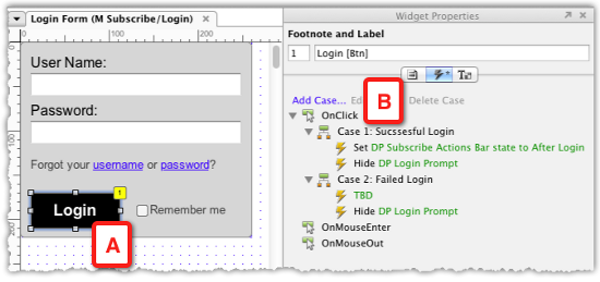
- The Subscribe/Login master is a dynamic panel with two states
- Login Form is on the second state, and the only widget with an interaction is the Login button (A)
- The interaction is triggered by an OnClick event which does not evaluate the User Name and Password fields
Step 2: Constructing Wireframe
We will start by iterating on top of what we have already created, and make adjustments to the wireframe according to the new requirements. The following screenshot illustrates the tweaks:
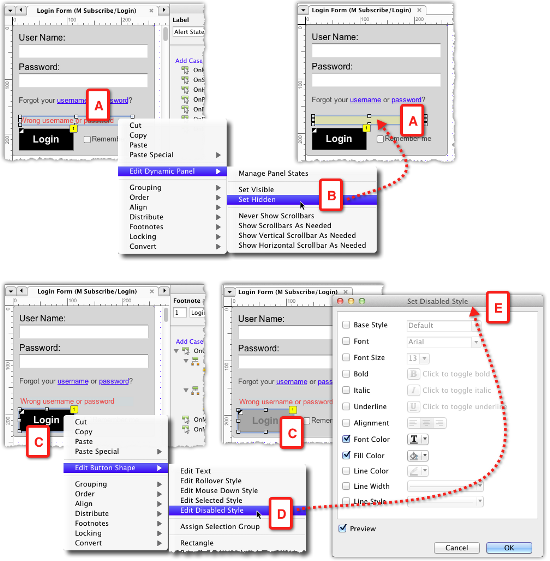
- It appears that in the current wireframe, there is no room for providing the user with feedback if there is an issue with the username or password.
- Right above the Login button, we will add a dynamic panel which will contain the error message (see the preceding screenshot, A) and set it to Hidden (B). Remember that dynamic panel widgets are the only widget type or which you can control the visibility properties:
- The height of the current pop up needs to be adjusted to accommodate the added alert, and remember to increase the height of the dynamic panel that holds the state.
- The Login button (C) needs to have a disabled state. There are at least a couple of ways to approach the constructions.
- Converting the widget into a dynamic panel and adding a disabled state:
- Use the styling feature to add a Disabled Style (D) in the Set Disabled Style editor (E) and use actions to switch between normal and disabled styles. In this example, I will use the second option because it involves maintaining a single wireframe widget and the use of styles which is faster to update.
With the wireframe updated to support the interaction, we can now move on to the next step.
Step 3: Interaction tweaks
A quick review of the flow of interactions, as it pertains to the wireframes, is illustrated in the following screenshot:
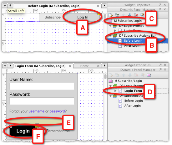
- The entire interaction is triggered when the user clicks on the Log In button (A), a widget in the Before Login state of the dynamic panel DP Subscribe Actions Bar (B), which is part of the master M Subscribe/Login (C).
- The dynamic panel Login Form (D), which is also in the master (C), will become visible.
- The alert dynamic panel (E) will be hidden. This is taken care of by setting the default visibility of this dynamic panel to hidden:
- The Login button (F) needs to be set to show its disabled state.
As setting the Login button to a disabled style cannot be defaulted on the widget, it needs to be set in an action. The process is illustrated in the following screenshot:
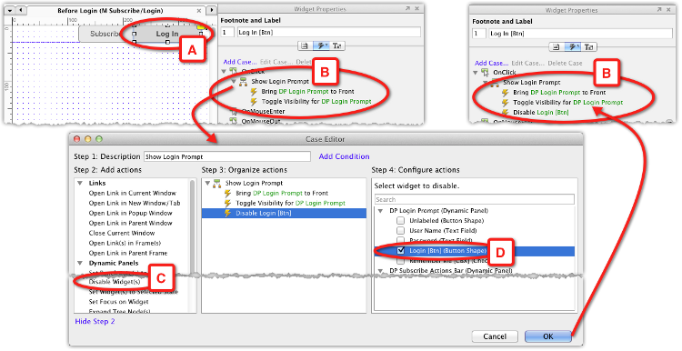
The logical place to have this action is on the button that triggers the interaction, the Log In button (see the preceding screenshot, A). Moreover, as we already created an initial interaction for this widget, we only need to add the action Disable Widget(s) (C and D) to that interaction. Generate the prototype and test this out. The styling of the Login button will be set to the visual style you assigned to the widget, and although the widget has an OnClick interaction associated with it, it will be disabled.
Step 4: Evaluating multiple conditions
Now that we have established an initial state for the Login button in the prompt, we can move on to composing the interaction that will enable the button and allow the user to continue with the login process.
As the Login button should only be enabled if there is some content in the User Name and Password fields, let's assign each of the fields with an interaction to evaluate just that. In this example, our evaluation will not be too elaborate.
- For the User Name field, we will check whether the user typed in at least four characters. We will not look for a specific value.
- For the Password field, we will check whether the user typed in at least six characters. We will not look for a specific value.
Both fields are Text Field widgets. This type of widget can support the following events:
- OnClick
- OnFocus
- OnKeyUp
- OnLostFocus
How can we decide which event should trigger the interaction? The truth is that you can accomplish the requirements in several ways, and in some cases, it is a matter of trial and error. In this example, I will use the OnKeyUp event to trigger the actions that evaluate the fields, because this event provides an instant feedback to the user if the entered credentials satisfy the requirements.
The following screenshot illustrates the conditions and interactions for the User Name field (A):
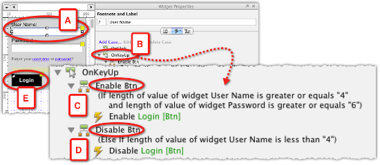
- We need to create two cases for the OnKeyUp event (B):
- The first case (C) will evaluate whether the length of the input in this field is at least four characters, and whether the length of the input in the Password field is at least six characters, because the user must provide both pieces of information. If the length of the input for both meets the conditions, the Login button (E) will be enabled.
- The second case (D) will keep the Login button disabled, if the length of input to the User Name field is less than four characters. We don't need to evaluate the length of the Password field, because the User Name must meet the condition and so it does not matter if the Password field is ok.
This example was a demonstration of the frequent need to evaluate multiple conditions in a single case. Let's take a closer look at the Condition Builder:
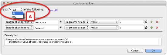
Satisfy all or any
The preceding screenshot illustrates the Condition Builder's Satisfy droplist (A) which has only two values, all and any. By default, it is set to all, which is fine if you have a single condition in the builder. With two or more conditions, it becomes critical that this droplist is set to the correct value. To help you make sense of the condition, the droplist is set as part of a sentence. Always read the entire sentence when you consider which option to set:
- Satisfy all of the following:
- Satisfy any of the following:
In our example, the conditional logic controls whether or not to activate the Login button, and because BOTH fields must be validated, the selection of "all" in the Satisfy droplist is the correct one.
Step 5: Final conditional touches
Complete the interactions and conditions for the Password field and generate the prototype to test whether the login control works as intended. The companion Axure file for this article includes the complete interaction, but I encourage you to try to figure it out yourself, because, as with anything else, we learn best by first-hand experimentation.
It will also be nice to demonstrate the alert field, which notifies the user when either of the fields is invalid. This condition is tested when the user clicks on the active Login button.
In this example, we will only evaluate the Password field and the process is illustrated in the following screenshot:
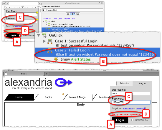
- We have already created an interaction for the Login button (A). The initial version did not evaluate anything, and the two cases for the OnClick event were to be triggered manually.
- The revised interactions for the Successful and Failed Login cases will evaluate a specific password value. While the conditional logic in the User Name and Password fields evaluates the length of the input, here, we want to simulate the system response if the value of the Password field (C) is incorrect.
- For convenience, set the password to something that is easy to remember and type, because as long as the conditional simulation of the login is in place, you will have to go through the flow each time you generate the prototype. This can become very tedious. Our password will be simply be 123456. If needed, however, you can use Axure to simulate very rigorous password verification conditions.
- The alert line (D) appears only if the password is incorrect. The Successful Login case will test if the password equals to 123456 and will change the state of the entire dynamic panel.

 United States
 Great Britain
 India
India
 Germany
 France
 Canada
 Russia
 Spain
Spain
 Brazil
 Australia
 Singapore
 Canary Islands
 Hungary
 Ukraine
 Luxembourg
 Estonia
 Lithuania
 South Korea
 Turkey
 Switzerland
 Colombia
 Taiwan
 Chile
Chile
 Norway
 Ecuador
 Indonesia
 New Zealand
 Cyprus
 Denmark
 Finland
 Poland
 Malta
Malta
 Czechia
 Austria
 Sweden
 Italy
Italy
 Egypt
Egypt
 Belgium
 Portugal
 Slovenia
 Ireland
 Romania
 Greece
 Argentina
 Netherlands
 Bulgaria
 Latvia
 South Africa
 Malaysia
 Japan
Japan
 Slovakia
 Philippines
 Mexico
 Thailand


