


The majority of styles that are applied to Material-UI components are part of the theme styles. In some cases, you need the ability to style individual components without changing the theme. For example, a button in one feature might need a specific style applied to it that shouldn’t change every other button in the app. Material-UI provides several ways to apply custom styles to components as a whole, or to specific parts of components.
In this article, we will look at the various styling solutions to design appealing user interfaces including basic component styles, scoped component styles, extending component styles, moving styles to themes, and others.
Basic component styles
Material uses JavaScript Style Sheets (JSS) to style its components. You can apply your own JSS using the utilities provided by Material-UI.
How to do it…
The withStyles() function is a higher-order function that takes a style object as an argument. The function that it returns takes the component to style as an argument. Here’s an example:
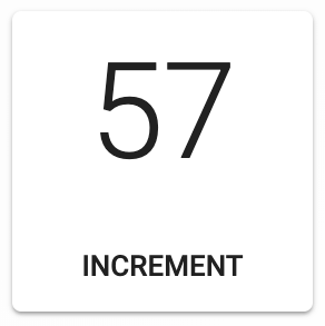
import React, { useState } from 'react';import { withStyles } from '@material-ui/core/styles';import Card from '@material-ui/core/Card';import CardActions from '@material-ui/core/CardActions';import CardContent from '@material-ui/core/CardContent';import Button from '@material-ui/core/Button';import Typography from '@material-ui/core/Typography';const styles = theme => ({card: {width: 135,height: 135,textAlign: 'center'},cardActions: {justifyContent: 'center'}});const BasicComponentStyles = withStyles(styles)(({ classes }) => {const [count, setCount] = useState(0);const onIncrement = () => {setCount(count + 1);};return (<Card className={classes.card}><CardContent><Typography variant="h2">{count}</Typography></CardContent><CardActions className={classes.cardActions}><Button size="small" onClick={onIncrement}>Increment</Button></CardActions></Card>);});export default BasicComponentStyles;Here’s what this component looks like:
How it works…
Let’s take a closer look at the styles defined by this example:
const styles = theme => ({
  card: {
    width: 135,
    height: 135,
    textAlign: 'center'
  },
  cardActions: {
    justifyContent: 'center'
  }
});
The styles that you pass to withStyles() can be either a plain object or a function that returns a plain object, as is the case with this example. The benefit of using a function is that the theme values are passed to the function as an argument, in case your styles need access to the theme values. There are two styles defined in this example: card and cardActions. You can think of these as Cascading Style Sheets (CSS) classes. Here’s what these two styles would look like as CSS:
.card { width: 135 height: 135 text-align: center}.cardActions {justify-content: center}By calling withStyles(styles)(MyComponent), you’re returning a new component that has a classes property. This object has all of the classes that you can apply to components now. You can’t just do something such as this:
<Card className="card" />
When you define your styles, they have their own build process and every class ends up getting its own generated name. This generated name is what you’ll find in the classes object, so this is why you would want to use it.
There’s more…
Instead of working with higher-order functions that return new components, you can leverage Material-UI style hooks. This example already relies on the useState() hook from React, so using another hook in the component feels like a natural extension of the same pattern that is already in place. Here’s what the example looks like when refactored to take advantage of the makeStyles() function:
import React, { useState } from 'react';import { makeStyles } from '@material-ui/styles';import Card from '@material-ui/core/Card';import CardActions from '@material-ui/core/CardActions';import CardContent from '@material-ui/core/CardContent';import Button from '@material-ui/core/Button';import Typography from '@material-ui/core/Typography';const useStyles = makeStyles(theme => ({card: {width: 135,height: 135,textAlign: 'center'},cardActions: {justifyContent: 'center'}}));export default function BasicComponentStyles() {const classes = useStyles();const [count, setCount] = useState(0);const onIncrement = () => {setCount(count + 1);};return (<Card className={classes.card}><CardContent><Typography variant="h2">{count}</Typography></CardContent><CardActions className={classes.cardActions}><Button size="small" onClick={onIncrement}>Increment</Button></CardActions></Card>);}The useStyles() hook is built using the makeStyles() function—which takes the exact same styles argument as withStyles(). By calling useStyles() within the component, you have your classes object. Another important thing to point out is that makeStyles is imported from @material-ui/styles, not @material-ui/core/styles.Scoped component styles
Most Material-UI components have a CSS API that is specific to the component. This means that instead of having to assign a class name to the className property for every component that you need to customize, you can target specific aspects of the component that you want to change. Material-UI has laid the foundation for scoping component styles; you just need to leverage the APIs.
How to do it…
Let’s say that you have the following style customizations that you want to apply to the Button components used throughout your application:
- Every button needs a margin by default.
- Every button that uses the contained variant should have additional top and bottom padding.
- Every button that uses the contained variant and the primary color should have additional top and bottom padding, as well as additional left and right padding.
Here’s an example that shows how to use the Button CSS API to target these three different Button types with styles:
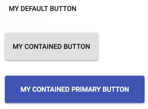
import React, { Fragment } from 'react';import { withStyles } from '@material-ui/core/styles';import Button from '@material-ui/core/Button';const styles = theme => ({root: {margin: theme.spacing(2)},contained: {paddingTop: theme.spacing(2),paddingBottom: theme.spacing(2)},containedPrimary: {paddingLeft: theme.spacing(4),paddingRight: theme.spacing(4)}});const ScopedComponentStyles = withStyles(styles)(({ classes: { root, contained, containedPrimary } }) => (<Fragment><Button classes={{ root }}>My Default Button</Button><Button classes={{ root, contained }} variant="contained">My Contained Button</Button><Buttonclasses={{ root, contained, containedPrimary }}variant="contained"color="primary">My Contained Primary Button</Button></Fragment>));export default ScopedComponentStyles;Here’s what the three rendered buttons look like:
How it works…
The Button CSS API takes named styles and applies them to the component. These same names are used in the styles in this code. For example, root applies to every Button component, whereas contained only applies the styles to the Button components that use the contained variant and the containedPrimary style only applies to Button components that use the contained variant and the primary color.
There’s more…
Each style is destructured from the classes property, then applied to the appropriate Button component. However, you don’t actually need to do all of this work. Since the Material-UI CSS API takes care of applying styles to components in a way that matches what you’re actually targeting, you can just pass the classes directly to the buttons and get the same result. Here’s a simplified version of this example:
import React, { Fragment } from 'react';import { withStyles } from '@material-ui/core/styles';import Button from '@material-ui/core/Button';const styles = theme => ({root: {margin: theme.spacing(2)},contained: {paddingTop: theme.spacing(2),paddingBottom: theme.spacing(2)},containedPrimary: {paddingLeft: theme.spacing(4),paddingRight: theme.spacing(4)}});const ScopedComponentStyles = withStyles(styles)(({ classes }) => (<Fragment><Button classes={classes}>My Default Button</Button><Button classes={classes} variant="contained">My Contained Button</Button><Button classes={classes} variant="contained" color="primary">My Contained Primary Button</Button></Fragment>));export default ScopedComponentStyles;The output looks the same because only buttons that match the constraints of the CSS API get the styles applied to them. For example, the first Button has the root, contained, and containedPrimary styles passed to the classes property, but only root is applied because it isn’t using the contained variant of the primary color. The second Button also has all three styles passed to it, but only root and contained are applied. The third Button has all three styles applied to it because it meets the criteria of each style.
Extending component styles
You can extend styles that you apply to one component with styles that you apply to another component. Since your styles are JavaScript objects, one option is to extend one style object with another. The only problem with this approach is that you end up with a lot of duplicate styles properties in the CSS output. A better alternative is to use the jss extend plugin.
How to do it…
Let’s say that you want to render three buttons and share some of the styles among them. One approach is to extend generic styles with more specific styles using the jss extend plugin. Here’s how to do it:
import React, { Fragment } from 'react';import { JssProvider, jss } from 'react-jss';import {withStyles,createGenerateClassName} from '@material-ui/styles';import {createMuiTheme,MuiThemeProvider} from '@material-ui/core/styles';import Button from '@material-ui/core/Button';const styles = theme => ({root: {margin: theme.spacing(2)},contained: {extend: 'root',paddingTop: theme.spacing(2),paddingBottom: theme.spacing(2)},containedPrimary: {extend: 'contained',paddingLeft: theme.spacing(4),paddingRight: theme.spacing(4)}});const App = ({ children }) => (<JssProviderjss={jss}generateClassName={createGenerateClassName()}><MuiThemeProvider theme={createMuiTheme()}>{children}</MuiThemeProvider></JssProvider>);const Buttons = withStyles(styles)(({ classes }) => (<Fragment><Button className={classes.root}>My Default Button</Button><Button className={classes.contained} variant="contained">My Contained Button</Button><ButtonclassName={classes.containedPrimary}variant="contained"color="primary">My Contained Primary Button</Button></Fragment>));const ExtendingComponentStyles = () => (<App><Buttons /></App>);export default ExtendingComponentStyles;Here’s what the rendered buttons look like:

How it works…
The easiest way to use the jss extend plugin in your Material-UI application is to use the default JSS plugin presets, which includes jss extend. Material-UI has several JSS plugins installed by default, but jss extend isn’t one of them. Let’s take a look at the App component in this example to see how this JSS plugin is made available:
const App = ({ children }) => (
  <JssProvider
    jss={jss}
    generateClassName={createGenerateClassName()}
  >
    <MuiThemeProvider theme={createMuiTheme()}>
      {children}
    </MuiThemeProvider>
  </JssProvider>
);
The JssProvider component is how JSS is enabled in Material-UI applications. Normally, you wouldn’t have to interface with it directly, but this is necessary when adding a new JSS plugin. The jss property takes the JSS preset object that includes the jss extend plugin. The generateClassName property takes a function from Material-UI that helps generate class names that are specific to Material-UI.
Next, let’s take a closer look at some styles:
const styles = theme => ({
  root: {
    margin: theme.spacing(2)
  },
  contained: {
    extend: 'root',
    paddingTop: theme.spacing(2),
    paddingBottom: theme.spacing(2)
  },
  containedPrimary: {
    extend: 'contained',
    paddingLeft: theme.spacing(4),
    paddingRight: theme.spacing(4)
  }
});
The extend property takes the name of a style that you want to extend. In this case, the contained style extends root. The containedPrimary extends contained and root. Now let’s take a look at how this translates into CSS. Here’s what the root style looks like:
.Component-root-1 {
  margin: 16px;
}
Next, here’s the contained style:
.Component-contained-2 {
  margin: 16px;
  padding-top: 16px;
  padding-bottom: 16px;
}
Finally, here’s the containedPrimary style:
.Component-containedPrimary-3 {
  margin: 16px;
  padding-top: 16px;
  padding-left: 32px;
  padding-right: 32px;
  padding-bottom: 16px;
}
Note that the properties from the more-generic properties are included in the more-specific styles. There are some properties duplicated, but this is in CSS, instead of having to duplicate JavaScript object properties. Furthermore, you could put these extended styles in a more central location in your code base, so that multiple components could use them.
Moving styles to themes
As you develop your Material-UI application, you’ll start to notice style patterns that repeat themselves. In particular, styles that apply to one type of component, such as buttons, evolve into a theme.
How to do it…
Let’s revisit the example from the Scoped component styles section:
import React, { Fragment } from 'react';import { withStyles } from '@material-ui/core/styles';import Button from '@material-ui/core/Button';const styles = theme => ({root: {margin: theme.spacing(2)},contained: {paddingTop: theme.spacing(2),paddingBottom: theme.spacing(2)},containedPrimary: {paddingLeft: theme.spacing(4),paddingRight: theme.spacing(4)}});const ScopedComponentStyles = withStyles(styles)(({ classes }) => (<Fragment><Button classes={classes}>My Default Button</Button><Button classes={classes} variant="contained">My Contained Button</Button><Button classes={classes} variant="contained" color="primary">My Contained Primary Button</Button></Fragment>));export default ScopedComponentStyles;Here’s what these buttons look like after they have these styles applied to them:

Now, let’s say you’ve implemented these same styles in several places throughout your app because this is how you want your buttons to look. At this point, you’ve evolved a simple component customization into a theme. When this happens, you shouldn’t have to keep implementing the same styles over and over again. Instead, the styles should be applied automatically by using the correct component and the correct property values. Let’s move these styles into theme:
import React from 'react';import {createMuiTheme,MuiThemeProvider} from '@material-ui/core/styles';import Button from '@material-ui/core/Button';const defaultTheme = createMuiTheme();const theme = createMuiTheme({overrides: {MuiButton: {root: {margin: 16},contained: {paddingTop: defaultTheme.spacing(2),paddingBottom: defaultTheme.spacing(2)},containedPrimary: {paddingLeft: defaultTheme.spacing(4),paddingRight: defaultTheme.spacing(4)}}}});const MovingStylesToThemes = ({ classes }) => (<MuiThemeProvider theme={theme}><Button>My Default Button</Button><Button variant="contained">My Contained Button</Button><Button variant="contained" color="primary">My Contained Primary Button</Button></MuiThemeProvider>);export default MovingStylesToThemes;Now, you can use Button components without having to apply the same styles every time.
How it works…
Let’s take a closer look at how your styles fit into a Material-UI theme:
overrides: {
  MuiButton: {
    root: {
      margin: 16
    },
    contained: {
      paddingTop: defaultTheme.spacing(2),
      paddingBottom: defaultTheme.spacing(2)
    },
    containedPrimary: {
      paddingLeft: defaultTheme.spacing(4),
      paddingRight: defaultTheme.spacing(4)
    }
  }
}
The overrides property is an object that allows you to override the component-specific properties of the theme. In this case, it’s the MuiButton component styles that you want to override. Within MuiButton, you have the same CSS API that is used to target specific aspects of components. This makes moving your styles into the theme straightforward because there isn’t much to change.
One thing that did have to change in this example is the way spacing works. In normal styles that are applied via withStyles(), you have access to the current theme because it’s passed in as an argument. You still need access to the spacing data, but there’s no theme argument because you’re not in a function. Since you’re just extending the default theme, you can access it by calling createMuiTheme() without any arguments, as this example shows.
This article explored some of the ways you can apply styles to Material-UI components of your React applications. There are many other styling options available to your Material-UI app beyond withStyles(). There’s the styled() higher-order component function that emulates styled components. You can also jump outside the Material-UI style system and use inline CSS styles or import CSS modules and apply those styles.
If you found this post useful, do check out the book, React Material-UI Cookbook by Adam Boduch. This book will help you build modern-day applications by implementing Material Design principles in React applications using Material-UI.
Read Next
Keeping animations running at 60 FPS in a React Native app [Tutorial]
React Native development tools: Expo, React Native CLI, CocoaPods [Tutorial]
Building a Progressive Web Application with Create React App 2 [Tutorial]


